Wondering how your logo performs? 🧐
Get professional logo reviews in seconds and catch design issues in time.
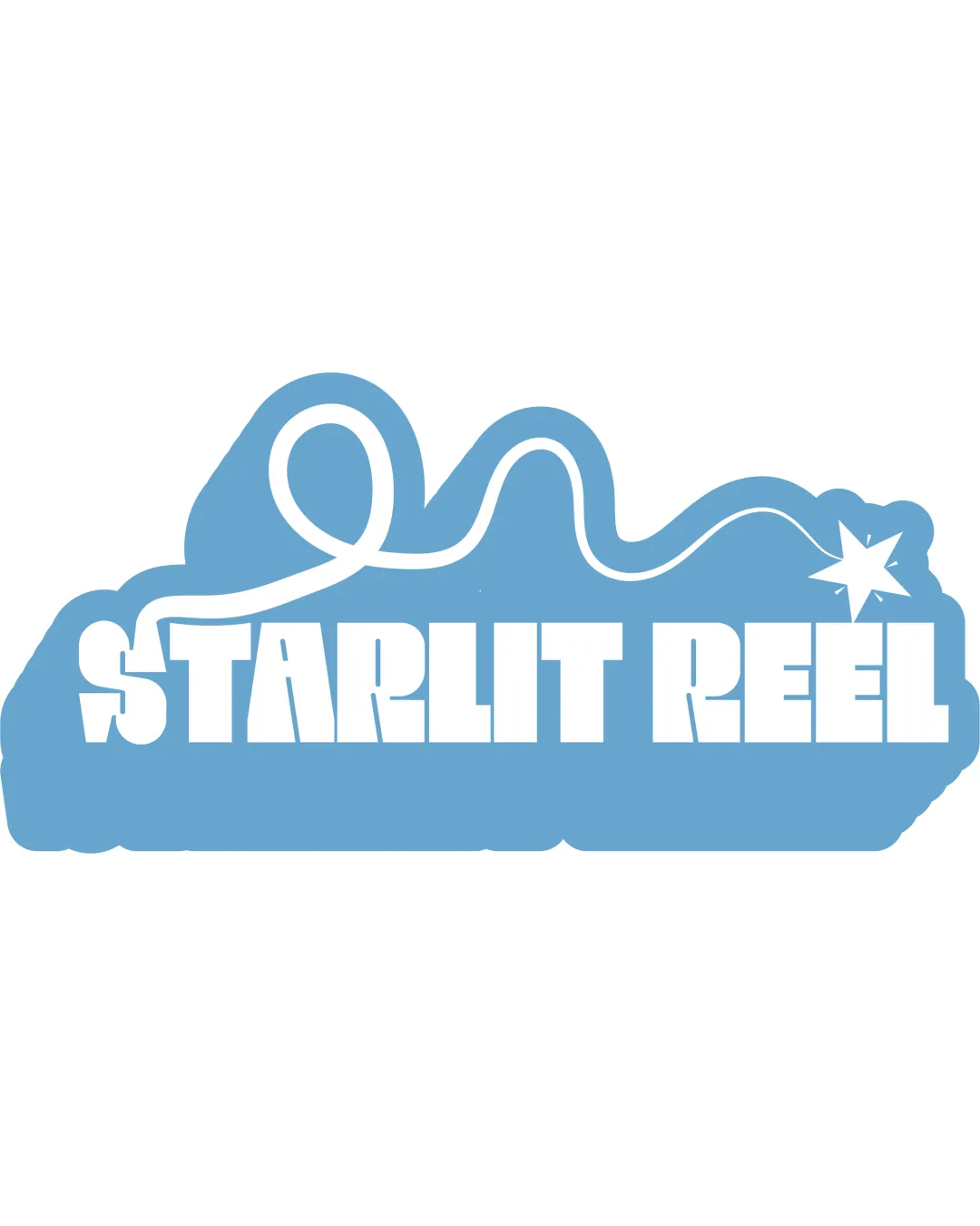
Try it Now!Logo review of STARLIT REEL
 Logo analysis by AI
Logo type:
Style:
Detected symbol:
Detected text:
Business industry:
Review requested by Koya122024
**If AI can recognize or misinterpret it, so can people.
Structured logo review
Legibility
![]() Text is bold, uppercase, and generally clear
Text is bold, uppercase, and generally clear![]() High contrast between text and background
High contrast between text and background
![]() Star and ribbon element interfere with the S, causing slight readability issues
Star and ribbon element interfere with the S, causing slight readability issues![]() Some cuts in the text style may make smaller display difficult for legibility
Some cuts in the text style may make smaller display difficult for legibility
Scalability versatility
![]() Bold lines and clear shapes hold up on signage or posters
Bold lines and clear shapes hold up on signage or posters![]() Logo outline provides an identifiable shape
Logo outline provides an identifiable shape
![]() Fine detail of the film reel line and star could become unclear at favicon or embroidery size
Fine detail of the film reel line and star could become unclear at favicon or embroidery size![]() Text style and silhouette may lose clarity and impact in very small uses such as business cards or social media profile icons
Text style and silhouette may lose clarity and impact in very small uses such as business cards or social media profile icons
200x250 px
100×125 px
50×62 px
Balance alignment
![]() Main text block is aligned and provides visual weight
Main text block is aligned and provides visual weight![]() Flowing line adds interest on top, echoing the theme
Flowing line adds interest on top, echoing the theme
![]() The visual top-heaviness of the swirling reel disrupts balance
The visual top-heaviness of the swirling reel disrupts balance![]() Placement of star and ribbon feels disconnected from text structure
Placement of star and ribbon feels disconnected from text structure

Originality
![]() Unique integration of a star and flowing film/ribbon matches the name creatively
Unique integration of a star and flowing film/ribbon matches the name creatively![]() Custom wordmark feel
Custom wordmark feel
![]() Star as a symbol is commonly used in entertainment, reducing some uniqueness
Star as a symbol is commonly used in entertainment, reducing some uniqueness![]() Film/ribbon motif is literal—could be interpreted as generic if not further stylized
Film/ribbon motif is literal—could be interpreted as generic if not further stylized
Logomark wordmark fit
![]() Symbol relates conceptually and visually to the text
Symbol relates conceptually and visually to the text![]() Color and thickness of ribbon complement bold wordmark
Color and thickness of ribbon complement bold wordmark
![]() Ribbon overlaps the ‘S’ in a way that detracts slightly from unity
Ribbon overlaps the ‘S’ in a way that detracts slightly from unity![]() Star at the end does not fully integrate with rest of symbol and text
Star at the end does not fully integrate with rest of symbol and text
Aesthetic look
![]() Playful silhouette and rounded shape create a friendly, inviting feel
Playful silhouette and rounded shape create a friendly, inviting feel![]() Color palette is harmonious and modern
Color palette is harmonious and modern
![]() Overall outline is blocky and a bit clumsy
Overall outline is blocky and a bit clumsy![]() Busy top element may feel dated or less premium
Busy top element may feel dated or less premium
Dual meaning and misinterpretations
![]() No inappropriate or unintended symbolism detected
No inappropriate or unintended symbolism detected
Color harmony
![]() Good use of a minimal, well-balanced palette
Good use of a minimal, well-balanced palette![]() Contrast is sufficient for most applications
Contrast is sufficient for most applications
Polo Blue
#7EB7DA
White
#FFFFFF