Wondering how your logo performs? 🧐
Get professional logo reviews in seconds and catch design issues in time.
Try it Now!Logo review of Ribbon Air, international airport
 Logo analysis by AI
Logo type:
Style:
Detected symbol:
Detected text:
Business industry:
Review requested by Roman_oleksiyevych
**If AI can recognize or misinterpret it, so can people.
Structured logo review
Legibility
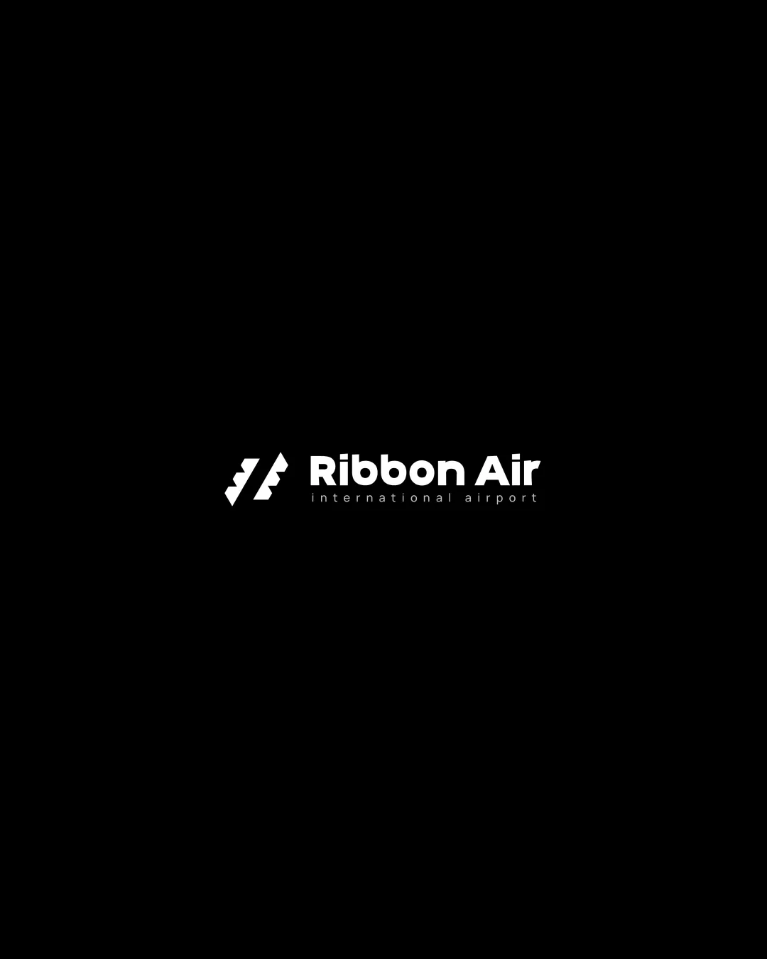
All text is crisp and highly readable against the black background.
Hierarchical distinction between 'Ribbon Air' and 'international airport' adds clarity.
Scalability versatility
Simple mark and strong sans-serif font ensure good readability at most scales.
Would work well for digital use, print, billboards, and airline branding.
The very thin tagline may disappear or be unreadable at smaller sizes such as favicons or business cards.

200x250 px

100×125 px

50×62 px
Balance alignment
Symbol and wordmark are well-aligned horizontally and vertically.
Visual weight is balanced between the icon and the main text.


Originality
The abstract ribbon/flight tailfin is a creative interpretation and fits the airline context.
Doesn't rely on generic airplanes or clichéd wings.
Still somewhat reminiscent of classic airline iconography, which doesn’t fully differentiate it from competitors.
Logomark wordmark fit
The geometric style of the symbol matches the bold sans-serif wordmark.
Proportions feel harmonious and intentional.
Aesthetic look
Minimal and modern composition is visually appealing.
Monochrome execution ensures it feels premium and professional.
Tagline font is almost too small; enlarging slightly would improve harmony and impact.
Dual meaning and misinterpretations
No accidental inappropriate shapes or double meanings present.
Color harmony
Black and white scheme ensures maximum contrast and clarity.
Single-color use allows easy adaptation for other color palettes.
White
#FFFFFF
Black
#000000


