Wondering how your logo performs? 🧐
Get professional logo reviews in seconds and catch design issues in time.
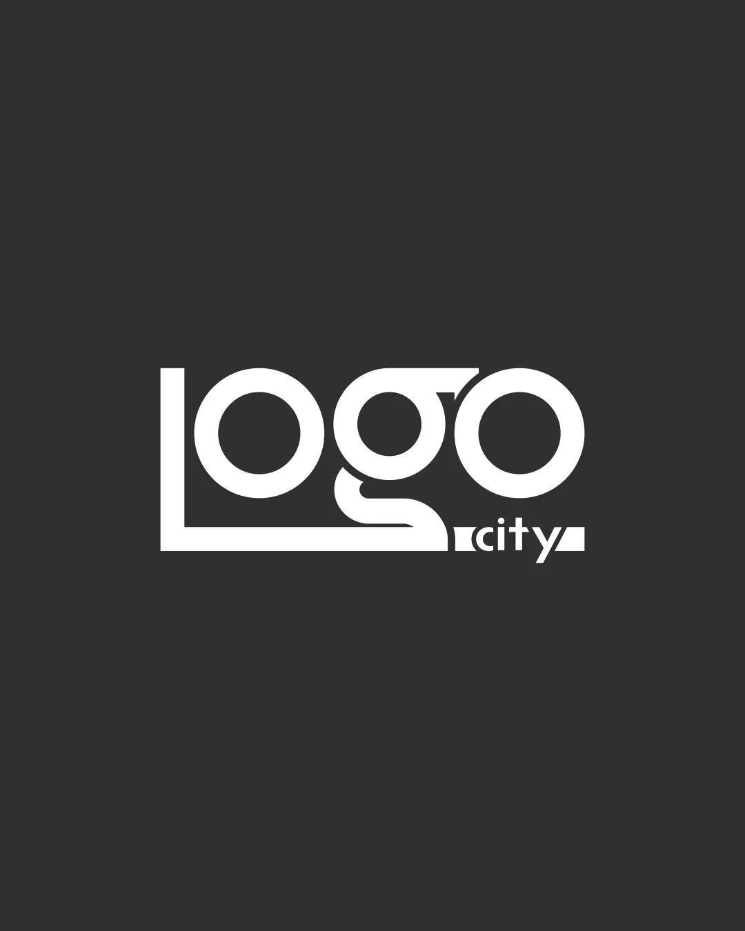
Try it Now!Logo review of Logo City
 Logo analysis by AI
Logo type:
Style:
Detected text:
Review requested by Gmrakib
**If AI can recognize or misinterpret it, so can people.
Structured logo review
Legibility
![]() Clear and simple typeface
Clear and simple typeface![]() High contrast with background
High contrast with background
![]() Slight ambiguity due to overlap in 'g' and 'o' characters
Slight ambiguity due to overlap in 'g' and 'o' characters
Scalability versatility
![]() Simplicity aids scalability
Simplicity aids scalability![]() Good for print and digital
Good for print and digital
![]() Interlocking letters may lose clarity at smaller sizes
Interlocking letters may lose clarity at smaller sizes
200x250 px
100×125 px
50×62 px
Balance alignment
![]() Well-aligned elements
Well-aligned elements![]() Balance between 'Logo' and 'city' text
Balance between 'Logo' and 'city' text
![]() Slight imbalance due to larger 'Logo' text
Slight imbalance due to larger 'Logo' text

Originality
![]() Unique type treatment
Unique type treatment
![]() The style is somewhat common in modern logos
The style is somewhat common in modern logos
Aesthetic look
![]() Modern and sleek appearance
Modern and sleek appearance![]() Minimalist design
Minimalist design
![]() May not stand out in a crowded market
May not stand out in a crowded market
Dual meaning and misinterpretations
![]() No inappropriate symbols
No inappropriate symbols
Color harmony
![]() Effective use of monochrome
Effective use of monochrome