Wondering how your logo performs? 🧐
Get professional logo reviews in seconds and catch design issues in time.
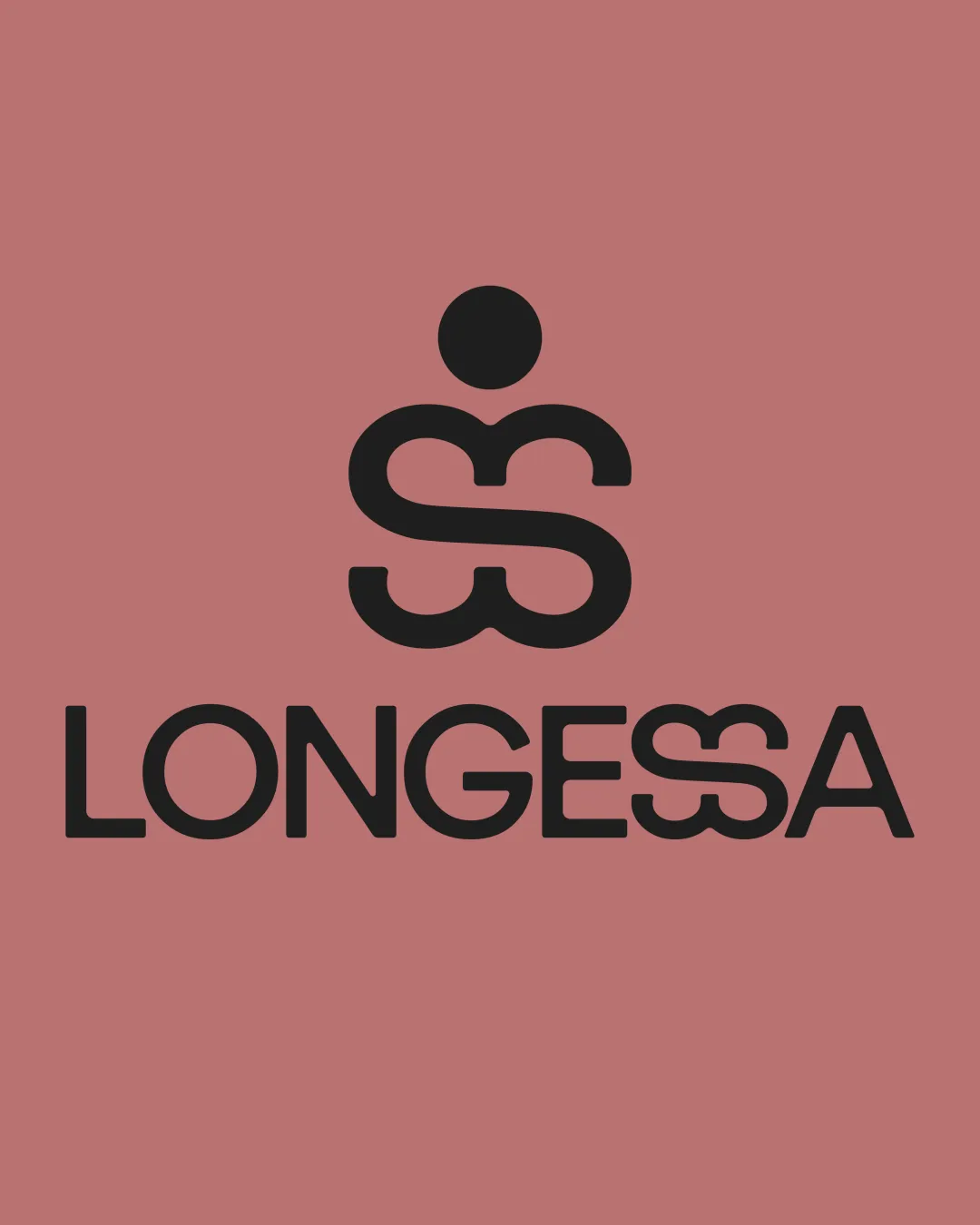
Try it Now!Logo review of LONGESSA
 Logo analysis by AI
Logo type:
Style:
Detected symbol:
Detected text:
Business industry:
Review requested by Gama
**If AI can recognize or misinterpret it, so can people.
Structured logo review
Legibility
![]() Majority of the wordmark is clear and easy to read
Majority of the wordmark is clear and easy to read![]() High-contrast between text and background aids readability
High-contrast between text and background aids readability
![]() Overlapping mirrored S's within the wordmark create mild confusion for the 'SS' segment
Overlapping mirrored S's within the wordmark create mild confusion for the 'SS' segment
Scalability versatility
![]() Simple, bold geometric forms maintain integrity at small and large sizes
Simple, bold geometric forms maintain integrity at small and large sizes![]() Strong mark will work across digital and print mediums, apparel tags, and signage
Strong mark will work across digital and print mediums, apparel tags, and signage
![]() Detail in the mirrored S's could merge visually at very small scales, such as on business cards or as an app icon
Detail in the mirrored S's could merge visually at very small scales, such as on business cards or as an app icon
200x250 px
100×125 px
50×62 px
Balance alignment
![]() Central alignment of mark and wordmark creates good visual flow
Central alignment of mark and wordmark creates good visual flow![]() Thickness and weight match well between logomark and wordmark
Thickness and weight match well between logomark and wordmark
![]() Placement of the dot above the mirrored S may feel top-heavy or disconnected at times
Placement of the dot above the mirrored S may feel top-heavy or disconnected at times

Originality
![]() Unique mirrored S's concept for both the logomark and within the wordmark
Unique mirrored S's concept for both the logomark and within the wordmark![]() Stylized execution not frequently seen in generic logos
Stylized execution not frequently seen in generic logos
![]() The overall idea of mirrored or stacked S's as a person is creative, but somewhat reminiscent of other stylized human icons
The overall idea of mirrored or stacked S's as a person is creative, but somewhat reminiscent of other stylized human icons
Logomark wordmark fit
![]() Excellent cohesion between the logomark and the mirrored S's in the wordmark
Excellent cohesion between the logomark and the mirrored S's in the wordmark![]() Stylistic and geometric language is consistent
Stylistic and geometric language is consistent
Aesthetic look
![]() Clean, contemporary feel with a clever mark
Clean, contemporary feel with a clever mark![]() Strong contrast and professional look
Strong contrast and professional look
![]() Integration of the mirrored S’s segment in 'LONGESSA' could polarize viewers due to mild legibility concerns
Integration of the mirrored S’s segment in 'LONGESSA' could polarize viewers due to mild legibility concerns
Dual meaning and misinterpretations
![]() No inappropriate secondary imagery detected; stylized human form is abstract and inoffensive
No inappropriate secondary imagery detected; stylized human form is abstract and inoffensive
Color harmony
![]() Simple, harmonious black-on-muted background is visually pleasant and professional
Simple, harmonious black-on-muted background is visually pleasant and professional![]() Minimal color use aids reproduction and adaptability
Minimal color use aids reproduction and adaptability
Black
#1E1C1C
Tapestry
#C17B7B


