Wondering how your logo performs? 🧐
Get professional logo reviews in seconds and catch design issues in time.
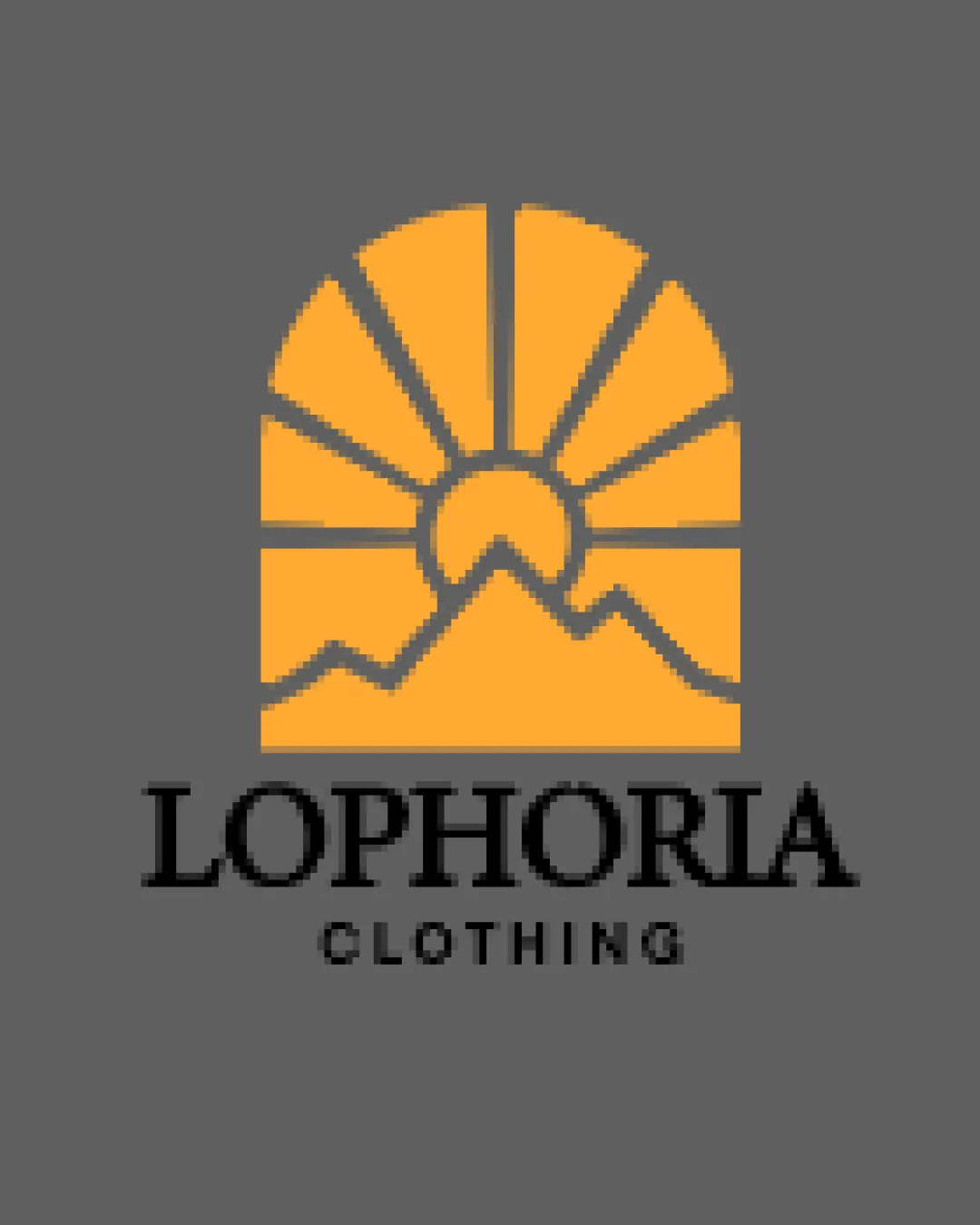
Try it Now!Logo review of LOPHORIA CLOTHING
 Logo analysis by AI
Logo type:
Style:
Detected symbol:
Detected text:
Business industry:
Review requested by Philodesigns
**If AI can recognize or misinterpret it, so can people.
Structured logo review
Legibility
![]() Text is clear and easy to read.
Text is clear and easy to read.![]() Font choice adds a modern appeal.
Font choice adds a modern appeal.
![]() The word 'CLOTHING' could be slightly bolder to improve visibility.
The word 'CLOTHING' could be slightly bolder to improve visibility.
Scalability versatility
![]() Clean design suitable for various applications.
Clean design suitable for various applications.
![]() Fine lines in the symbol may lose detail at smaller sizes.
Fine lines in the symbol may lose detail at smaller sizes.
200x250 px
100×125 px
50×62 px
Balance alignment
![]() Balanced composition of text and symbol.
Balanced composition of text and symbol.![]() Good alignment and proportionality.
Good alignment and proportionality.

Originality
![]() The sun and mountains symbol supports the brand image.
The sun and mountains symbol supports the brand image.
![]() Sun and mountains are often used in logos, making it less unique.
Sun and mountains are often used in logos, making it less unique.
Aesthetic look
![]() Visually appealing with a well-chosen color palette.
Visually appealing with a well-chosen color palette.
Dual meaning and misinterpretations
![]() No inappropriate symbols or meanings detected.
No inappropriate symbols or meanings detected.
Color harmony
![]() Good contrast between orange and black.
Good contrast between orange and black.
![]() Consider testing the orange on various backgrounds for consistency.
Consider testing the orange on various backgrounds for consistency.