Wondering how your logo performs? 🧐
Get professional logo reviews in seconds and catch design issues in time.
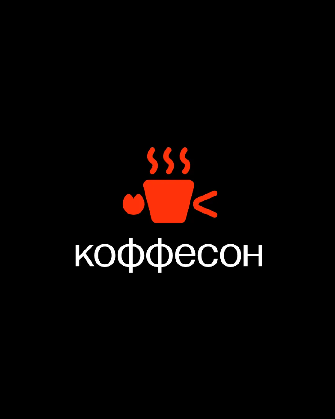
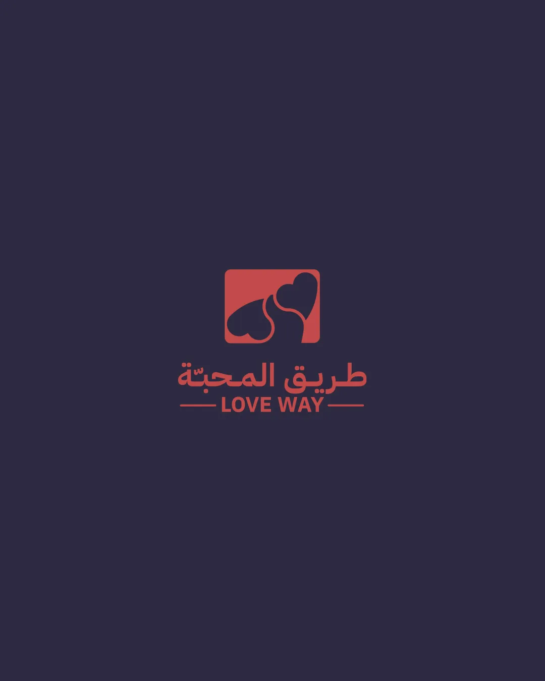
Try it Now!Logo review of LOVE WAY, طريق المحبة
 Logo analysis by AI
Logo type:
Style:
Detected symbol:
Detected text:
Business industry:
Review requested by Nj_des
**If AI can recognize or misinterpret it, so can people.
Structured logo review
Legibility
![]() Both Arabic and English text are clear and easily readable.
Both Arabic and English text are clear and easily readable.![]() Good contrast between the text color and the background.
Good contrast between the text color and the background.
![]() Arabic and English type treatment could be slightly more harmonious for a more cohesive visual flow.
Arabic and English type treatment could be slightly more harmonious for a more cohesive visual flow.
Scalability versatility
![]() Minimal overall design allows moderate scalability.
Minimal overall design allows moderate scalability.![]() Should work well for digital applications, app icons, and social profiles.
Should work well for digital applications, app icons, and social profiles.
![]() Thin lines in the heart symbol path may become less recognizable at small sizes or on embroidery.
Thin lines in the heart symbol path may become less recognizable at small sizes or on embroidery.![]() Small text below the symbol can get lost when scaled for small widgets or favicons.
Small text below the symbol can get lost when scaled for small widgets or favicons.
200x250 px
100×125 px
50×62 px
Balance alignment
![]() Good vertical stack between the symbol and dual-language wordmark.
Good vertical stack between the symbol and dual-language wordmark.![]() Horizontal line accents help ground the text block.
Horizontal line accents help ground the text block.
![]() Heart symbol is slightly off-balance within the rectangle due to negative space arrangement.
Heart symbol is slightly off-balance within the rectangle due to negative space arrangement.

Originality
![]() Creative integration of two hearts and path motif to represent the idea of 'Love Way'.
Creative integration of two hearts and path motif to represent the idea of 'Love Way'.![]() Dual-language support adds a unique cultural touch.
Dual-language support adds a unique cultural touch.
![]() Hearts are a very conventional symbol for love/dating, and some aspect may feel visually familiar/generic.
Hearts are a very conventional symbol for love/dating, and some aspect may feel visually familiar/generic.
Logomark wordmark fit
![]() The visual style of the mark and text fits well together.
The visual style of the mark and text fits well together.
![]() Text could benefit from a slight weight or size adjustment to match the visual presence of the symbol more closely.
Text could benefit from a slight weight or size adjustment to match the visual presence of the symbol more closely.
Aesthetic look
![]() Clean and minimal, aligns well with modern branding aesthetics.
Clean and minimal, aligns well with modern branding aesthetics.![]() Color selection is pleasant and suitable for the industry.
Color selection is pleasant and suitable for the industry.
![]() Rectangular symbol block feels somewhat rigid compared to the fluidity of the heart and path shapes.
Rectangular symbol block feels somewhat rigid compared to the fluidity of the heart and path shapes.
Dual meaning and misinterpretations
![]() No inappropriate visual double-meanings detected.
No inappropriate visual double-meanings detected.
Color harmony
![]() Effective use of two colors creates a strong and distinct identity.
Effective use of two colors creates a strong and distinct identity.![]() Colors harmonize well with the romantic theme.
Colors harmonize well with the romantic theme.
![]() Contrast between the colors could be pushed a bit further for more vibrancy on screens.
Contrast between the colors could be pushed a bit further for more vibrancy on screens.
Cranberry Red
#E14B5A
Midnight Blue
#201C3A