View review
Logo review ofLowbean
Review the detailed scores below to see what is working and what should be refined first.
What to fix first
The most important fixes to handle before polishing the full presentation.
Fix possible misinterpretation
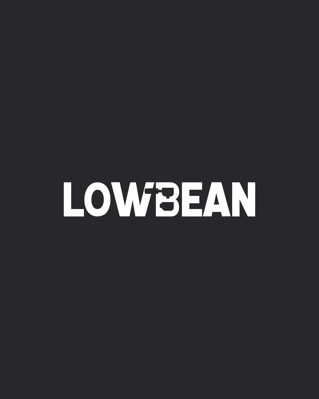
High priorityPossible confusion with the number 3, which could detract from brand clarity for first-time viewers.
Impact: High · Effort: Medium
Logo performance breakdown
Legibility
Overall word is readable with high contrast.
Bold font aids visibility from a distance.
The custom B can initially be mistaken for a number 3, especially at smaller sizes.
The mug/cup detail partially disrupts text flow, affecting instant legibility.
Originality
Creative use of negative space to form a mug or cup in the B.
Distinct from generic coffee shop logos with beans or cups used as standalone icons.
Typographic play with B as a cup is clever but not highly unique in the coffee industry.
Color harmony
Excellent use of monochrome, providing strong contrast and professional look.
High adaptability for lighter or darker backgrounds.
White
#FFFFFF
Charcoal
#29282C
Balance alignment
Text is centered and evenly spaced, with good horizontal alignment.
Weight distribution is consistent across letters.
Slight visual imbalance due to the intricate B, which attracts more attention than any other character.
Scalability
Simple design with limited color palette works well for print and digital.
Strong visibility on signage, packaging, and merchandise.
Cup/mug detail in B may lose clarity at favicon or embroidery scale.
Requires separate versions for very small applications.
200x250 px
100×125 px
50×62 px
Misinterpretations
Cup/mug visual is appropriate for coffee.
No inappropriate symbolism or double meaning detected.
Possible confusion with the number 3, which could detract from brand clarity for first-time viewers.
Wondering how your logo performs?
Get a clear logo score, key risks, and priority fix ideas before your client or audience sees it.