Wondering how your logo performs? 🧐
Get professional logo reviews in seconds and catch design issues in time.
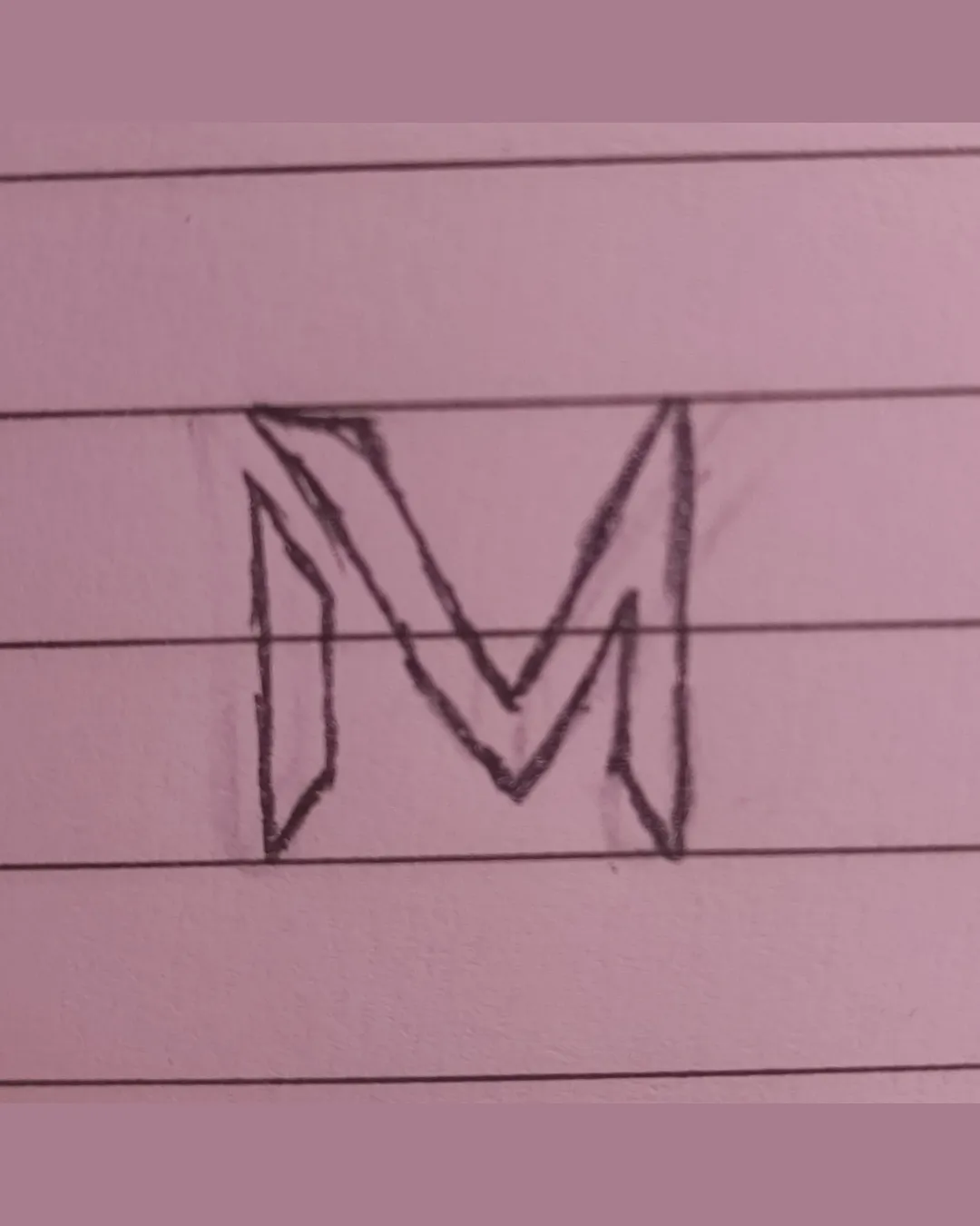
Try it Now!Logo review of M
 Logo analysis by AI
Logo type:
Style:
Detected symbol:
Detected text:
Business industry:
Review requested by DSk
**If AI can recognize or misinterpret it, so can people.
Structured logo review
Legibility
![]() The letter M is generally clearly recognizable.
The letter M is generally clearly recognizable.![]() Strong contrast between design and background.
Strong contrast between design and background.
![]() 3D effect introduces some minor confusion at smaller sizes.
3D effect introduces some minor confusion at smaller sizes.![]() Hand-drawn lines reduce overall crispness.
Hand-drawn lines reduce overall crispness.
Scalability versatility
![]() Simple outline allows for moderate scale-up.
Simple outline allows for moderate scale-up.
![]() Hand-drawn unevenness will distort at small sizes.
Hand-drawn unevenness will distort at small sizes.![]() Thin lines and overlapping angles could become illegible as a favicon or embroidery.
Thin lines and overlapping angles could become illegible as a favicon or embroidery.![]() Design complexity does not translate well for business cards or small icons.
Design complexity does not translate well for business cards or small icons.
200x250 px
100×125 px
50×62 px
Balance alignment
![]() Visual center is somewhat maintained.
Visual center is somewhat maintained.
![]() Left and right verticals are disproportionate.
Left and right verticals are disproportionate.![]() Internal shapes create a visual weight imbalance.
Internal shapes create a visual weight imbalance.

Originality
![]() Three-dimensional treatment of the M adds some uniqueness.
Three-dimensional treatment of the M adds some uniqueness.![]() Geometric interpretation shows an attempt at stylization.
Geometric interpretation shows an attempt at stylization.
![]() M lettermark is a common approach and lacks a distinctive concept.
M lettermark is a common approach and lacks a distinctive concept.![]() No creative use of negative space or iconography outside the standard letter.
No creative use of negative space or iconography outside the standard letter.
Aesthetic look
![]() Geometric lines add a modern edge.
Geometric lines add a modern edge.
![]() Hand-drawn quality undermines polish.
Hand-drawn quality undermines polish.![]() The busy interior lines make the logo feel cluttered.
The busy interior lines make the logo feel cluttered.
Dual meaning and misinterpretations
![]() No inappropriate or accidental symbols detected.
No inappropriate or accidental symbols detected.
Color harmony
![]() Monochromatic palette provides simplicity.
Monochromatic palette provides simplicity.
![]() Background color does not contrast well with logo.
Background color does not contrast well with logo.![]() Pencil sketch does not convey professional branding colors.
Pencil sketch does not convey professional branding colors.
Pale Purple
#A97D8F
Black
#000000


