Wondering how your logo performs? 🧐
Get professional logo reviews in seconds and catch design issues in time.
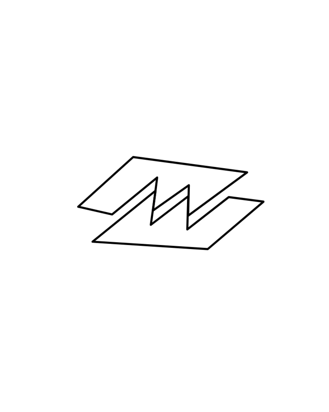
Try it Now!Logo review of M
 Logo analysis by AI
Logo type:
Style:
Detected symbol:
Negative space:
Detected text:
Business industry:
Review requested by DSk
**If AI can recognize or misinterpret it, so can people.
Structured logo review
Scalability versatility
![]() Simple geometric lines ensure clarity at small and large sizes.
Simple geometric lines ensure clarity at small and large sizes.![]() No excessive details or fine elements that risk loss of clarity.
No excessive details or fine elements that risk loss of clarity.![]() Easily adaptable for digital icons, print, and embroidery.
Easily adaptable for digital icons, print, and embroidery.
200x250 px
100×125 px
50×62 px
Balance alignment
![]() Symmetrical composition gives a stable, balanced look.
Symmetrical composition gives a stable, balanced look.![]() Clean alignment of angular lines creates harmonious geometry.
Clean alignment of angular lines creates harmonious geometry.

Originality
![]() Angular stacked forms add deliberate personality to the common M monogram.
Angular stacked forms add deliberate personality to the common M monogram.![]() Negative space usage in the middle enhances visual interest.
Negative space usage in the middle enhances visual interest.
![]() The M monogram concept is common—execution is fresh but not groundbreaking.
The M monogram concept is common—execution is fresh but not groundbreaking.
Aesthetic look
![]() Minimalist, modern aesthetic is cohesive and appealing.
Minimalist, modern aesthetic is cohesive and appealing.![]() Strong, deliberate lines create an assertive visual impact.
Strong, deliberate lines create an assertive visual impact.
![]() Could come across as generic if not paired with a distinctive wordmark or color scheme.
Could come across as generic if not paired with a distinctive wordmark or color scheme.
Dual meaning and misinterpretations
![]() No unintended or inappropriate symbols detected in the form.
No unintended or inappropriate symbols detected in the form.
Color harmony
![]() Monochrome palette supports versatility and timelessness.
Monochrome palette supports versatility and timelessness.![]() No clashing or excessive colors—clean execution.
No clashing or excessive colors—clean execution.
White
#FFFFFF
Black
#000000


