Maintix logo review
3.8 / 5
Logo score
Logo review of

Maintix

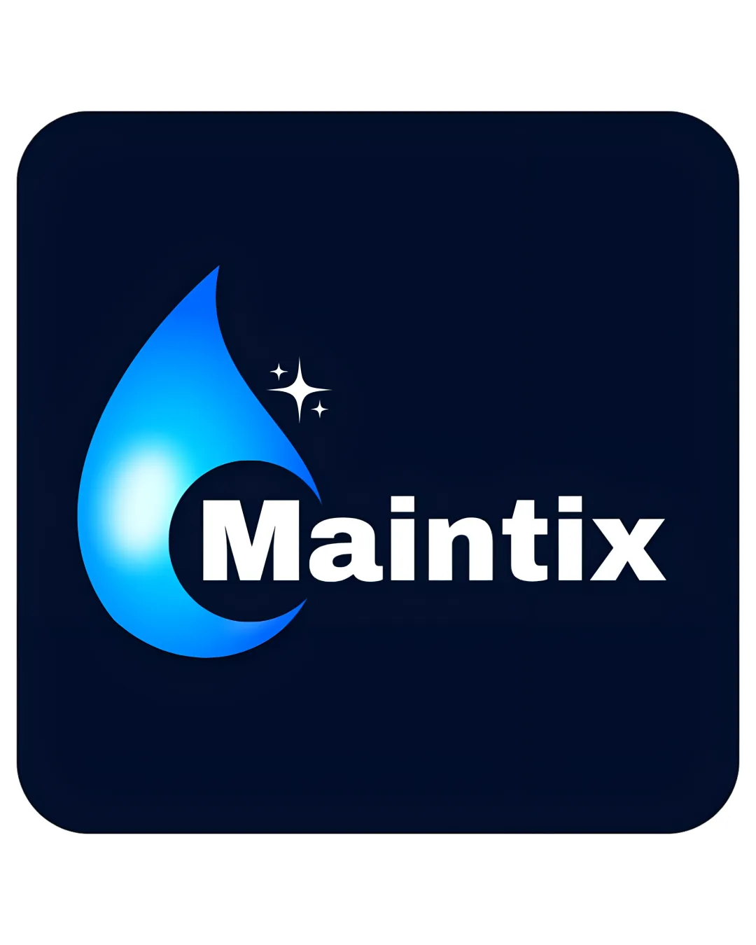
A clear, functional logo for cleaning services that is visually appealing but would benefit from modernized color treatments and a more distinctive mark.

Combination Mark Modern, Clean Cleaning Services
5/5
Legibility
3/5
Originality
5/5
Misread
4/5
Balance
4/5
Scale
Action plan

What to fix first

The most important fixes to handle before polishing the full presentation.

1

Reduce or simplify the glow and gradients in the water drop for better versatility across all sizes and backgrounds.

High priority

Current gradients can look dated and become muddy at small sizes.

Impact: Improves Scalability And Modernizes Appearance. · Effort: Medium

2

Explore tweaks to balance mark and wordmark spatial relationship.

Medium priority

Current layout is somewhat left-heavy.

Impact: Strengthens Professional Polish And Overall Visual Harmony. · Effort: Low

Detailed review

Logo performance breakdown

5/5

Legibility

Checkmark icon Wordmark is bold, clear, and easy to read

3/5

Originality

Checkmark icon Water droplet and sparkles are relevant to cleaning

Warning icon Visuals are fairly generic for the cleaning industry

4/5

Color harmony

Checkmark icon Blue tones effectively communicate cleanliness and trust

Warning icon Heavy gradient use feels somewhat dated

Blue
#007BFF

White
#FFFFFF

Navy
#031027

Your palette is close. Refine the color roles and combinations before updating the logo.

Build brand colors
4/5

Balance alignment

Checkmark icon Strong alignment between symbol and wordmark

Warning icon Left-heavy mark creates slight imbalance

logo 200x250 pixels scalability test alignment grid overlay
4/5

Scalability

Checkmark icon Simple mark maintains clarity at smaller sizes

Warning icon Glow gradients may lose effect at very small sizes

logo 200x250 pixels scalability test

200x250 px

logo 100x125 pixels scalability test

100×125 px

logo 50x62 pixels scalability test

50×62 px

5/5

Misinterpretations

Checkmark icon No negative or confusing interpretations

4 / 5

Logo structure & brief match

Checkmark icon Water droplet integrates well with wordmark

Warning icon No unique relation between symbol and type beyond placement

Checkmark icon Industry Relevance: Visuals clearly communicate cleaning and maintenance services
Checkmark icon App Readiness: Logo is simple enough for app use but could benefit from further simplification

Try your own review

Wondering how your logo performs?

Get a clear logo score, key risks, and priority fix ideas before your client or audience sees it.

Review my logo