Wondering how your logo performs? 🧐
Get professional logo reviews in seconds and catch design issues in time.
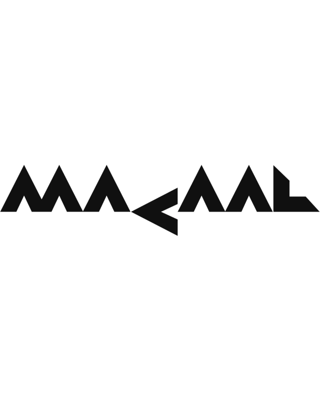
Try it Now!Logo review of MAKAAL
 Logo analysis by AI
Logo type:
Style:
Detected text:
Business industry:
Review requested by Gamixa7550
**If AI can recognize or misinterpret it, so can people.
Structured logo review
Legibility
![]() Consistent geometric shapes create a cohesive aesthetic.
Consistent geometric shapes create a cohesive aesthetic.![]() Uniform stroke width aids in recognizability at larger scales.
Uniform stroke width aids in recognizability at larger scales.
![]() Certain letters are difficult to distinguish due to overly abstract forms (the center 'K' and mirrored 'A's are especially confusing).
Certain letters are difficult to distinguish due to overly abstract forms (the center 'K' and mirrored 'A's are especially confusing).![]() Letter spacing and sharp angles hinder quick readability, especially at a glance.
Letter spacing and sharp angles hinder quick readability, especially at a glance.![]() Symmetrical treatment leads to mirrored elements that can be misinterpreted as shapes rather than letters.
Symmetrical treatment leads to mirrored elements that can be misinterpreted as shapes rather than letters.
Scalability versatility
![]() Bold, solid shapes maintain clarity when resized for signage or large applications.
Bold, solid shapes maintain clarity when resized for signage or large applications.![]() Monochromatic palette ensures effective reproduction across different media.
Monochromatic palette ensures effective reproduction across different media.
![]() Extremely angular geometry and close letter spacing may lose definition at small scales (e.g., app icons, business cards).
Extremely angular geometry and close letter spacing may lose definition at small scales (e.g., app icons, business cards).![]() Abstract construction may cause confusion in small or low-resolution formats.
Abstract construction may cause confusion in small or low-resolution formats.
200x250 px
100×125 px
50×62 px
Balance alignment
![]() Symmetrical design delivers a strong horizontal balance.
Symmetrical design delivers a strong horizontal balance.![]() Even baseline alignment across all letters.
Even baseline alignment across all letters.
![]() Sharp divergence at the center disrupts the natural reading flow.
Sharp divergence at the center disrupts the natural reading flow.![]() Negative space under the central 'K' creates a distracting visual gap.
Negative space under the central 'K' creates a distracting visual gap.

Originality
![]() Distinctive geometric construction offers a unique, memorable look.
Distinctive geometric construction offers a unique, memorable look.![]() Creative abstraction of letterforms makes the logo stand out.
Creative abstraction of letterforms makes the logo stand out.
![]() Sacrifices legibility for uniqueness, which can be problematic for brand recognition.
Sacrifices legibility for uniqueness, which can be problematic for brand recognition.![]() The concept of angular/geometric wordmarks has precedent in the entertainment and tech industries.
The concept of angular/geometric wordmarks has precedent in the entertainment and tech industries.
Aesthetic look
![]() Striking, modern, and edgy visual impact.
Striking, modern, and edgy visual impact.![]() Minimalist approach keeps the brand visually clean and focused.
Minimalist approach keeps the brand visually clean and focused.
![]() Overly obtuse geometry and mirrored elements can be visually fatiguing.
Overly obtuse geometry and mirrored elements can be visually fatiguing.![]() Lack of softer curves or varying weights makes the logo feel rigid and flat.
Lack of softer curves or varying weights makes the logo feel rigid and flat.
Dual meaning and misinterpretations
![]() No inappropriate or unintended symbols detected within the composition.
No inappropriate or unintended symbols detected within the composition.
Color harmony
![]() Simple black-and-white palette ensures high versatility and contrast.
Simple black-and-white palette ensures high versatility and contrast.![]() Monochrome scheme is timeless and widely adaptable.
Monochrome scheme is timeless and widely adaptable.
Black
#000000
White
#FFFFFF