1
Category Fit
Good fitHeritage badge design is on target for professional sports teams.
No mismatch; widely accepted format.
Client-ready for most brand applications; consider minor adjustments for tiny formats.
The most important fixes to handle before polishing the full presentation.
Details could blur or fill in on apparel and digital icons.
Impact: Improves Small-format Reproduction And Embroidery Versatility. · Effort: Medium
Emblem format does not always scale well to tiny sizes.
Impact: Ensures Clear Brand Presence In All Digital Contexts. · Effort: Medium
Current palette is light-biased, may require tweak for dark uses.
Impact: Maximizes Adaptability Across Diverse Applications. · Effort: Low
 Clear sans-serif font is highly readable even at smaller sizes. Good contrast between text and background.
Heraldic style lends some distinction.
 Badge format and ship motif are common among sports crests; does not break new ground.
Palette is clean, limited, and harmonious; maintains brand strength. Color assignments are meaningful and balanced.
PowderBlue
#A9D6F6
White
#FFFFFF
DeepBlue
#2A4368
Gold
#FFD34E
Red
#D8322F
Well-centered, precise spacing between symbol and text. All elements feel balanced within circular lockup.

Compact circular design aids scalability. Distinct outlines hold shape at smaller scales.
Detailed elements in shield (ship, rose) may lose definition at very small sizes.
200x250 px
100×125 px
50×62 px
No inappropriate or unintended visual readings detected.
Wordmark smoothly integrated into badge format.
Mark and wordmark are visually cohesive.
Industry Fit: Stadium-ready emblem style is appropriate for sports and team branding.
Heritage Cues: Incorporates traditional local and historical symbols for authenticity.
Category-appropriate but modestly differentiated.
Fits classic sports badge type, carries club/local cues, but not highly distinctive among similar badge logos.
Heritage badge design is on target for professional sports teams.
No mismatch; widely accepted format.
Some risk of blending in due to common badge layout and familiar motifs.
Similar style/logos exist in the club/sports space.
Visually signals established, tradition-rich team.
Badge suggests club legacy and trust.
Where the logo is ready to use, where it needs adjustment, and where it may break in real applications.
Bold text and compact badge work well.
Highly detailed; consider an alternate monogram or mark.
Some intricate details may not stitch well; simplify if needed.
Small details in crest could blur; offer a simplified version.
Strong contours support large-scale usage.
A practical checklist of the logo versions to prepare before sending the final files to a client or team.
Core identity.
Required for print, apparel, varied backgrounds.
Needed for icons, avatars, and small-scale use.
Userful for letterheads, banners, or name-driven needs.
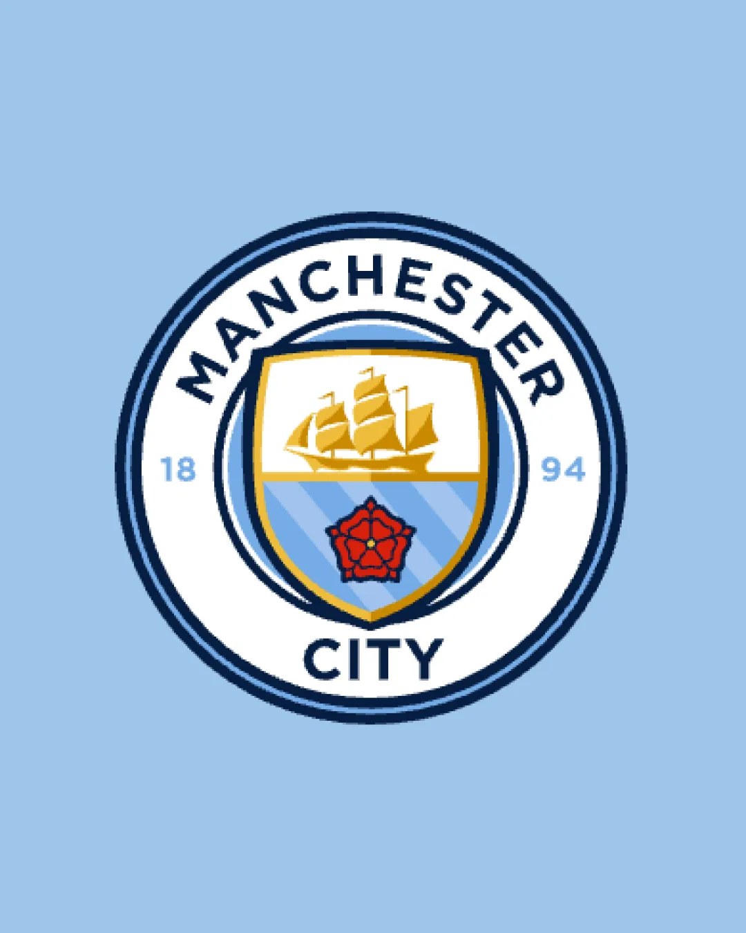
A sharp, circular badge featuring a gold heraldic ship and red rose above blue stripes, encapsulating the team name and founding year for a traditional-yet-modern identity.
Bold sans-serif uppercase 'MANCHESTER CITY' encircles the badge, ensuring visibility and pride.
Central shield holds a stylized ship and rose, rich in local symbolism and club heritage.
A badge-style logo blending heritage and modernity for instant team recognition.
Circular emblem guarantees recognition and unity.
Historical elements (ship, rose) reinforce regional pride and club legacy.
Get a clear logo score, key risks, and priority fix ideas before your client or audience sees it.
More credits needed
Add credits to continue without losing your work.