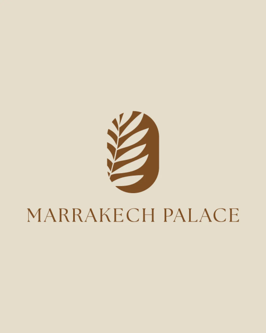
MARRAKECH PALACE logo review
4/5
Logo score
Logo review of

Marrakech Palace

An elegant, professionally balanced mark and wordmark pairing, best suited to upscale real estate or hospitality; minor enhancements could further distinguish it.

Combination Elegant, Minimal, Serif Wordmark With A Nature-inspired Mark Real Estate / Hospitality
5/5
Legibility
3.5/5
Originality
5/5
Misread
5/5
Balance
3.5/5
Scale
Your next steps

What to fix first

Focus on the changes that matter. Keep what makes the logo work.

1

Standalone mark

Test the symbol at small sizes, consider simplifying leaf detail if needed.

Visible issue Medium priority Medium effort
Area to inspectApproximate location

The finer lines of the leaf pattern may lose clarity at very small sizes.

How to check

Render the mark at below 1cm and check if all details remain recognizable.

See the category review
2

Standalone mark

Explore unique framing or distinctive motif integration.

Visible issue Medium priority Medium effort
Area to inspectApproximate location

The leaf in an arch/capsule shape is elegant but not highly distinctive among luxury or hospitality brands.

How to check

Compare with established hospitality/real estate icons to assess risk of visual blending.

See the category review
Detailed review

Logo performance breakdown

4.5/5

Brief & logo match

Based on your brief
Compared with

realestate

Logo expresses both luxury and a sense of place, with only minor risk of being generic in the high-end real estate sector.

  • Luxury Real Estate/hospitality Positioning

    The logo communicates elegance and exclusivity suitable for an upscale Marrakech property.

  • Cultural/nature Connection

    Botanical motif references Moroccan gardens and oasis imagery, aligning with regional and hospitality expectations.

5/5

Legibility

  • Clear serif wordmark with excellent spacing.
3.5/5

Originality

  • Botanical mark in capsule frame is elegant.
  • The leaf in an arch/capsule shape is elegant but not highly distinctive among luxury or hospitality brands.

    Visible issue Standalone mark

    Try: Explore unique framing or distinctive motif integration.

    Check: Compare with established hospitality/real estate icons to assess risk of visual blending.

    Area to inspectApproximate location
5/5

Balance alignment

  • Wordmark and mark are visually balanced with precise vertical alignment.
Uploaded logoAlignment guide overlay

Inspect spacing with the guide. Optical balance may differ from geometric centering.

3.5/5

Scalability

  • Simple mark, but inner leaf details may challenge tiny reproductions.
  • The finer lines of the leaf pattern may lose clarity at very small sizes.

    Visible issue Standalone mark

    Try: Test the symbol at small sizes, consider simplifying leaf detail if needed.

    Check: Render the mark at below 1cm and check if all details remain recognizable.
    Area to inspectApproximate location
Uploaded logo at 200 pixels wide
200 × 250 px
Uploaded logo at 100 pixels wide
100 × 125 px
Uploaded logo at 50 pixels wide
50 × 63 px

Compare the detail at different sizes. Labels show the full image dimensions.

5/5

Misinterpretations

4.5/5

Symbol & text fit

  • Wordmark style matches the organic luxury of the mark.

Black & white

Does the shape still work without color?

These tests are available only for logos uploaded in vector (SVG) format.

Background contrast

Find the surfaces where your logo stays clear.

These tests are available only for logos uploaded in vector (SVG) format.

Blur & silhouette

A 3px blur softens fine details so you can check whether the overall shape stays recognizable. If key gaps close or elements merge, the logo may rely too heavily on detail.

These tests are available only for logos uploaded in vector (SVG) format.

Try your own review

Wondering how your logo performs?

Get a clear logo score, key risks, and priority fix ideas before your client or audience sees it.

Review my logo