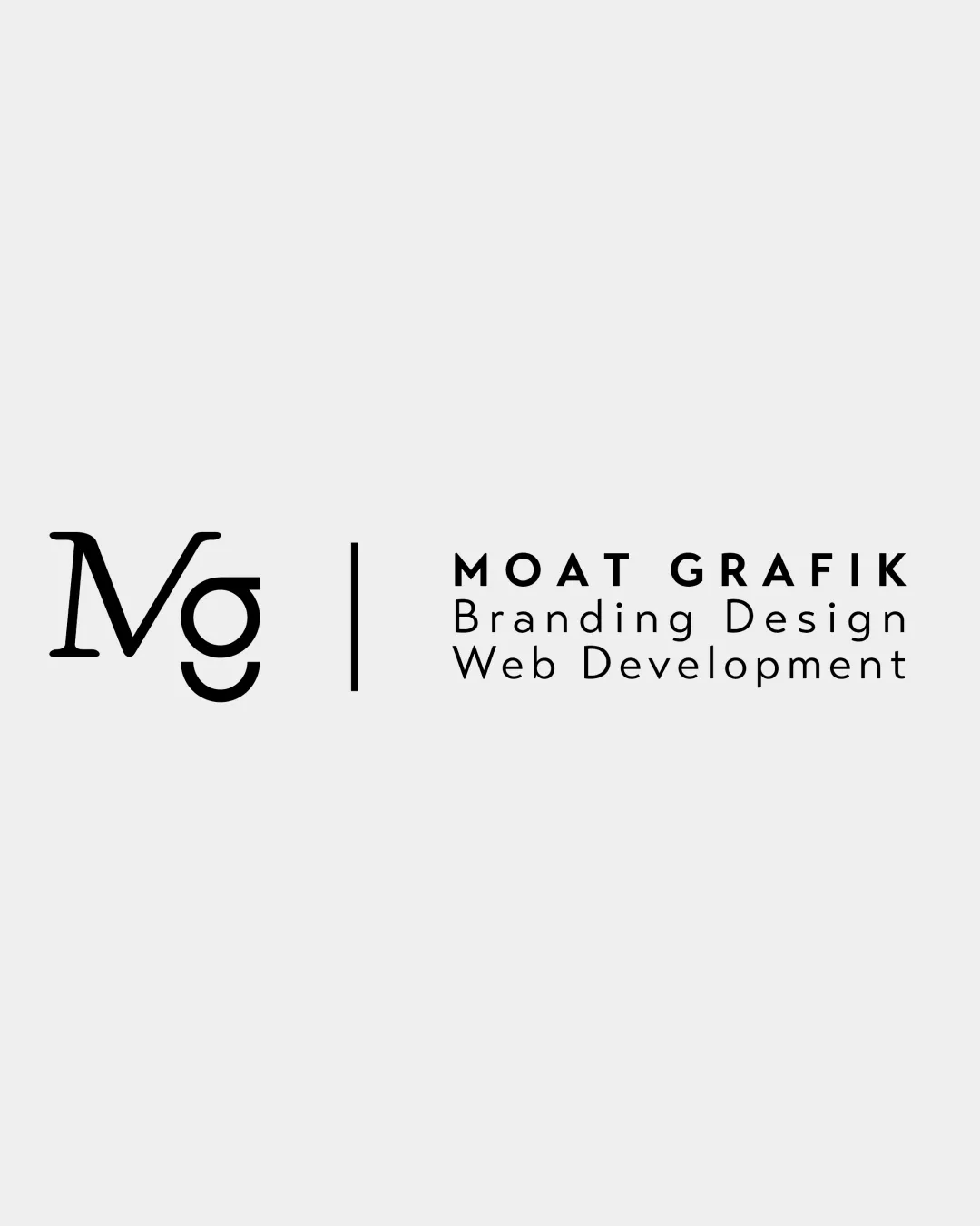
Mg, MOAT GRAFIK, Branding Design, Web Development logo review
4.1 / 5
Logo score
Logo review of

Mg, Moat Grafik, Branding Design, Web Development

Review the detailed scores below to see what is working and what should be refined first.

Combination Mark Modern Minimalist Creative
5/5
Legibility
3/5
Originality
5/5
Misread
4/5
Balance
4/5
Scale
Detailed review

Logo performance breakdown

5/5

Legibility

Checkmark icon All text is clear, crisp, and easy to read.
Checkmark icon Strong contrast between black typography and light background ensures legibility across mediums.
3/5

Originality

Checkmark icon Monogram combines the initials in a visually engaging way.
Checkmark icon Use of a modern serif adds a subtle, unique touch for the monogram.

Warning icon Monogram concept is commonly used and does not introduce an innovative twist.
Warning icon Overall layout is conventional for creative agencies.

5/5

Color harmony

Checkmark icon Monochrome palette is timeless and extremely versatile.
Checkmark icon Black and light gray provide elegance and high adaptability.

Black
#000000

Alabaster
#EEEEEE

4/5

Balance alignment

Checkmark icon Good horizontal alignment between the monogram and wordmark.
Checkmark icon Vertical divider creates a clear separation and visual structure.

Warning icon The weight and style difference between the monogram and the sans-serif text creates slight visual tension.
Warning icon Monogram feels visually heavier than the body text despite being thinner in stroke.

logo 200x250 pixels scalability test alignment grid overlay
4/5

Scalability

Checkmark icon Minimalist design retains clarity in small-scale formats such as business cards and app favicons.
Checkmark icon Would work well in black-and-white applications.

Warning icon Fine lines in the 'Mg' monogram could get lost at very small sizes, especially on textured materials like embroidery.

logo 200x250 pixels scalability test

200x250 px

logo 100x125 pixels scalability test

100×125 px

logo 50x62 pixels scalability test

50×62 px

5/5

Misinterpretations

Checkmark icon No inappropriate or unintended visual interpretations detected.
Checkmark icon Clear, straightforward composition.

3 / 5

Symbol & text fit

Checkmark icon Monogram and wordmark are separated for clarity.

Warning icon Mismatch in font styles (serif for monogram, sans-serif for wordmark) causes slight visual disconnect.
Warning icon Sizes could be more proportionally balanced to tie the units together.

Try your own review

Wondering how your logo performs?

Get a clear logo score, key risks, and priority fix ideas before your client or audience sees it.

Review my logo