Wondering how your logo performs? 🧐
Get professional logo reviews in seconds and catch design issues in time.
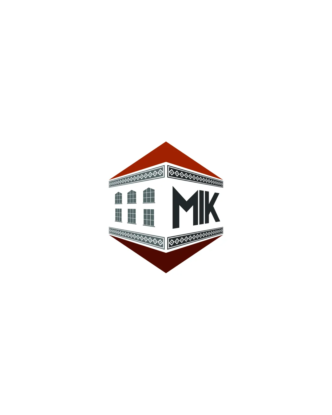
Try it Now!Logo review of MIK
 Logo analysis by AI
Logo type:
Style:
Detected symbol:
Detected text:
Business industry:
Review requested by Leonard
**If AI can recognize or misinterpret it, so can people.
Structured logo review
Legibility
![]() Text 'MIK' is bold, clear, and easy to read.
Text 'MIK' is bold, clear, and easy to read.![]() Good contrast between text and background ensures legibility.
Good contrast between text and background ensures legibility.
![]() The three-dimensional perspective slightly distorts the text, especially the K, which may impact clarity at smaller sizes.
The three-dimensional perspective slightly distorts the text, especially the K, which may impact clarity at smaller sizes.
Scalability versatility
![]() Distinctive shape will be memorable at large sizes such as building signage or posters.
Distinctive shape will be memorable at large sizes such as building signage or posters.
![]() High detail in building illustration and decorative trims will be lost/blur on small scales like business cards or app icons.
High detail in building illustration and decorative trims will be lost/blur on small scales like business cards or app icons.![]() Thin lines may not render cleanly in embroidery or at small print sizes.
Thin lines may not render cleanly in embroidery or at small print sizes.![]() Complex color gradients limit single-color or flat adaptations.
Complex color gradients limit single-color or flat adaptations.
200x250 px
100×125 px
50×62 px
Balance alignment
![]() Overall geometric shape maintains a sense of symmetry.
Overall geometric shape maintains a sense of symmetry.![]() Centered composition gives visual stability.
Centered composition gives visual stability.
![]() Text and building windows are aligned to different planes, reducing cohesive alignment.
Text and building windows are aligned to different planes, reducing cohesive alignment.![]() Perspective creates slight imbalance between symbolic and textual elements.
Perspective creates slight imbalance between symbolic and textual elements.

Originality
![]() Unique isometric perspective integrating architecture and text into a single form.
Unique isometric perspective integrating architecture and text into a single form.![]() Decorative pattern adds additional cultural or local flair.
Decorative pattern adds additional cultural or local flair.
![]() Isometric building form is not commonly used, but melds two familiar tropes (building and text), so some originality is diminished.
Isometric building form is not commonly used, but melds two familiar tropes (building and text), so some originality is diminished.
Logomark wordmark fit
![]() Wordmark is visually integrated into the building for coherence.
Wordmark is visually integrated into the building for coherence.
![]() The perspective difference causes slight discord between the flat wordmark and the 3D building form.
The perspective difference causes slight discord between the flat wordmark and the 3D building form.![]() Variation in weight and orientation between wordmark and building illustration.
Variation in weight and orientation between wordmark and building illustration.
Aesthetic look
![]() Visually striking and memorable shape.
Visually striking and memorable shape.![]() Color palette feels consistent with architectural themes.
Color palette feels consistent with architectural themes.
![]() Logo appears busy due to window details and decorative elements.
Logo appears busy due to window details and decorative elements.![]() Complexity detracts from a modern, minimal aesthetic.
Complexity detracts from a modern, minimal aesthetic.![]() Roof color feels harsh compared to muted body tones.
Roof color feels harsh compared to muted body tones.
Dual meaning and misinterpretations
![]() No inappropriate or unintended visual meanings detected.
No inappropriate or unintended visual meanings detected.
Color harmony
![]() Palette is restrained and avoids unnecessary color clutter.
Palette is restrained and avoids unnecessary color clutter.![]() Strong color contrast highlights logo structure.
Strong color contrast highlights logo structure.
![]() Red roof is a bit strong in comparison to muted blues and grays; integrating one more muted earthly tone could further balance the palette.
Red roof is a bit strong in comparison to muted blues and grays; integrating one more muted earthly tone could further balance the palette.
Red Oxide
#8B1B08
Gunmetal
#272C2C
White
#FFFFFF