Refine the 'By.' wordmark for better legibility, possibly by opening counters or simplifying letterforms.
Font style currently compromises wordmark clarity, especially at small sizes.
Improves quick recognition and accessibility.
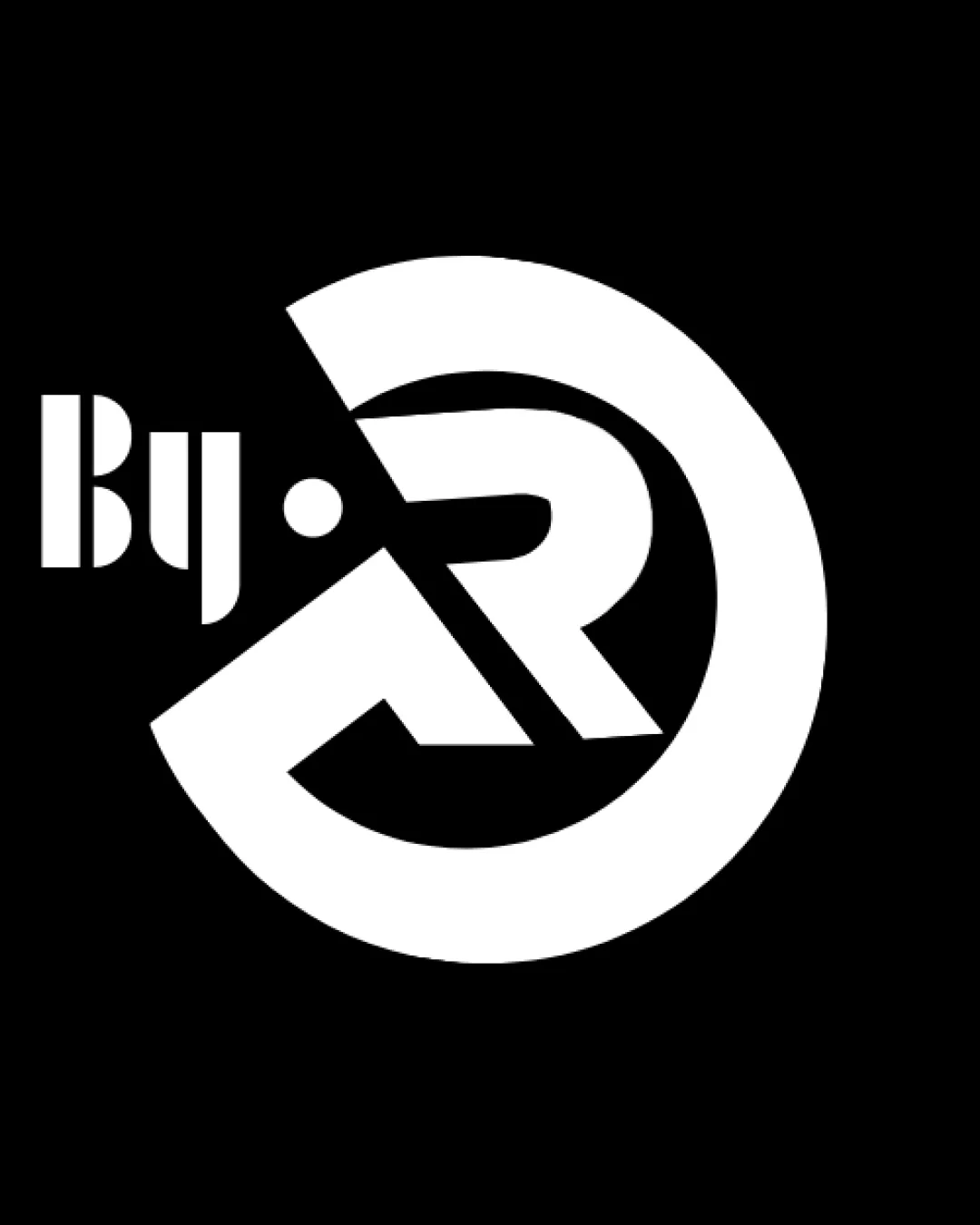
Distinctive geometric identity with strong creative appeal, but needs minor adjustments to ensure universal readability and versatility.
Focus on the changes that matter. Keep what makes the logo work.
Font style currently compromises wordmark clarity, especially at small sizes.
Improves quick recognition and accessibility.
Prevents visual crowding and maintains clarity at reduced sizes.
Supports versatility without diluting the core identity.
Strong fit; modern, bold style conveys creativity and professionalism.

Inspect spacing with the guide. Optical balance may differ from geometric centering.
Get a clear logo score, key risks, and priority fix ideas before your client or audience sees it.
More credits needed
Add credits to continue without losing your work.
Then $7/month. Cancel anytime.
Essential logo review with AI
Estimated progress