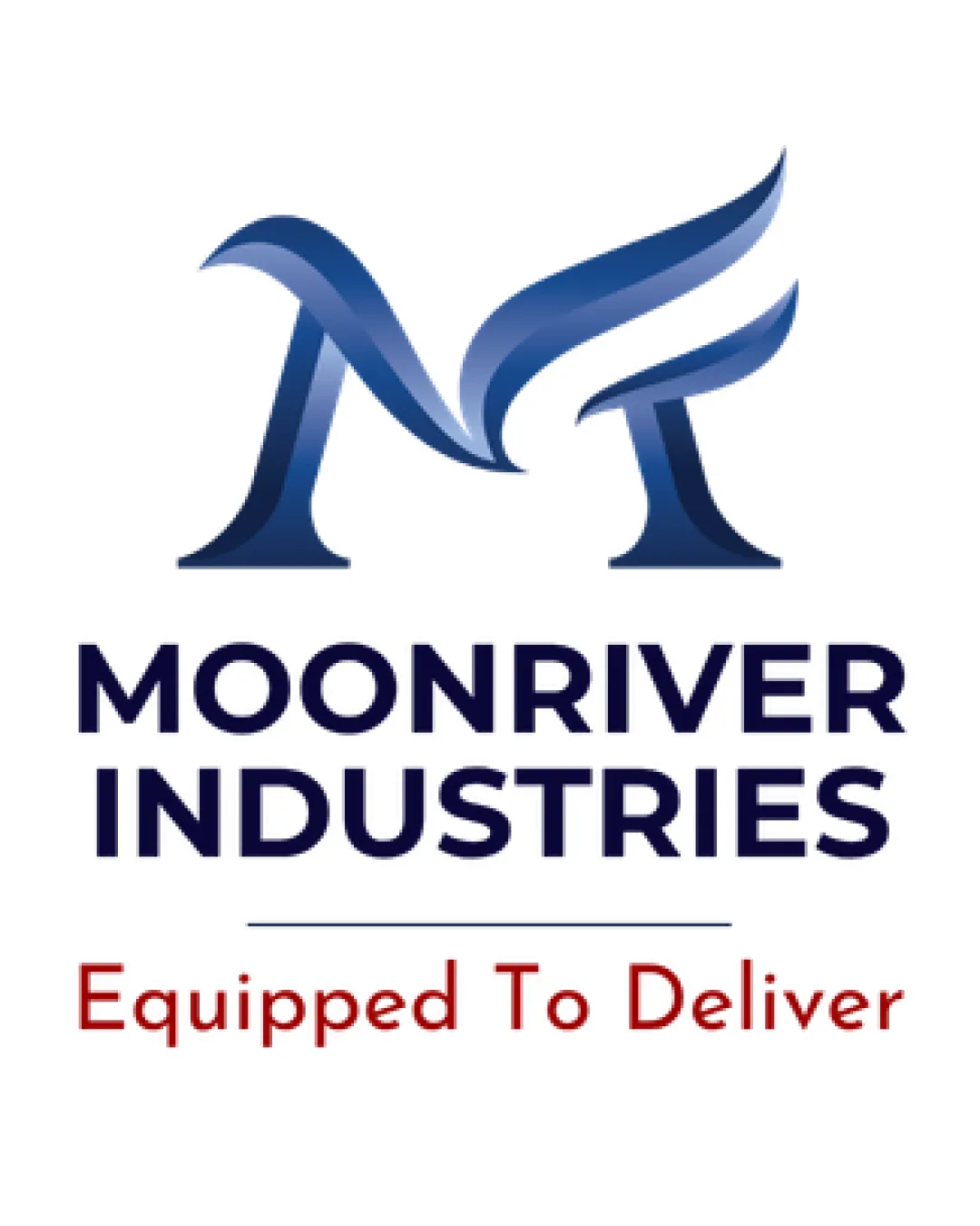
MOONRIVER INDUSTRIES Equipped To Deliver logo review
3.5/5
Logo score
Logo review of

Moonriver Industries Equipped To Deliver

A clear, functional mark with professional presence, but lacks distinctiveness or full brand motif integration for optimal memorability.

Combination Modern, Corporate, Gradient Monogram With Wordmark And Tagline Industrial Supply / Uniforms / Security Equipment
5/5
Legibility
3/5
Originality
5/5
Misread
4/5
Balance
4/5
Scale
Your next steps

What to fix first

Focus on the changes that matter. Keep what makes the logo work.

1

monogram (top band)

Explore unique visual cues or integrate subtle references to security/PPE, or the brand's hexagonal motif, into the monogram to build distinctiveness.

Visible issue High priority Medium effort
Area to inspectApproximate location

The 'M' monogram, though well-executed, is visually generic and resembles common corporate ribbon letter treatments, making it less distinctive within the security/PPE field.

How to check

Compare with competitors and test memorandum recall among target users.

See the category review
2

monogram (top band)

Integrate a subtle hexagon or geometric motif into or around the 'M' to support differentiation and align with the brief.

Optional refinement Medium priority Medium effort
Area to inspectApproximate location

No visible hexagonal motifs are present despite this being in the brief and potentially creating a memorable touchpoint.

How to check

Check for visible geometric cues that do not clutter the mark.

See the category review
Detailed review

Logo performance breakdown

3/5

Brief & logo match

Based on your brief
Compared with

supplier of PPE, Security uniforms, security, equipment. light Hexagon elements, colors are #112449, #0B48A4, #7891C4, #990000, #FFAC2E.

The logo expresses reliability for the category but does not fully capture the hexagonal motif or utilize the complete color brief for true differentiation.

  • Industry/sector Visibility

    The formal, crisp design aligns with expectations for security and PPE suppliers.

  • Hexagon/geometric Motif

    No discernible hexagon or geometric elements are utilized, which is a missed opportunity versus brief.

5/5

Legibility

  • Wordmark and tagline are highly readable.
  • Monogram 'M' is clear and unambiguous.
3/5

Originality

  • Clean, professional execution.
  • The 'M' monogram, though well-executed, is visually generic and resembles common corporate ribbon letter treatments, making it less distinctive within the security/PPE field.

    Visible issue monogram (top band)

    Try: Explore unique visual cues or integrate subtle references to security/PPE, or the brand's hexagonal motif, into the monogram to build distinctiveness.

    Check: Compare with competitors and test memorandum recall among target users.
    Area to inspectApproximate location
  • No visible hexagonal motifs are present despite this being in the brief and potentially creating a memorable touchpoint.

    Optional refinement monogram (top band)

    Try: Integrate a subtle hexagon or geometric motif into or around the 'M' to support differentiation and align with the brief.

    Check: Check for visible geometric cues that do not clutter the mark.

    Area to inspectApproximate location
3/5

Color harmony

  • Primary and accent blues are harmonious.
  • The brand's full palette includes orange and yellow (#FFAC2E), but these are absent from the main mark, which leans heavily into blue and red; missing the opportunity for stronger palette synergy.

    Optional refinement wordmark, monogram, tagline

    Try: Incorporate more of the secondary brand colors (orange/yellow) into the mark or accent details for improved brand palette consistency.

    Check: Test secondary color use for cohesion and legibility.

Navy#112449
Medium Blue#0B48A4
Light Blue#7891C4
Dark Red#990000
Yellow-Orange#FFAC2E

Estimated colors. Use the original design file for exact values.

Create a full color palette using these colors

Create new palette
4/5

Balance alignment

  • Good optical balance between symbol and text.
  • Strong hierarchy between company name and tagline.
Uploaded logoAlignment guide overlay

Inspect spacing with the guide. Optical balance may differ from geometric centering.

4/5

Scalability

  • Simple, bold forms for the 'M' scale well.
  • Typography remains crisp at smaller sizes.
Uploaded logo at 200 pixels wide
200 × 250 px
Uploaded logo at 100 pixels wide
100 × 125 px
Uploaded logo at 50 pixels wide
50 × 63 px

Compare the detail at different sizes. Labels show the full image dimensions.

5/5

Misinterpretations

  • No unintended readings.
4/5

Symbol & text fit

  • The monogram and wordmark create a cohesive visual system.

Black & white

Does the shape still work without color?

These tests are available only for logos uploaded in vector (SVG) format.

Background contrast

Find the surfaces where your logo stays clear.

These tests are available only for logos uploaded in vector (SVG) format.

Blur & silhouette

A 3px blur softens fine details so you can check whether the overall shape stays recognizable. If key gaps close or elements merge, the logo may rely too heavily on detail.

These tests are available only for logos uploaded in vector (SVG) format.

Try your own review

Wondering how your logo performs?

Get a clear logo score, key risks, and priority fix ideas before your client or audience sees it.

Review my logo