 View review
Logo score
Logo review ofMr
Review the detailed scores below to see what is working and what should be refined first.
Legibility
Originality
Misread
Balance
Scale
Detailed review
Logo performance breakdown
Legibility
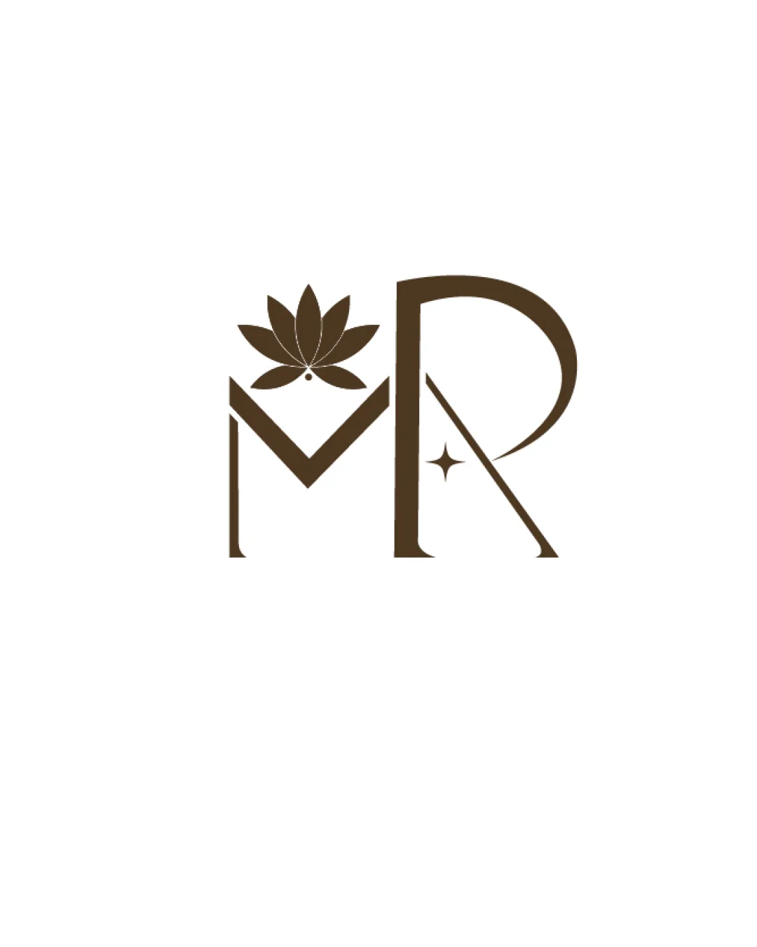
![]() Both M and R are clearly distinguishable and cleanly executed.
Both M and R are clearly distinguishable and cleanly executed.![]() Letterforms are consistent and professional.
Letterforms are consistent and professional.
![]() Decorative elements, especially the flower and star, slightly distract from the overall letter clarity.
Decorative elements, especially the flower and star, slightly distract from the overall letter clarity.
Originality
![]() Incorporation of the lotus flower adds originality and subtly reflects wellness/nature.
Incorporation of the lotus flower adds originality and subtly reflects wellness/nature.![]() The star inside the R adds a unique touch.
The star inside the R adds a unique touch.
![]() Lotus flowers are commonly used in wellness and beauty spaces, which affects overall uniqueness.
Lotus flowers are commonly used in wellness and beauty spaces, which affects overall uniqueness.![]() Letter arrangement is somewhat typical for monogram-based logos.
Letter arrangement is somewhat typical for monogram-based logos.
Color harmony
![]() Single-color palette is cohesive, sophisticated, and supports versatile branding.
Single-color palette is cohesive, sophisticated, and supports versatile branding.![]() Color contrast is excellent for both print and digital.
Color contrast is excellent for both print and digital.
Brown
#5D4327
White
#FFFFFF
Balance alignment
![]() Composition is visually centered and elements feel harmonized.
Composition is visually centered and elements feel harmonized.![]() Lotus is well-aligned with the M’s apex.
Lotus is well-aligned with the M’s apex.
![]() The R’s stem is heavier than the rest, giving a slight rightward weight; the left feels lighter due to negative space above M.
The R’s stem is heavier than the rest, giving a slight rightward weight; the left feels lighter due to negative space above M.![]() The flower adds vertical weight without a balancing counterpart on the R.
The flower adds vertical weight without a balancing counterpart on the R.

Scalability
![]() Clean lines support decent scalability for print and digital applications.
Clean lines support decent scalability for print and digital applications.![]() Works well on a white background and could be used for packaging or print material.
Works well on a white background and could be used for packaging or print material.
![]() Fine details like the lotus petals and the small star risk losing clarity at small sizes (e.g., favicon or embroidery).
Fine details like the lotus petals and the small star risk losing clarity at small sizes (e.g., favicon or embroidery).![]() Thin elements may not reproduce well on small-scale materials or textured surfaces.
Thin elements may not reproduce well on small-scale materials or textured surfaces.
200x250 px
100×125 px
50×62 px
Misinterpretations
![]() No inappropriate or ambiguous visual meanings are detected.
No inappropriate or ambiguous visual meanings are detected.![]() Elements are clearly symbols of nature and elegance.
Elements are clearly symbols of nature and elegance.
Try your own review
Review my logo
Wondering how your logo performs?
Get a clear logo score, key risks, and priority fix ideas before your client or audience sees it.
Keep exploring


