Wondering how your logo performs? 🧐
Get professional logo reviews in seconds and catch design issues in time.
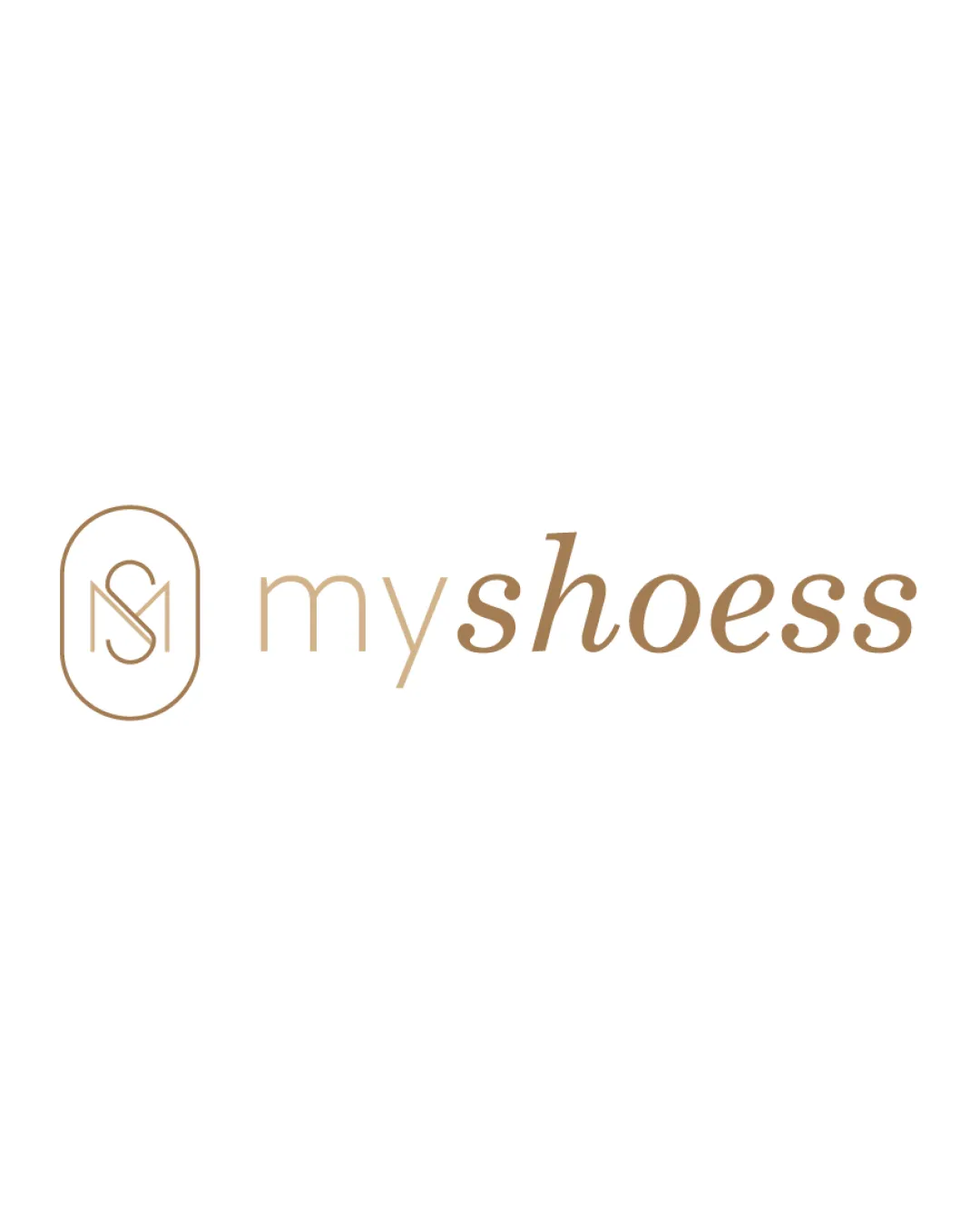
Try it Now!Logo review of myshoess
 Logo analysis by AI
Logo type:
Style:
Detected symbol:
Detected text:
Business industry:
Review requested by Hannafer
**If AI can recognize or misinterpret it, so can people.
Structured logo review
Legibility
![]() Clear sans-serif and serif text contrast
Clear sans-serif and serif text contrast![]() Good color contrast for readability
Good color contrast for readability
![]() Word 'shoess' has an apparent typo with double 's', which looks unintentional and distracts
Word 'shoess' has an apparent typo with double 's', which looks unintentional and distracts![]() Very light line weight could be challenging at smaller sizes
Very light line weight could be challenging at smaller sizes
Scalability versatility
![]() Minimalistic style helps in retaining details at various sizes
Minimalistic style helps in retaining details at various sizes![]() Would work on business cards, packaging, and signage
Would work on business cards, packaging, and signage
![]() Thin lines in the monogram might get lost when the logo is scaled down for smaller applications such as favicons or embroidery
Thin lines in the monogram might get lost when the logo is scaled down for smaller applications such as favicons or embroidery![]() Gradient color may lose impact in single-color or black-and-white applications
Gradient color may lose impact in single-color or black-and-white applications
200x250 px
100×125 px
50×62 px
Balance alignment
![]() Spacing between monogram and wordmark is well considered
Spacing between monogram and wordmark is well considered![]() Monogram and text are horizontally aligned
Monogram and text are horizontally aligned
![]() Letter weights differ (monogram vs. wordmark), causing mild imbalance
Letter weights differ (monogram vs. wordmark), causing mild imbalance

Originality
![]() Modern MS monogram within a soft geometric shape is somewhat unique
Modern MS monogram within a soft geometric shape is somewhat unique![]() Contrast between script and sans-serif is a nice touch
Contrast between script and sans-serif is a nice touch
![]() Monogram style is fairly common in the fashion/shoe industry
Monogram style is fairly common in the fashion/shoe industry![]() No significant use of negative space or creative symbolism
No significant use of negative space or creative symbolism
Logomark wordmark fit
![]() Both elements share a refined, minimalistic look
Both elements share a refined, minimalistic look![]() Visual flow from monogram to text is smooth
Visual flow from monogram to text is smooth
![]() Monogram's roundedness does not fully reflect in the wordmark, resulting in slight stylistic separation
Monogram's roundedness does not fully reflect in the wordmark, resulting in slight stylistic separation
Aesthetic look
![]() Clean and sophisticated feel supports a premium fashion brand
Clean and sophisticated feel supports a premium fashion brand![]() Simple color palette is elegant
Simple color palette is elegant
![]() Thin lines can create a fragile look
Thin lines can create a fragile look![]() Typo in 'shoess' affects professional appearance
Typo in 'shoess' affects professional appearance
Dual meaning and misinterpretations
![]() No inappropriate secondary imagery detected
No inappropriate secondary imagery detected
Color harmony
![]() Single gold-beige tone is harmonious and upscale
Single gold-beige tone is harmonious and upscale![]() No excessive or clashing colors
No excessive or clashing colors
Teak
#B7996E
White
#FFFFFF