Wondering how your logo performs? 🧐
Get professional logo reviews in seconds and catch design issues in time.
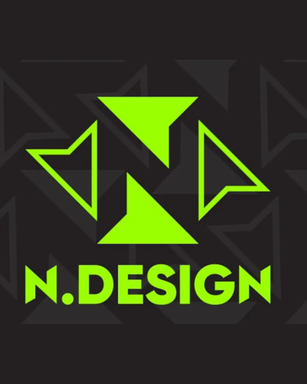
Try it Now!Logo review of N.DESIGN
 Logo analysis by AI
Logo type:
Style:
Detected symbol:
Negative space:
Detected text:
Business industry:
Review requested by Leonard
**If AI can recognize or misinterpret it, so can people.
Structured logo review
Legibility
![]() Text is bold, uppercase, and high contrast against the background.
Text is bold, uppercase, and high contrast against the background.![]() Readability is clear even at smaller sizes.
Readability is clear even at smaller sizes.
![]() Period between N and DESIGN interrupts visual flow slightly, could confuse quick readers.
Period between N and DESIGN interrupts visual flow slightly, could confuse quick readers.
Scalability versatility
![]() Logo has strong, simple geometric shapes that translate well in larger formats like signage or web headers.
Logo has strong, simple geometric shapes that translate well in larger formats like signage or web headers.![]() Color contrast ensures visibility on various backgrounds.
Color contrast ensures visibility on various backgrounds.
![]() Thin, outline portions of the symbol may lose clarity and become indistinct at favicon or embroidery scale.
Thin, outline portions of the symbol may lose clarity and become indistinct at favicon or embroidery scale.![]() Geometric layering might create confusion in single-color or high reduction settings.
Geometric layering might create confusion in single-color or high reduction settings.
200x250 px
100×125 px
50×62 px
Balance alignment
![]() Text and symbol are center-aligned, providing a sense of structure.
Text and symbol are center-aligned, providing a sense of structure.![]() Logo elements are mostly symmetrical and balanced spatially.
Logo elements are mostly symmetrical and balanced spatially.
![]() Top-heavy triangle makes composition feel slightly lopsided; dense upper portion draws attention away from the text.
Top-heavy triangle makes composition feel slightly lopsided; dense upper portion draws attention away from the text.![]() Outlined triangles are visually lighter than filled ones, leading to imbalance in visual weight.
Outlined triangles are visually lighter than filled ones, leading to imbalance in visual weight.

Originality
![]() Creative use of geometric elements to form an abstract letter N.
Creative use of geometric elements to form an abstract letter N.![]() Negative space adds subtlety to the mark.
Negative space adds subtlety to the mark.
![]() While geometric, triangles and arrows are common motifs in the design industry.
While geometric, triangles and arrows are common motifs in the design industry.![]() Does not fully break away from generic tech/design tropes.
Does not fully break away from generic tech/design tropes.
Logomark wordmark fit
![]() Boldness of text matches the aggressiveness of the symbol.
Boldness of text matches the aggressiveness of the symbol.![]() Font and geometric shapes feel consistent with the overall modern style.
Font and geometric shapes feel consistent with the overall modern style.
![]() Slight disconnect in visual weight between the chunky symbol and lighter aspects of the wordmark.
Slight disconnect in visual weight between the chunky symbol and lighter aspects of the wordmark.
Aesthetic look
![]() Striking neon color provides a modern edge.
Striking neon color provides a modern edge.![]() Minimalist use of elements avoids visual clutter.
Minimalist use of elements avoids visual clutter.![]() Sharp lines create a contemporary, energetic feel.
Sharp lines create a contemporary, energetic feel.
![]() Not universally versatile; extreme color choice may limit professional application.
Not universally versatile; extreme color choice may limit professional application.![]() Could appear harsh or overly stylized to conservative audiences.
Could appear harsh or overly stylized to conservative audiences.
Dual meaning and misinterpretations
![]() No inappropriate symbols or unfortunate dual meanings detected.
No inappropriate symbols or unfortunate dual meanings detected.![]() Abstraction is clear enough to avoid confusion.
Abstraction is clear enough to avoid confusion.
Color harmony
![]() Two-color palette is clear and bold.
Two-color palette is clear and bold.![]() High-contrast ensures strong visibility.
High-contrast ensures strong visibility.
![]() Neon green on black could strain eyes over time; may be too intense for print.
Neon green on black could strain eyes over time; may be too intense for print.![]() Color pairing leans heavily into tech/club aesthetics, reducing broad appeal.
Color pairing leans heavily into tech/club aesthetics, reducing broad appeal.
Lime
#B2FF00
Cod Gray
#1D1C1C