Wondering how your logo performs? 🧐
Get professional logo reviews in seconds and catch design issues in time.
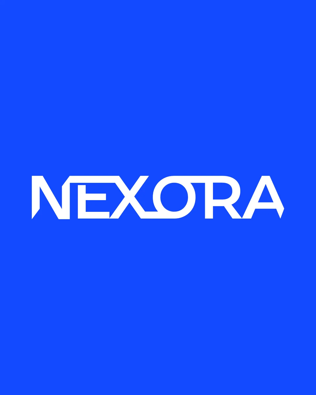
Try it Now!Logo review of NEXORA
 Logo analysis by AI
Logo type:
Style:
Detected text:
Business industry:
Review requested by Marwan_Mohamed
**If AI can recognize or misinterpret it, so can people.
Structured logo review
Legibility
![]() The type is clear and generally easy to read.
The type is clear and generally easy to read.![]() Letterforms are distinct with a futuristic, tech-inspired twist.
Letterforms are distinct with a futuristic, tech-inspired twist.
![]() The altered 'E' and the joined 'O'/'R' may cause brief hesitation or reduce instant recognition for some audiences.
The altered 'E' and the joined 'O'/'R' may cause brief hesitation or reduce instant recognition for some audiences.
Scalability versatility
![]() Bold line weight ensures visibility at small sizes.
Bold line weight ensures visibility at small sizes.![]() Works well for large-scale applications like signage or digital headers.
Works well for large-scale applications like signage or digital headers.
![]() Intricate cuts and unique letter treatments might lose clarity at micro sizes, such as favicons or embroidery on apparel.
Intricate cuts and unique letter treatments might lose clarity at micro sizes, such as favicons or embroidery on apparel.
200x250 px
100×125 px
50×62 px
Balance alignment
![]() Consistent baseline and x-height maintain a harmonious wordmark.
Consistent baseline and x-height maintain a harmonious wordmark.![]() Letter spacing is evenly managed for optimal visual flow.
Letter spacing is evenly managed for optimal visual flow.

Originality
![]() Geometric modifications in the wordmark create a distinct, tech-forward identity.
Geometric modifications in the wordmark create a distinct, tech-forward identity.![]() Customizations on 'E', 'O', and 'R' add character.
Customizations on 'E', 'O', and 'R' add character.
![]() Base style is reminiscent of other futuristic/tech logos, limiting absolute uniqueness.
Base style is reminiscent of other futuristic/tech logos, limiting absolute uniqueness.
Aesthetic look
![]() Clean and minimal aesthetic that feels modern and energetic.
Clean and minimal aesthetic that feels modern and energetic.![]() Color choice is vibrant and technology-appropriate.
Color choice is vibrant and technology-appropriate.
Dual meaning and misinterpretations
![]() No inappropriate symbols or suggestive shapes observed.
No inappropriate symbols or suggestive shapes observed.![]() Overall composition stays safe and professional.
Overall composition stays safe and professional.
Color harmony
![]() Simple, high-contrast color scheme provides maximum impact.
Simple, high-contrast color scheme provides maximum impact.![]() Blue and white combination is visually appealing and readable.
Blue and white combination is visually appealing and readable.
Blue
#1762FF
White
#FFFFFF


