 View review
Logo score
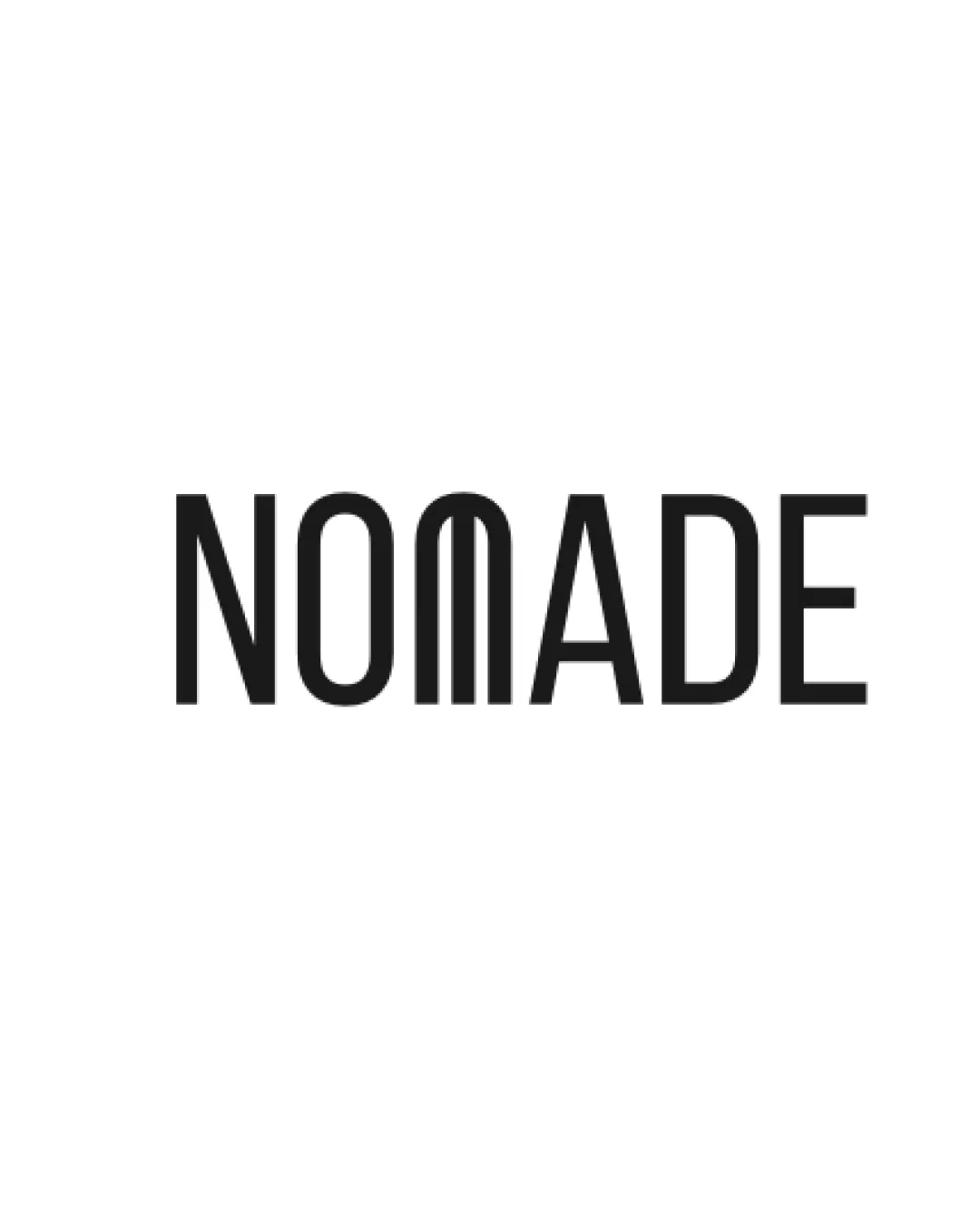
Logo review ofNomade
Review the detailed scores below to see what is working and what should be refined first.
Legibility
Originality
Misread
Balance
Scale
Detailed review
Logo performance breakdown
Legibility
![]() Most letters are clearly legible and evenly spaced.
Most letters are clearly legible and evenly spaced.![]() Clean sans-serif style enhances general readability.
Clean sans-serif style enhances general readability.
![]() The 'M' is creatively converted from straight vertical lines, making it look similar to the adjacent 'N' and 'A'—potentially confusing at a glance.
The 'M' is creatively converted from straight vertical lines, making it look similar to the adjacent 'N' and 'A'—potentially confusing at a glance.![]() Unconventional 'M' construction can cause misreading or recognition issues, especially at small sizes or quick view.
Unconventional 'M' construction can cause misreading or recognition issues, especially at small sizes or quick view.
Originality
![]() Custom modification of the 'M' provides a memorable and distinctive look.
Custom modification of the 'M' provides a memorable and distinctive look.![]() Avoids generic fonts by employing bespoke typography.
Avoids generic fonts by employing bespoke typography.
![]() Other than the 'M', the rest of the wordmark feels common; only one letter carries the identity.
Other than the 'M', the rest of the wordmark feels common; only one letter carries the identity.
Color harmony
![]() Black text on white background offers excellent contrast and high flexibility.
Black text on white background offers excellent contrast and high flexibility.![]() Monochromatic scheme ensures easy integration across brand collateral.
Monochromatic scheme ensures easy integration across brand collateral.
Black
#000000
White
#FFFFFF
Balance alignment
![]() The typographic elements align well on a baseline.
The typographic elements align well on a baseline.![]() Consistent stroke weight across characters maintains visual harmony.
Consistent stroke weight across characters maintains visual harmony.
![]() Slight imbalance introduced by the unique 'M', which visually narrows the mid-section of the wordmark and slightly disrupts natural letter flow.
Slight imbalance introduced by the unique 'M', which visually narrows the mid-section of the wordmark and slightly disrupts natural letter flow.

Scalability
![]() Simple, bold letterforms ensure visibility and maintain integrity when scaled.
Simple, bold letterforms ensure visibility and maintain integrity when scaled.![]() Will reproduce well on most products, packaging, signage, and digital screen applications.
Will reproduce well on most products, packaging, signage, and digital screen applications.
![]() The altered 'M' may become less distinguishable on smaller applications such as embroidery or favicons.
The altered 'M' may become less distinguishable on smaller applications such as embroidery or favicons.
200x250 px
100×125 px
50×62 px
Misinterpretations
![]() No inappropriate or accidental imagery detected in the custom letter design.
No inappropriate or accidental imagery detected in the custom letter design.![]() Abstracted 'M' does not resemble any negative or controversial shapes.
Abstracted 'M' does not resemble any negative or controversial shapes.
Try your own review
Review my logo
Wondering how your logo performs?
Get a clear logo score, key risks, and priority fix ideas before your client or audience sees it.
Keep exploring


