 View review
Logo score
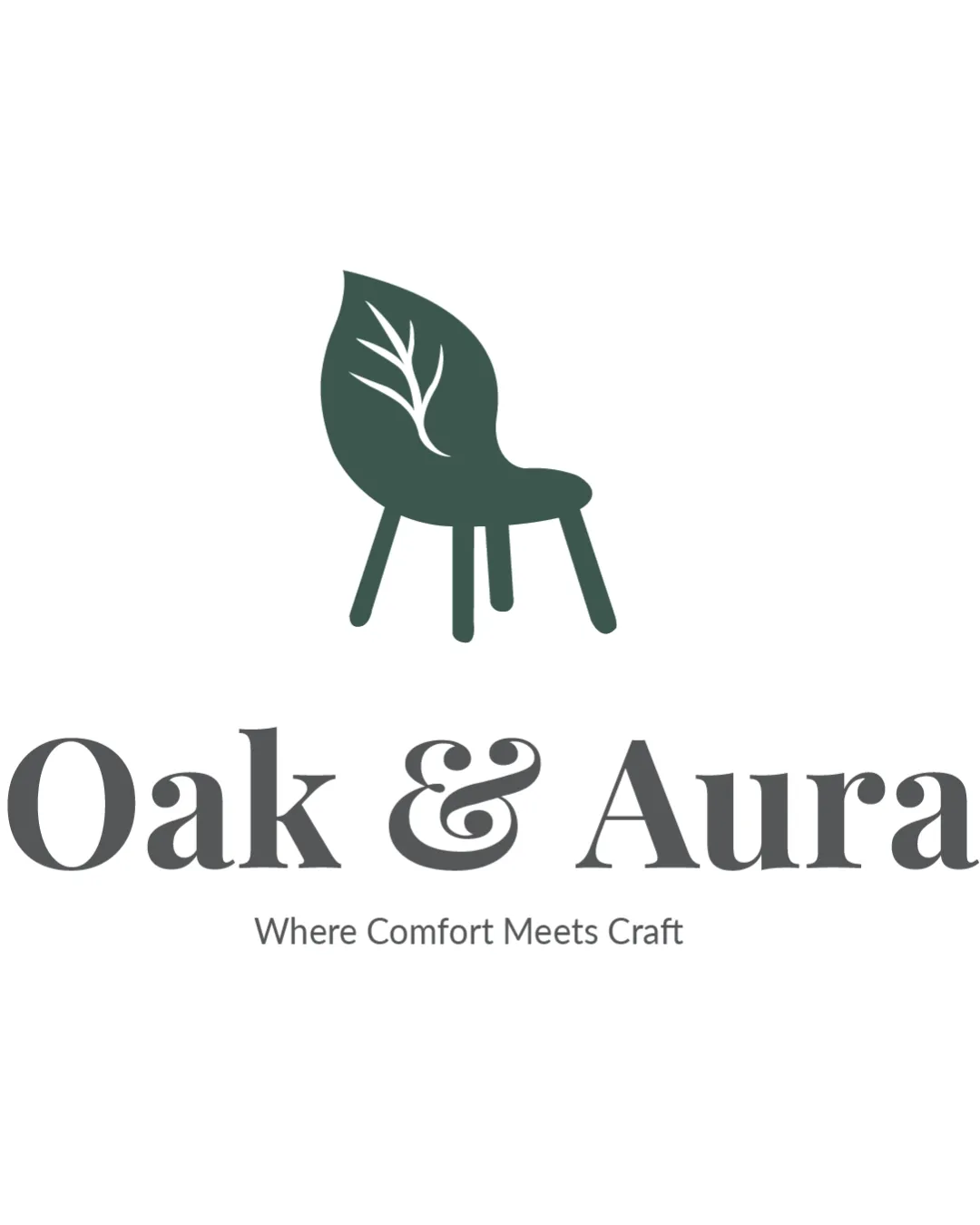
Logo review ofOak & Aura, Where Comfort Meets Craft
Review the detailed scores below to see what is working and what should be refined first.
Legibility
Originality
Misread
Balance
Scale
Detailed review
Logo performance breakdown
Legibility
![]() Primary name is very readable due to ample spacing and clear serif font.
Primary name is very readable due to ample spacing and clear serif font.![]() Tagline is legible at larger sizes.
Tagline is legible at larger sizes.
![]() Tagline may become hard to read at small sizes due to lighter weight and smaller scale.
Tagline may become hard to read at small sizes due to lighter weight and smaller scale.
Originality
![]() Integrates chair and leaf/branch concept in a creative way, reflecting both comfort and nature.
Integrates chair and leaf/branch concept in a creative way, reflecting both comfort and nature.![]() Unique combination relevant to the brand.
Unique combination relevant to the brand.
![]() The chair-leaf concept, while creative, is not entirely novel in eco-furniture branding.
The chair-leaf concept, while creative, is not entirely novel in eco-furniture branding.
Color harmony
![]() Muted palette is sophisticated and calming.
Muted palette is sophisticated and calming.![]() High contrast ensures good visibility across mediums.
High contrast ensures good visibility across mediums.![]() Excellent color consistency for both print and digital.
Excellent color consistency for both print and digital.
Deep Green
#43534C
Dark Gray
#5A5A5A
White
#FFFFFF
Balance alignment
![]() Logo is well-balanced with a harmonious relationship between logomark and wordmark.
Logo is well-balanced with a harmonious relationship between logomark and wordmark.![]() Vertical and horizontal alignment is precise.
Vertical and horizontal alignment is precise.

Scalability
![]() Simple, bold logomark ensures clarity at small and large sizes.
Simple, bold logomark ensures clarity at small and large sizes.![]() Would work well on signage, packaging, and digital applications.
Would work well on signage, packaging, and digital applications.
![]() Tagline may be lost in smaller applications like social media profile images or business cards.
Tagline may be lost in smaller applications like social media profile images or business cards.![]() Leaf branch detail could become indistinct if drastically reduced in size.
Leaf branch detail could become indistinct if drastically reduced in size.
200x250 px
100×125 px
50×62 px
Misinterpretations
![]() Dual symbolism (natural and crafted/comfort) is clear and on-brand.
Dual symbolism (natural and crafted/comfort) is clear and on-brand.![]() No inappropriate or negative interpretations.
No inappropriate or negative interpretations.
Symbol & text fit
![]() The organic logomark style complements the elegant serif typeface.
The organic logomark style complements the elegant serif typeface.
![]() Consistent mood and aesthetic are shared between elements.
Consistent mood and aesthetic are shared between elements.
Try your own review
Review my logo
Wondering how your logo performs?
Get a clear logo score, key risks, and priority fix ideas before your client or audience sees it.
Keep exploring


