Wondering how your logo performs? 🧐
Get professional logo reviews in seconds and catch design issues in time.
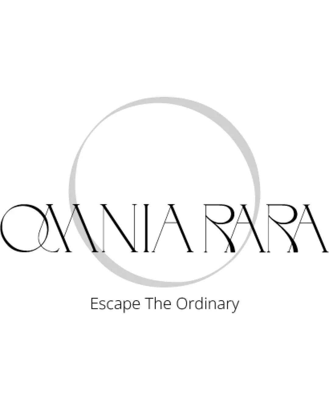
Try it Now!Logo review of OMNIA RARA, Escape The Ordinary
 Logo analysis by AI
Logo type:
Style:
Detected symbol:
Negative space:
Detected text:
Business industry:
Review requested by Ferrettimarmi
**If AI can recognize or misinterpret it, so can people.
Structured logo review
Legibility
Main brand name is prominent and draws attention.
Tagline text is simple and clear.
The ultra-thin, high-contrast stroke in 'OMNIA RARA' reduces readability, especially at small sizes.
Interlocking characters (notably Q and A, R and A) create visual confusion.
Scalability versatility
Minimal use of color ensures some clarity on print and digital mediums.
Fine details and thin lines will be lost at small sizes (business cards, embroidery, app icons).
The overlapping circle and text detail do not scale well, risking visual clutter.
Would lose legibility on product labels or when used in single-color formats.

200x250 px

100×125 px

50×62 px
Balance alignment
Central alignment of elements provides an initial sense of balance.
Overall composition feels elegant.
Overlapping of the circle and text disrupts harmony.
Letterform inconsistencies and overlaps impact visual steadiness.


Originality
Creative, bespoke typographic approach.
Unique combination of circle and thin, stylized letterforms.
Overlapping and experimental letter shapes are trending in luxury/fashion sectors and not entirely unique.
No negative space symbols or double meaning detected.
Logomark wordmark fit
Attempt at visual integration between the circle and letterforms.
The circle feels only partially related to the wordmark, lacking cohesion.
Opacity and weight contrast between mark and type further separate the two elements.
Aesthetic look
Modern and elegant appearance aligns well with upscale/luxury branding.
Sparse color palette conveys sophistication.
Overlapping and very thin elements can appear visually fragile or inconsistent.
Dual meaning and misinterpretations
No inappropriate or unintended visual connotations detected.
Color harmony
Limited black and gray palette is harmonious and versatile.
Clean contrast between text and background.
Black
#000000
Light Gray
#CBCBCB
White
#FFFFFF

