Wondering how your logo performs? 🧐
Get professional logo reviews in seconds and catch design issues in time.
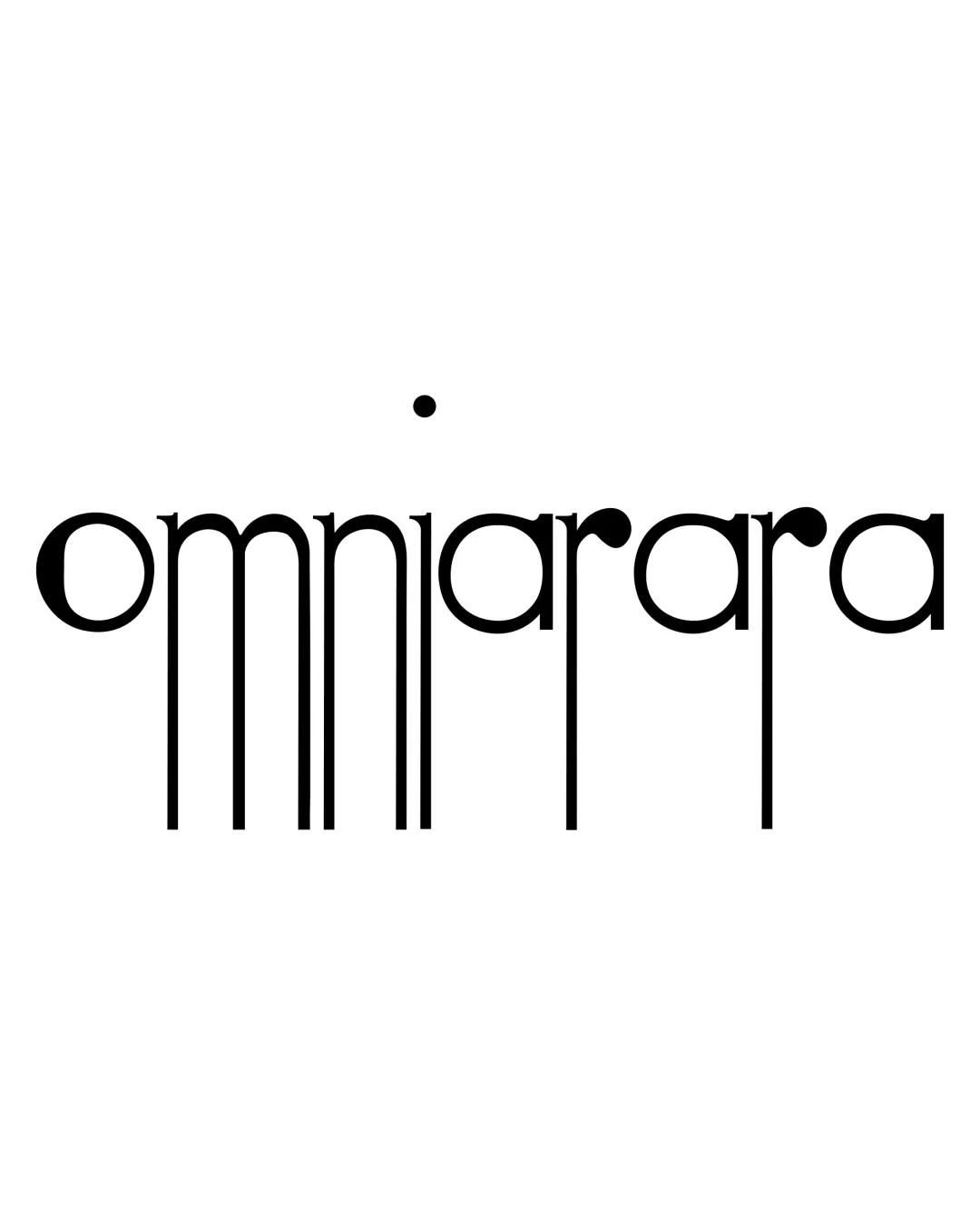
Try it Now!Logo review of omniarara
 Logo analysis by AI
Logo type:
Style:
Detected symbol:
Detected text:
Business industry:
Review requested by Ferrettimarmi
**If AI can recognize or misinterpret it, so can people.
Structured logo review
Legibility
![]() Letterforms are generally consistent and geometric.
Letterforms are generally consistent and geometric.![]() The wordmark is readable at larger sizes with concentration.
The wordmark is readable at larger sizes with concentration.
![]() Excessively long vertical stems disrupt reading flow.
Excessively long vertical stems disrupt reading flow.![]() The dot above the word creates ambiguity and potential for distraction.
The dot above the word creates ambiguity and potential for distraction.![]() At smaller scales, vertical stems may merge, severely impacting legibility.
At smaller scales, vertical stems may merge, severely impacting legibility.
Scalability versatility
![]() Simplicity in color makes adaptation easy for monochrome applications.
Simplicity in color makes adaptation easy for monochrome applications.![]() Would work on signage due to high contrast.
Would work on signage due to high contrast.
![]() The extended vertical lines become problematic at small sizes, making the wordmark illegible.
The extended vertical lines become problematic at small sizes, making the wordmark illegible.![]() Overly tall design may create practical issues for favicon, embroidery, and compact applications.
Overly tall design may create practical issues for favicon, embroidery, and compact applications.![]() Does not adapt well to square or horizontal layouts due to height.
Does not adapt well to square or horizontal layouts due to height.
200x250 px
100×125 px
50×62 px
Balance alignment
![]() Horizontal rhythm of rounded forms is consistent.
Horizontal rhythm of rounded forms is consistent.
![]() The vertical lines create too much visual tension and imbalance.
The vertical lines create too much visual tension and imbalance.![]() The floating dot is disconnected from the rest of the design, hurting compositional harmony.
The floating dot is disconnected from the rest of the design, hurting compositional harmony.![]() Weight distribution is overly bottom heavy from the stems.
Weight distribution is overly bottom heavy from the stems.

Originality
![]() Creative and experimental use of vertical stems for a unique visual presence.
Creative and experimental use of vertical stems for a unique visual presence.![]() Floating dot adds an abstract, intriguing element.
Floating dot adds an abstract, intriguing element.
![]() Letter structure could be more imaginative beyond merely extending stems.
Letter structure could be more imaginative beyond merely extending stems.![]() May border on style-over-substance—innovation reduces practical function.
May border on style-over-substance—innovation reduces practical function.
Aesthetic look
![]() Typeface is modern and visually interesting.
Typeface is modern and visually interesting.![]() Minimal black-and-white palette is clean.
Minimal black-and-white palette is clean.
![]() Overly experimental proportions create awkwardness and can polarize viewers.
Overly experimental proportions create awkwardness and can polarize viewers.![]() Overall look is more decorative than functional—appeals to niche tastes.
Overall look is more decorative than functional—appeals to niche tastes.
Dual meaning and misinterpretations
![]() Does not overtly resemble inappropriate or violent imagery.
Does not overtly resemble inappropriate or violent imagery.
![]() Excessive stems may vaguely evoke barcode or dripping effects, which may or may not suit the intended brand personality.
Excessive stems may vaguely evoke barcode or dripping effects, which may or may not suit the intended brand personality.
Color harmony
![]() Limited to black and white, ensuring strong contrast and maximum adaptability.
Limited to black and white, ensuring strong contrast and maximum adaptability.![]() Color usage is simple and harmonious.
Color usage is simple and harmonious.
Black
#000000
White
#FFFFFF


