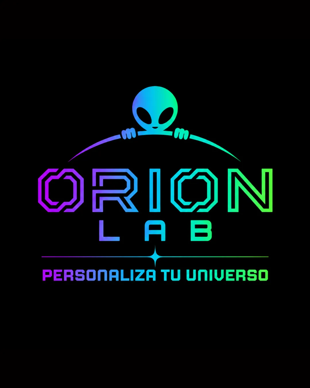
ORION LAB PERSONALIZA TU UNIVERSO logo review
4.0 / 5
Logo score
Logo review of

Orion Lab Personaliza Tu Universo

Distinctive, contemporary logo with strong appeal for tech and customization. Effectively balances originality and functionality, suitable for brand deployment.

Combination Mark Futuristic Neon Gradient Custom Products
4/5
Legibility
4/5
Originality
4.5/5
Misread
4/5
Balance
3.5/5
Scale
Action plan

What to fix first

The most important fixes to handle before polishing the full presentation.

1

Simplify gradients and test a single-color option for smaller usage.

Medium priority

Ensures legibility and impact at all sizes and on varied backgrounds.

Impact: Improves Versatility Across Print And Digital Applications. · Effort: Medium

2

Slightly clarify 'ORION' letter shapes for instant recognition.

Low priority

Addresses minor legibility reduction from decorative forms.

Impact: Enhances Initial Readability Without Losing Unique Style. · Effort: Low

Detailed review

Logo performance breakdown

4/5

Legibility

Checkmark icon Primary wordmark 'ORION LAB' is readable with custom, futuristic letterforms.
Checkmark icon Tagline is clear and contrasts well.

Warning icon Decorative type slightly reduces instant legibility for the word 'ORION'.

4/5

Originality

Checkmark icon Alien mascot is a memorable, ownable touch for the brand context.
Checkmark icon Custom typography sets it apart from generics.

Warning icon Alien motif is somewhat common in tech and customization niches.

4/5

Color harmony

Checkmark icon Gradient transitions smoothly and fits futuristic theme; strong contrast on black.

Warning icon Color vibrancy might not reproduce well in all print processes.

Cyan
#46c9f5

Green
#36f565

Purple
#bb36f5

Your palette is close. Refine the color roles and combinations before updating the logo.

Build brand colors
4/5

Balance alignment

Checkmark icon Central alignment is stable; arc and mascot unify the top composition.
Checkmark icon Good spacing between logo elements.

Warning icon Alien hands' position creates slight visual tension with arc thickness.

logo 200x250 pixels scalability test alignment grid overlay
3.5/5

Scalability

Checkmark icon Bold lines and high contrast work at moderate sizes.

Warning icon Gradient effect and fine details in the alien and arc may be less effective at very small scales.

logo 200x250 pixels scalability test

200x250 px

logo 100x125 pixels scalability test

100×125 px

logo 50x62 pixels scalability test

50×62 px

4.5/5

Misinterpretations

Checkmark icon No plausible negative or off-brand interpretations.

4 / 5

Logo structure & brief match

Checkmark icon Alien mark integrates cohesively with arc above wordmark; feels unified.

Checkmark icon Style: Highly aligned with futuristic and technological aesthetics.
Checkmark icon Industry: Custom mascot and sci-fi cues directly target custom product/tech-savvy audience.

Try your own review

Wondering how your logo performs?

Get a clear logo score, key risks, and priority fix ideas before your client or audience sees it.

Review my logo