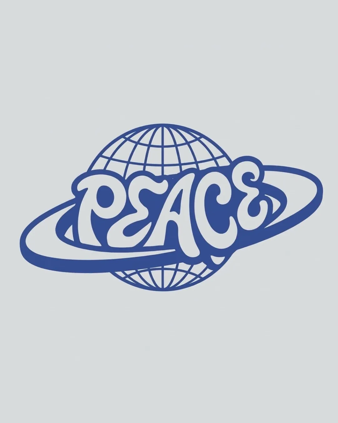
PEACE logo review
4/5
Logo score
Logo review of

Peace

A strong, memorable logo ideal for apparel, with only minor tweaks needed for maximum versatility.

Combination Retro Illustrative Apparel
4/5
Legibility
4/5
Originality
5/5
Misread
4/5
Balance
3/5
Scale
Your next steps

What to fix first

Focus on the changes that matter. Keep what makes the logo work.

1

detailed globe lines

Check line thickness and consider a simplified globe for tiny applications.

Worth testing Medium priority Medium effort

The globe's fine latitude/longitude lines may blur or lose clarity at small scales or in low-resolution print.

How to check

Print and digital tests at reduced scales.

See the category review
2

overall wordmark-globe composition

Slightly increase negative space between the orbit and wordmark for extra clarity.

Optional refinement Medium priority Low effort

The orbit ring overlaps and slightly crowds the lower parts of some letterforms, which could hinder crispness in very small sizes or busy backgrounds.

How to check

Test on small placements and different backgrounds.

See the category review
Detailed review

Logo performance breakdown

5/5

Brief & logo match

Based on your brief
Compared with

hoodies

The playful, globally-themed logo is very well suited for hoodie branding and appeals to a broad audience.

  • Global/positive Message

    The globe, orbit, and the word 'PEACE' convey a strong, inclusive message well-suited to apparel's aspirational tone.

  • Distinctiveness For Hoodies

    The retro illustrative style stands out against mainstream minimal/bold hoodie graphics, appealing to a youthful or idealistic audience.

4/5

Legibility

  • The word 'PEACE' is highly readable and attractively styled.
4/5

Originality

  • Distinctive hand-drawn wordmark with a playful, retro-globe motif.
4/5

Balance alignment

  • Orbit and globe balance the dynamic wordmark.
  • Smooth, cohesive integration.
  • The orbit ring overlaps and slightly crowds the lower parts of some letterforms, which could hinder crispness in very small sizes or busy backgrounds.

    Optional refinement overall wordmark-globe composition

    Try: Slightly increase negative space between the orbit and wordmark for extra clarity.

    Check: Test on small placements and different backgrounds.

Uploaded logoAlignment guide overlay

Inspect spacing with the guide. Optical balance may differ from geometric centering.

3/5

Scalability

  • Strong central silhouette for apparel.
  • Wordmark remains distinct at modest reduction.
  • The globe's fine latitude/longitude lines may blur or lose clarity at small scales or in low-resolution print.

    Worth testing detailed globe lines

    Try: Check line thickness and consider a simplified globe for tiny applications.

    Check: Print and digital tests at reduced scales.

Uploaded logo at 200 pixels wide
200 × 250 px
Uploaded logo at 100 pixels wide
100 × 125 px
Uploaded logo at 50 pixels wide
50 × 63 px

Compare the detail at different sizes. Labels show the full image dimensions.

5/5

Misinterpretations

  • No inappropriate or confusing alternate readings.
4/5

Symbol & text fit

  • The globe-and-orbit effectively support the 'PEACE' concept.

Black & white

Does the shape still work without color?

These tests are available only for logos uploaded in vector (SVG) format.

Background contrast

Find the surfaces where your logo stays clear.

These tests are available only for logos uploaded in vector (SVG) format.

Blur & silhouette

A 3px blur softens fine details so you can check whether the overall shape stays recognizable. If key gaps close or elements merge, the logo may rely too heavily on detail.

These tests are available only for logos uploaded in vector (SVG) format.

Try your own review

Wondering how your logo performs?

Get a clear logo score, key risks, and priority fix ideas before your client or audience sees it.

Review my logo