PHAOS logo review
3.4/5
Logo score Combination mark category Possible misinterpretation

PHAOS

cristina-sampaol Essential logo review

Visually distinctive and fits premium, authentic positioning but readability and mark clarity must be addressed before further refinement or presentation.

Symbols recognized:
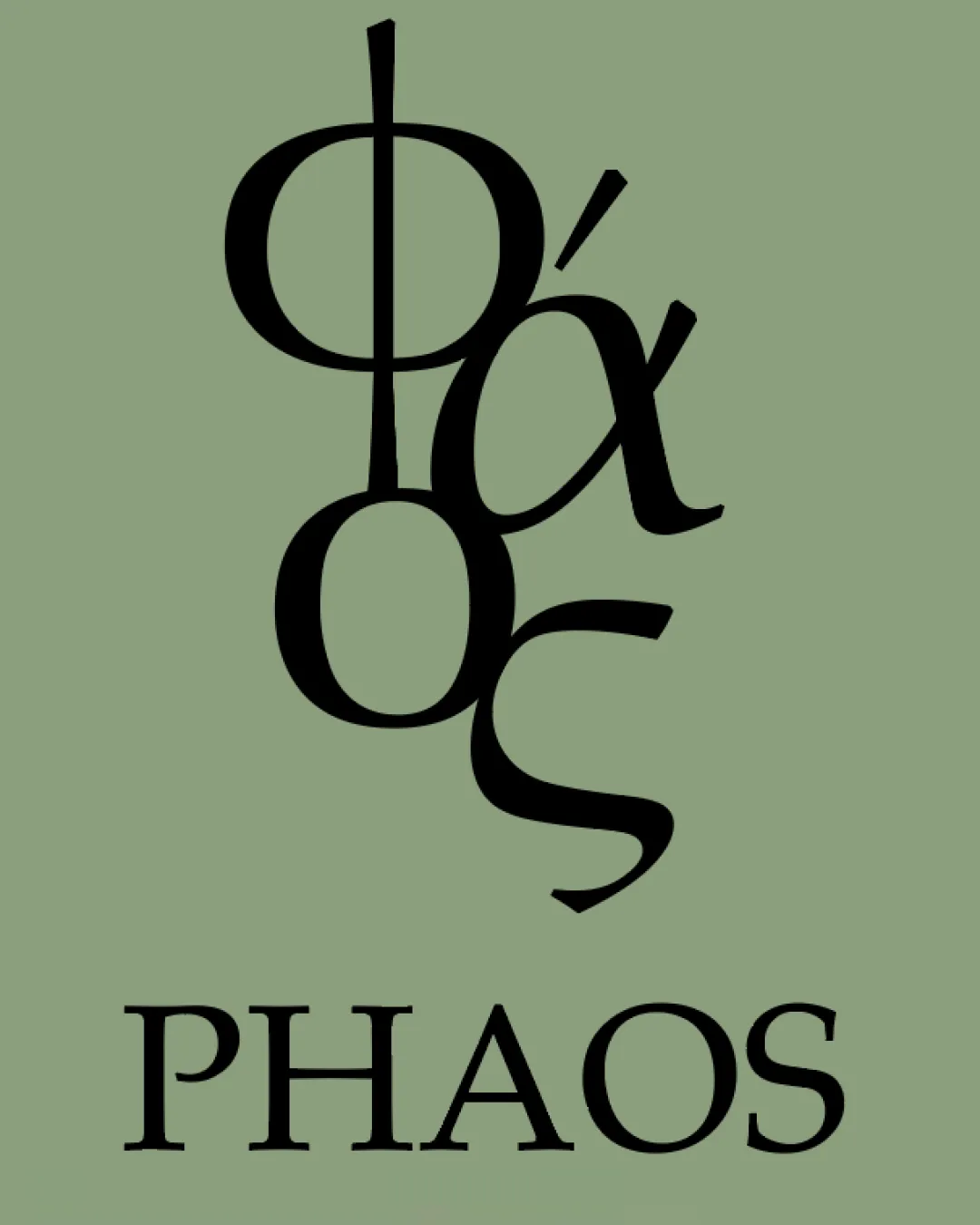
stacked Greek characters resembling Phi, Alpha, Omicron, Sigma
Legible text:
PHAOS
Combination Mark Classic Serif Letterform Food & Beverage
2/5
Legibility
4/5
Originality
3/5
Balance
3/5
Scale
Your next steps

What to fix first

Focus on the changes that matter. Keep what makes the logo work.

1

Check the possible misinterpretation

Density and overlap could cause abstract readings, but nothing overtly negative
2

Redesign the stacked Greek lettermark to improve readability and reduce visual congestion without losing the classic, heritage impression.

High priority High effort

Current Greek letter overlay is nearly illegible and risks failing as a recognizable brand icon.

Significantly increases brand recognition and prevents confusion in luxury F&B market.

3

Slightly increase stroke weight or spacing in the mark to improve clarity at smaller sizes.

Medium priority Medium effort

Thinness and close overlaps may break down at small scale.

Improves scalability and practical usage, particularly for packaging and digital use.

Detailed review

Logo performance breakdown

Not scored

Brief & logo match

Classic serif, restrained palette, and use of Greek heritage cues suggest premium, health-oriented positioning and authenticity. However, strong readability issues in the mark could challenge shelf presence.

2/5

Legibility

  • 'PHAOS' in Latin letters is readable
  • Stacked Greek letters are difficult to read and may confuse viewers
  • Possible misreading of the word or brand name
4/5

Originality

  • Distinctive concept using Greek letters referencing heritage
  • Stacked-letter technique is visually complex and less unique in luxury/olive oil categories
5/5

Color harmony

  • Neutral green and black palette fits premium, natural positioning
Sage Green#889876
Black#191919

Estimated colors. Use the original design file for exact values.

Create a full color palette using these colors

Create new palette

3/5

Balance alignment

  • Wordmark is centered below the mark
  • Stacked logomark appears cramped and visually heavy at the top, creating imbalance
Uploaded logoAlignment guide overlay

Inspect spacing with the guide. Optical balance may differ from geometric centering.

3/5

Scalability

  • Limited detail in the logomark aids scaling
  • Thin overlapping lines risk losing detail or clarity at small sizes
4/5

Misinterpretations

  • No immediate inappropriate or offensive shapes detected
  • Density and overlap could cause abstract readings, but nothing overtly negative
4/5

Symbol & text fit

  • Both parts share classic serif style, aiding cohesion
  • Greek letter stack is a different script from the Latin wordmark, creating minor disconnect
Try your own review

Wondering how your logo performs?

Get a clear logo score, key risks, and priority fix ideas before your client or audience sees it.

Review my logo