What to preserve
A distinctive, playful goblin mascot with creative energy, aligning well with a fun design brand identity.
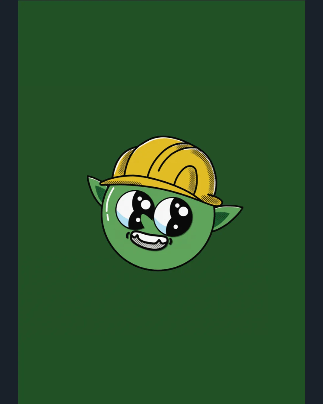
Distinctive, lively mascot design that strongly expresses brand personality but requires size adaptation and minor optical balancing for professional use.
Focus on the changes that matter. Keep what makes the logo work.
A distinctive, playful goblin mascot with creative energy, aligning well with a fun design brand identity.
mascot mark (head, face, hat)
The detailed facial features and halftone shading may become unclear or messy at small sizes.
See the category reviewmascot mark overall
The head appears slightly off-center, with the hat weighted to the right, which might create a subtle imbalance.
See the category reviewThe mascot captures the fun and playful spirit but could better reference type or design directly.
Estimated colors. Use the original design file for exact values.
Create a full color palette using these colors
Create new paletteThe head appears slightly off-center, with the hat weighted to the right, which might create a subtle imbalance.
Try: Adjust the composition or ear placement for a more optically centered mascot.

Inspect spacing with the guide. Optical balance may differ from geometric centering.
The detailed facial features and halftone shading may become unclear or messy at small sizes.
Try: Create a simplified small-size version or favicon with reduced detail and fewer color/texture effects.
Get a clear logo score, key risks, and priority fix ideas before your client or audience sees it.
More credits needed
Add credits to continue without losing your work.
Then $7/month. Cancel anytime.
Essential logo review with AI
Estimated progress