 View review
Logo score
Logo review ofPro Kick 26
Review the detailed scores below to see what is working and what should be refined first.
Legibility
Originality
Misread
Balance
Scale
Detailed review
Logo performance breakdown
Legibility
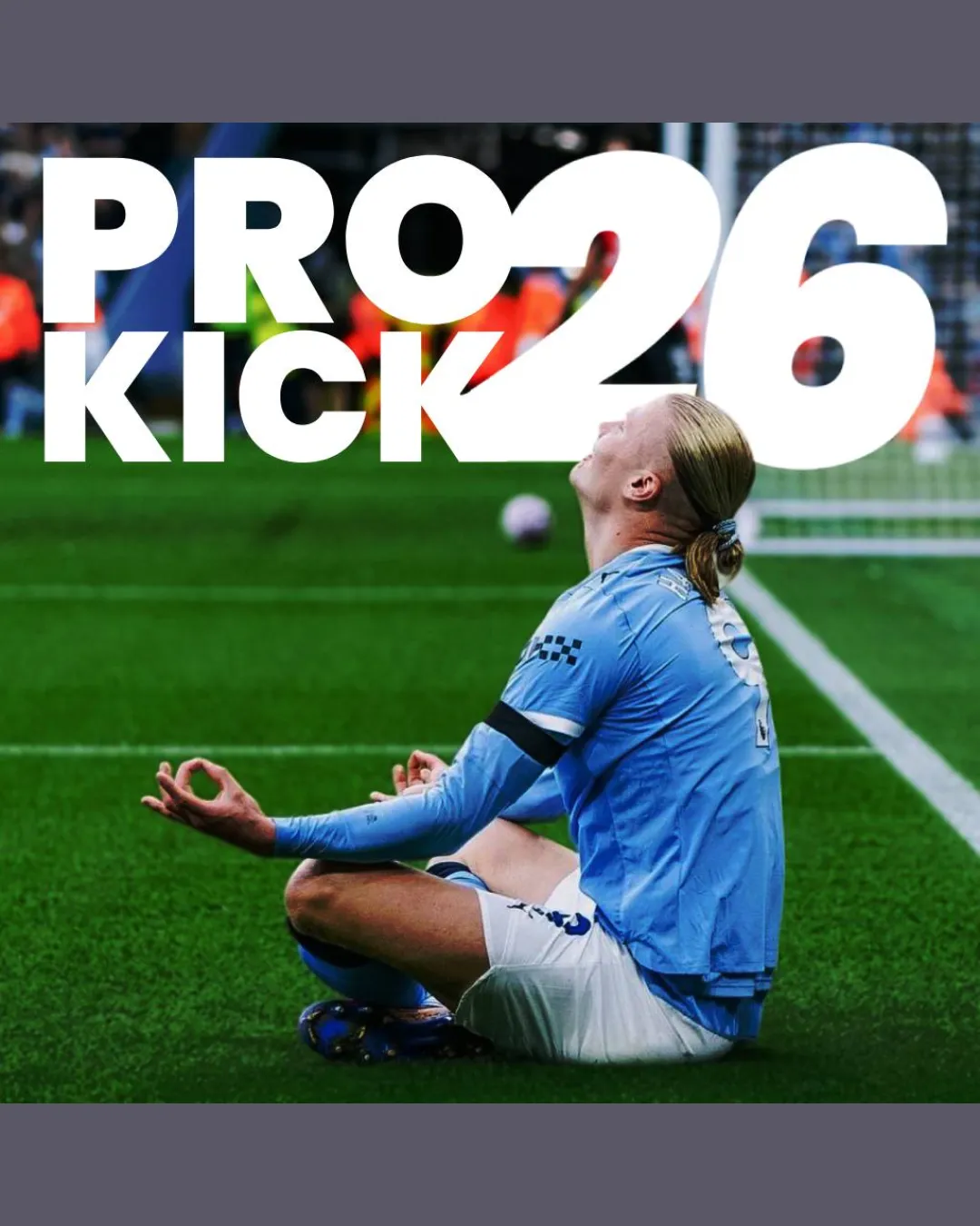
![]() Bold sans-serif letters ensure general visibility.
Bold sans-serif letters ensure general visibility.![]() High contrast between white text and darker background aids primary legibility.
High contrast between white text and darker background aids primary legibility.
![]() Text overlaps background image elements, especially in 'KICK' and '26', reducing clarity.
Text overlaps background image elements, especially in 'KICK' and '26', reducing clarity.![]() The focus is split between the text and the underlying image, making the message slightly harder to grasp at a glance.
The focus is split between the text and the underlying image, making the message slightly harder to grasp at a glance.![]() Crowding in 'PRO' and size imbalance between 'KICK' and '26' introduces visual noise.
Crowding in 'PRO' and size imbalance between 'KICK' and '26' introduces visual noise.
Originality
![]() The combination of bold text on a sports photo is a familiar design in sports branding.
The combination of bold text on a sports photo is a familiar design in sports branding.
![]() Very generic approach—typography overlaying a popular action photo lacks uniqueness.
Very generic approach—typography overlaying a popular action photo lacks uniqueness.![]() No memorable or clever visual devices, no icon or negative space play.
No memorable or clever visual devices, no icon or negative space play.![]() The numeral '26' as a visual focus is typical in sports and doesn't distinguish the brand.
The numeral '26' as a visual focus is typical in sports and doesn't distinguish the brand.
Color harmony
![]() White primary text ensures good contrast.
White primary text ensures good contrast.![]() Blue and green from the photo compliment the sports theme.
Blue and green from the photo compliment the sports theme.![]() Not an overwhelming color palette.
Not an overwhelming color palette.
![]() The color harmony is somewhat accidental, reliant on background photo—may not translate if image context changes.
The color harmony is somewhat accidental, reliant on background photo—may not translate if image context changes.
White
#FFFFFF
Cornflower Blue
#6AA3D8
Dark Green
#39532C
Black
#000000
Your palette is close. Explore sharper color combinations with Colorfly.design before updating the logo.
Explore palettesBalance alignment
![]() The large '26' draws immediate attention and pairs with 'PRO KICK' for hierarchy.
The large '26' draws immediate attention and pairs with 'PRO KICK' for hierarchy.
![]() Significant imbalance between the size of '26' and the rest of the text.
Significant imbalance between the size of '26' and the rest of the text.![]() 'PRO' and 'KICK' are not perfectly evenly spaced or aligned beneath '26'.
'PRO' and 'KICK' are not perfectly evenly spaced or aligned beneath '26'.![]() Visual weight is poorly distributed, as the bold '26' overpowers the rest of the composition.
Visual weight is poorly distributed, as the bold '26' overpowers the rest of the composition.

Scalability
![]() Simple, bold typography theoretically allows for resizing if extracted from the background.
Simple, bold typography theoretically allows for resizing if extracted from the background.![]() Could work on large format signage or billboards if image background is omitted.
Could work on large format signage or billboards if image background is omitted.
![]() Relying on a photo background severely limits scalability—logo loses clarity at small sizes.
Relying on a photo background severely limits scalability—logo loses clarity at small sizes.![]() Not suitable for embroidery, favicons, or small merch due to photographic elements.
Not suitable for embroidery, favicons, or small merch due to photographic elements.![]() Will not translate well to monochrome or minimalist applications.
Will not translate well to monochrome or minimalist applications.
200x250 px
100×125 px
50×62 px
Misinterpretations
![]() No inappropriate dual meanings or accidental imagery detected.
No inappropriate dual meanings or accidental imagery detected.
Try your own review
Review my logo
Wondering how your logo performs?
Get a clear logo score, key risks, and priority fix ideas before your client or audience sees it.
Keep exploring


