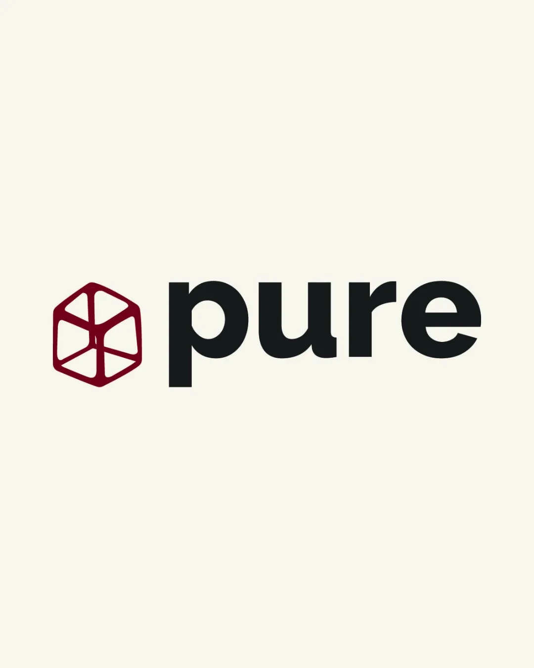
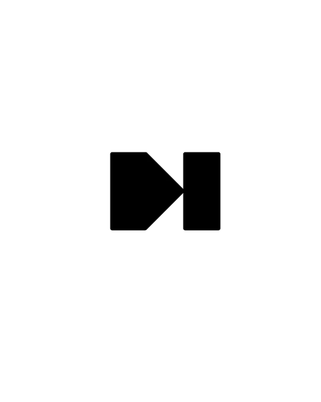
pure logo review
4.0 / 5
Logo score
Logo review of

Pure

A clean, modern combination mark with excellent basic execution. Strengthen conceptual ties for full distinctiveness.

Combination Mark Modern Geometric Sans-serif Tech Or Clean Products
5/5
Legibility
3/5
Originality
4.8/5
Misread
4.5/5
Balance
4/5
Scale
Action plan

What to fix first

The most important fixes to handle before polishing the full presentation.

1

Enhance or clarify the conceptual link between the symbol and the brand name or values.

High priority

Current mark is visually clean but generic; adding distinctive meaning would boost brand identity.

Impact: Would Make The Logo More Memorable And Unique. · Effort: Medium

2

Test symbol legibility at smaller sizes and refine line thicknesses as needed.

Medium priority

Some interior detail in the mark may collapse at reduced scales.

Impact: Ensures The Logo Remains Legible And Balanced In Smaller Or Digital Applications. · Effort: Low

Detailed review

Logo performance breakdown

5/5

Legibility

Checkmark icon Wordmark is highly readable with clear, bold typography.

3/5

Originality

Checkmark icon Geometric mark is custom and provides some uniqueness.

Warning icon Hexagonal motifs and this style of geometric abstraction are fairly common, limiting distinctiveness.

4.5/5

Color harmony

Checkmark icon Color pairing is professional, high contrast, and modern.

Burgundy
#9B1C2E

Black
#181A19

Off White
#F9F8EA

Your palette is close. Refine the color roles and combinations before updating the logo.

Build brand colors
4.5/5

Balance alignment

Checkmark icon Strong horizontal lockup and proportional relationship between mark and wordmark.

logo 200x250 pixels scalability test alignment grid overlay
4/5

Scalability

Checkmark icon Bold shapes and simple forms scale well for most uses.

Warning icon Geometric mark may lose some inner detail at very small sizes.

logo 200x250 pixels scalability test

200x250 px

logo 100x125 pixels scalability test

100×125 px

logo 50x62 pixels scalability test

50×62 px

4.8/5

Misinterpretations

Checkmark icon No plausible or clear misinterpretations.

4 / 5

Logo structure & brief match

Checkmark icon Clean visual harmony between mark and sans-serif wordmark.

Warning icon No direct conceptual reinforcement between mark and word.

Checkmark icon Clarity, Clean Modern Feel: Successfully delivered through type and geometric mark.
Checkmark icon Direct Representation Of 'pure': No clear symbolic link; abstract mark is visually clean but not conceptually tied.

Try your own review

Wondering how your logo performs?

Get a clear logo score, key risks, and priority fix ideas before your client or audience sees it.

Review my logo