QUDSN PRINTABLE logo review
4.2/5
Logo score
Logo review of

Qudsn Printable

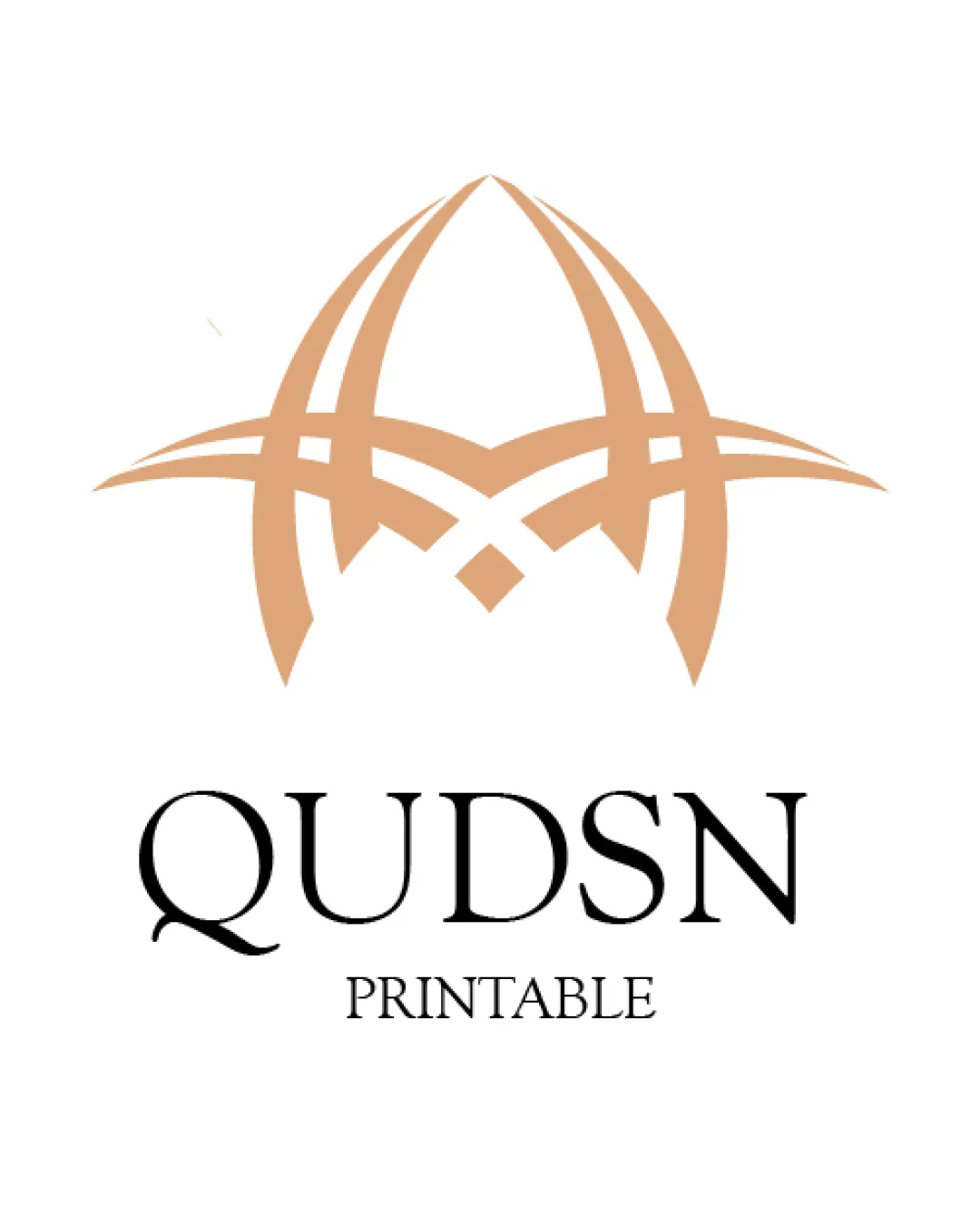
A thoughtful, premium mark well-matched for the brief, with only minor typographic spacing and small-size symbol refinements recommended.

Combination Minimal, Elegant, Contemporary Islamic Digital Islamic Art / Home Decor
5/5
Legibility
4/5
Originality
5/5
Misread
4/5
Balance
3.5/5
Scale
Your next steps

What to fix first

Focus on the changes that matter. Keep what makes the logo work.

1

Standalone mark

Test the icon at small sizes typical for digital/print use, ensuring lines remain visible.

Worth testing High priority Low effort
Area to inspectApproximate location

The thin lines in the domed symbol may lose clarity at small sizes or in low-resolution reproduction.

How to check

Review small digital and print mockups for symbol clarity.

See the category review
2

Standalone mark and wordmark alignment

Reduce the vertical gap between 'QUDSN' and 'PRINTABLE' to improve unity.

Optional refinement Medium priority Low effort
Area to inspectApproximate location

There is a slight vertical spacing imbalance between the symbol, the primary wordmark, and the secondary 'PRINTABLE' text; the distance between 'QUDSN' and 'PRINTABLE' could be reduced for greater cohesion.

How to check

Visually compare before and after adjustments at various sizes.

See the category review
Detailed review

Logo performance breakdown

5/5

Brief & logo match

Based on your brief
Compared with

Digital design brand for elegant, meaningful, and printable Islamic art with a minimal, premium, and modern aesthetic.

The logo convincingly expresses the target of premium, elegant, and Islamic-inspired digital printables.

  • Premium Islamic Aesthetic

    Mark channels Islamic motifs in a minimal, abstract fashion—a contemporary, elegant approach.

  • Minimal, Modern Design

    Symbol and type avoid excess decoration, focusing on crisp forms and negative space.

5/5

Legibility

  • Sharp, spacious serif permits easy reading at multiple sizes.
  • No ambiguous or fused letters.
4/5

Originality

  • The dome-like abstract mark combines architectural and calligraphic heritage in a fresh way.
  • Serif and mark pairing is not generic.
4.5/5

Color harmony

  • Tan and black combination is warm, elegant, and contemporary.
Tan#D9A87D
Black#000000

Estimated colors. Use the original design file for exact values.

Create a full color palette using these colors

Create new palette
4/5

Balance alignment

  • Centrally balanced composition.
  • Clear vertical stacking of elements.
  • There is a slight vertical spacing imbalance between the symbol, the primary wordmark, and the secondary 'PRINTABLE' text; the distance between 'QUDSN' and 'PRINTABLE' could be reduced for greater cohesion.

    Optional refinement Standalone mark and wordmark alignment

    Try: Reduce the vertical gap between 'QUDSN' and 'PRINTABLE' to improve unity.

    Check: Visually compare before and after adjustments at various sizes.

    Area to inspectApproximate location
Uploaded logoAlignment guide overlay

Inspect spacing with the guide. Optical balance may differ from geometric centering.

3.5/5

Scalability

  • Minimal detail aids resizing.
  • Discrete symbol and type for alternate uses.
  • The thin lines in the domed symbol may lose clarity at small sizes or in low-resolution reproduction.

    Worth testing Standalone mark

    Try: Test the icon at small sizes typical for digital/print use, ensuring lines remain visible.

    Check: Review small digital and print mockups for symbol clarity.
    Area to inspectApproximate location
Uploaded logo at 200 pixels wide
200 × 250 px
Uploaded logo at 100 pixels wide
100 × 125 px
Uploaded logo at 50 pixels wide
50 × 63 px

Compare the detail at different sizes. Labels show the full image dimensions.

5/5

Misinterpretations

  • No unintended readings or negative space issues.
4/5

Symbol & text fit

  • Mark's geometric elegance supports premium and Islamic themes.

Black & white

Does the shape still work without color?

These tests are available only for logos uploaded in vector (SVG) format.

Background contrast

Find the surfaces where your logo stays clear.

These tests are available only for logos uploaded in vector (SVG) format.

Blur & silhouette

A 3px blur softens fine details so you can check whether the overall shape stays recognizable. If key gaps close or elements merge, the logo may rely too heavily on detail.

These tests are available only for logos uploaded in vector (SVG) format.

Try your own review

Wondering how your logo performs?

Get a clear logo score, key risks, and priority fix ideas before your client or audience sees it.

Review my logo