Wondering how your logo performs? 🧐
Get professional logo reviews in seconds and catch design issues in time.
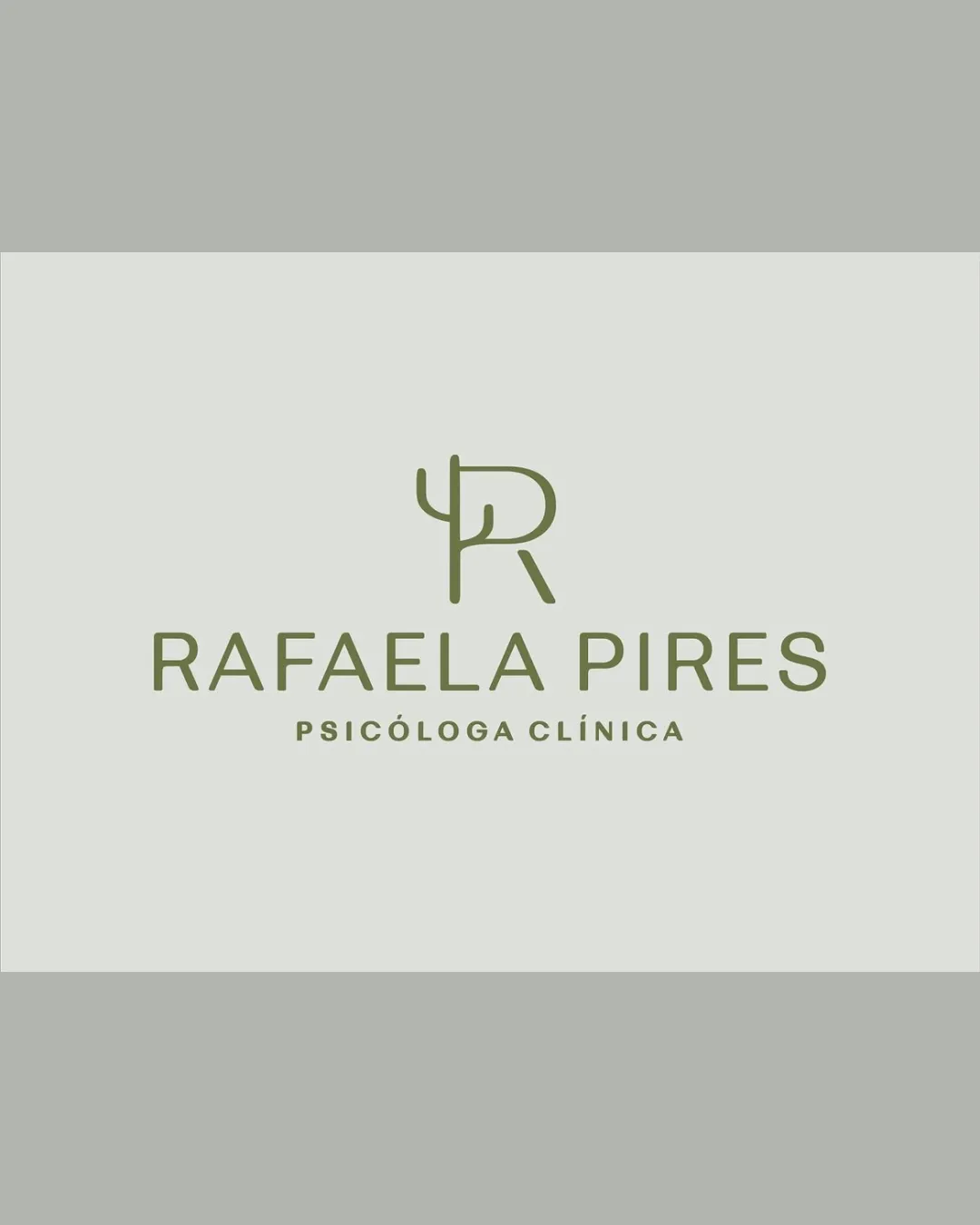
Try it Now!Logo review of RAFAELA PIRES, PSICÓLOGA CLÍNICA
 Logo analysis by AI
Logo type:
Style:
Detected symbol:
Negative space:
Detected text:
Business industry:
Review requested by Hannafer
**If AI can recognize or misinterpret it, so can people.
Structured logo review
Legibility
All text elements are clear, well-spaced, and highly readable.
Font choice conveys professionalism appropriate to the clinical psychology field.
Scalability versatility
Minimal lines ensure good clarity at small sizes, especially for the symbol.
Text remains legible for web, print, and office signage.
Simple enough for business cards and stationary.
Thinness of monogram lines could lose definition on very small or embroidered applications.

200x250 px

100×125 px

50×62 px
Balance alignment
Great optical balance between monogram and text.
Text and symbol alignment is visually harmonious and well-centered.


Originality
Creative integration of ψ (psi) symbol with the R monogram, tying directly to psychology.
Unique mark for individual branding.
Combination of initial and psi symbol has been used before in psychology branding, reducing overall uniqueness.
Logomark wordmark fit
Symbol and wordmark match stylistically—modern, professional, and clean.
Sizing is appropriate and neither element overshadows the other.
Aesthetic look
Minimalist, modern look enhances professionalism.
Color palette is elegant and soothing, fitting for healthcare and psychology.
Dual meaning and misinterpretations
No inappropriate or misleading shapes detected.
Symbol communicates the psychological focus immediately.
Color harmony
Monochrome olive green palette provides calm and trustworthiness.
Excellent contrast with background, reinforces readability.
Olive Drab
#848C6A
Grey Green
#DBDDD7
Light Grey
#B8B8B2

