Wondering how your logo performs? 🧐
Get professional logo reviews in seconds and catch design issues in time.
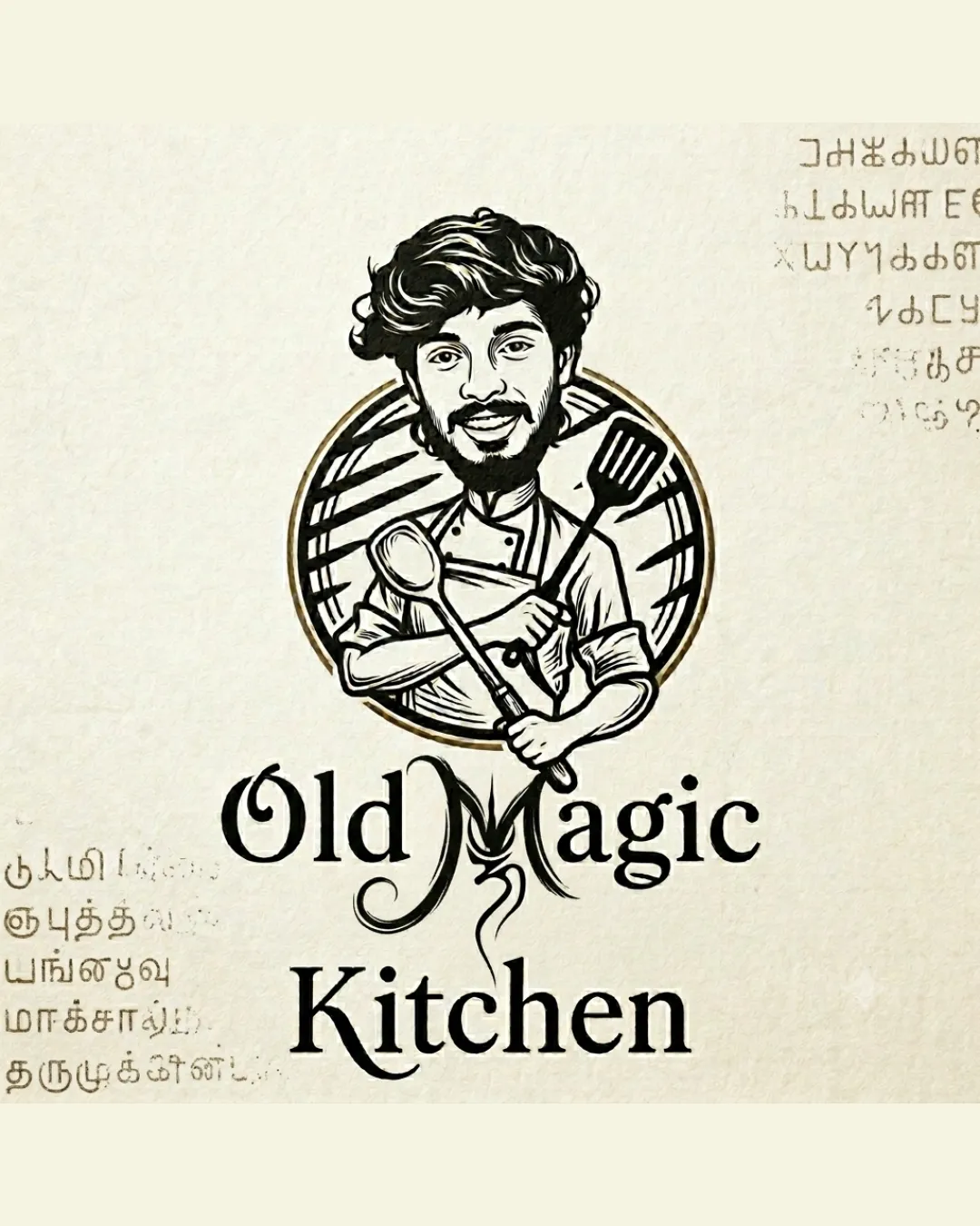
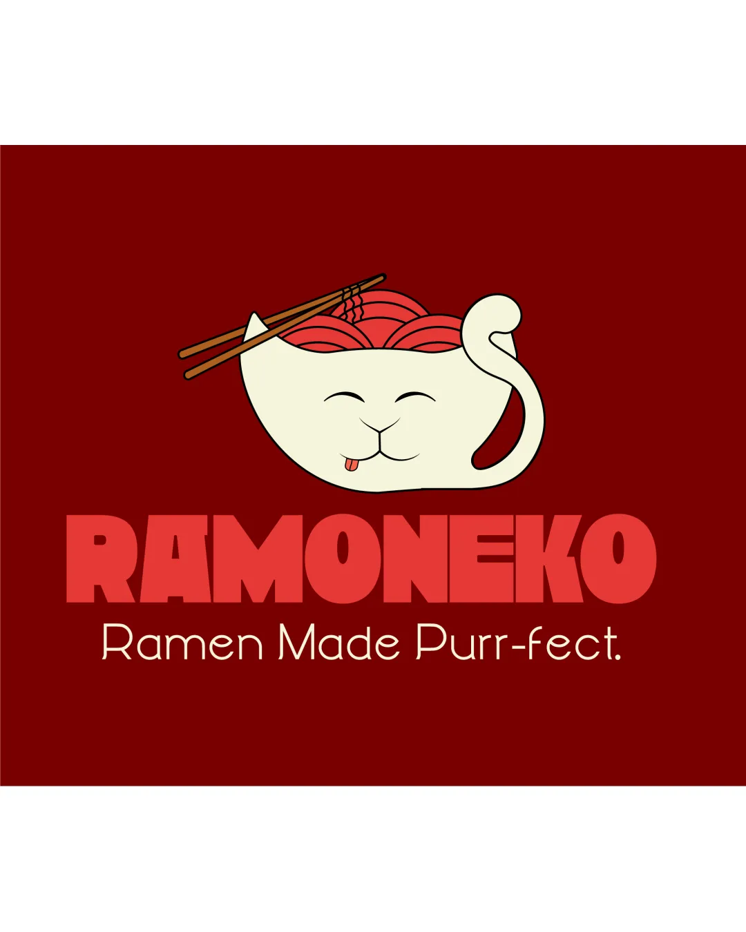
Try it Now!Logo review of RAMONEKO, Ramen Made Purr-fect.
 Logo analysis by AI
Logo type:
Style:
Detected symbol:
Negative space:
Detected text:
Business industry:
Review requested by Koya122024
**If AI can recognize or misinterpret it, so can people.
Structured logo review
Legibility
![]() Main wordmark (RAMONEKO) is bold, highly readable, and has strong visual impact.
Main wordmark (RAMONEKO) is bold, highly readable, and has strong visual impact.![]() Tagline uses a simple, clear font for easy reading.
Tagline uses a simple, clear font for easy reading.
![]() Contrast between background and tagline could be stronger; thinness of tagline font may be harder to read at small sizes.
Contrast between background and tagline could be stronger; thinness of tagline font may be harder to read at small sizes.![]() Wordmark color can blend slightly into deep red background depending on display/screen settings.
Wordmark color can blend slightly into deep red background depending on display/screen settings.
Scalability versatility
![]() Cartoonish symbol retains some clarity at small scale due to bold outline.
Cartoonish symbol retains some clarity at small scale due to bold outline.![]() Wordmark remains legible in most standard uses (signage, menus, packaging).
Wordmark remains legible in most standard uses (signage, menus, packaging).
![]() Complexity of the cat/ramen symbol with fine lines (chopsticks, noodles) will lose detail at very small sizes (favicon, embroidery).
Complexity of the cat/ramen symbol with fine lines (chopsticks, noodles) will lose detail at very small sizes (favicon, embroidery).![]() Thin tagline font will likely become illegible on small-scale collateral.
Thin tagline font will likely become illegible on small-scale collateral.
200x250 px
100×125 px
50×62 px
Balance alignment
![]() Logo is well centered with a clear hierarchy from symbol to wordmark to tagline.
Logo is well centered with a clear hierarchy from symbol to wordmark to tagline.![]() The bowl and text align into a visually cohesive unit.
The bowl and text align into a visually cohesive unit.
![]() Slight visual weight imbalance as the symbol occupies a larger space than the wide wordmark, leading to some top-heaviness.
Slight visual weight imbalance as the symbol occupies a larger space than the wide wordmark, leading to some top-heaviness.

Originality
![]() Inventive fusion of cat and ramen bowl instantly conveys brand concept.
Inventive fusion of cat and ramen bowl instantly conveys brand concept.![]() Tail as handle and facial integration adds charm and character.
Tail as handle and facial integration adds charm and character.![]() Pun with brand name is distinctive.
Pun with brand name is distinctive.
Logomark wordmark fit
![]() Playful style is consistent between logomark (cat/ramen) and bold, rounded wordmark.
Playful style is consistent between logomark (cat/ramen) and bold, rounded wordmark.![]() Color palette ties both elements together.
Color palette ties both elements together.
![]() There’s a mild mismatch in mood: logomark is whimsical, while the wordmark is very blocky; a slightly rounder or softer wordmark font might be more harmonious.
There’s a mild mismatch in mood: logomark is whimsical, while the wordmark is very blocky; a slightly rounder or softer wordmark font might be more harmonious.
Aesthetic look
![]() Visuals are cute, inviting, and have strong immediate appeal.
Visuals are cute, inviting, and have strong immediate appeal.![]() Color palette is appetizing and culturally appropriate for ramen.
Color palette is appetizing and culturally appropriate for ramen.
![]() Cartoonish style may feel too playful for upscale or more mature dining concepts.
Cartoonish style may feel too playful for upscale or more mature dining concepts.![]() Palette is a bit monochromatic—more color accent could add vibrancy.
Palette is a bit monochromatic—more color accent could add vibrancy.
Dual meaning and misinterpretations
![]() Dual meaning (cat + ramen bowl) is positive, clever, and intentional.
Dual meaning (cat + ramen bowl) is positive, clever, and intentional.![]() No inappropriate imagery present.
No inappropriate imagery present.
Color harmony
![]() Main colors complement each other well and evoke Japanese cuisine themes.
Main colors complement each other well and evoke Japanese cuisine themes.![]() No excessive color usage.
No excessive color usage.
![]() Contrast for tagline could be improved; readability may suffer on different backgrounds.
Contrast for tagline could be improved; readability may suffer on different backgrounds.
Deep Red
#7A0E13
Ivory
#F9F7E2
Light Red
#E44D4D
Dark Brown
#332016