 View review
Logo score
Logo review ofS
Review the detailed scores below to see what is working and what should be refined first.
Legibility
Originality
Misread
Balance
Scale
Detailed review
Logo performance breakdown
Legibility
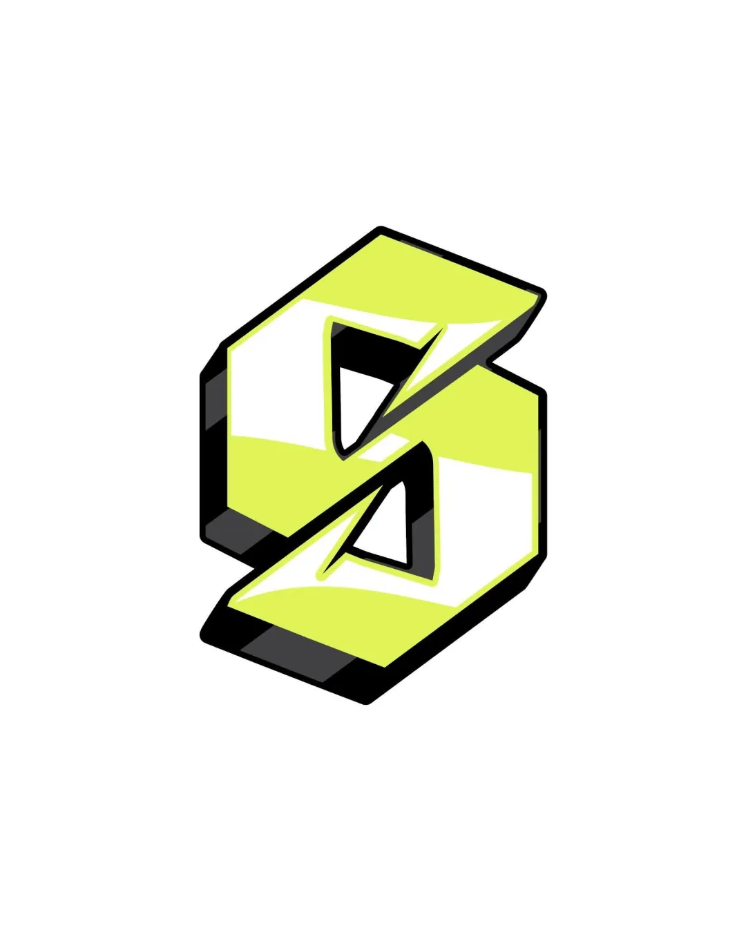
![]() The 'S' is instantly recognizable and clear even at a glance.
The 'S' is instantly recognizable and clear even at a glance.![]() High visual contrast between colors and sharp contours enhances readability.
High visual contrast between colors and sharp contours enhances readability.
Originality
![]() Graffiti-inspired, stylized approach injects personality into a classic form.
Graffiti-inspired, stylized approach injects personality into a classic form.![]() 3D rendering offers a dynamic, youthful touch.
3D rendering offers a dynamic, youthful touch.
![]() The stylized 'S' shape is a widely recognizable motif, commonly used in similar street art styles, making it less unique.
The stylized 'S' shape is a widely recognizable motif, commonly used in similar street art styles, making it less unique.![]() Feels somewhat generic without supplemental brand elements.
Feels somewhat generic without supplemental brand elements.
Color harmony
![]() Limited color palette with strong contrast helps the letterform stand out.
Limited color palette with strong contrast helps the letterform stand out.![]() Consistent use of color between foreground and shadow elements.
Consistent use of color between foreground and shadow elements.
![]() Harsh lime shade can feel somewhat aggressive and may not pair well with all brand palettes.
Harsh lime shade can feel somewhat aggressive and may not pair well with all brand palettes.
Lime
#EBFF51
White
#FFFFFF
Black
#111111
Your palette is close. Explore sharper color combinations with Colorfly.design before updating the logo.
Explore palettesBalance alignment
![]() The letterform feels visually well-balanced and symmetrical.
The letterform feels visually well-balanced and symmetrical.![]() Consistent stroke weight and directional slants create cohesion.
Consistent stroke weight and directional slants create cohesion.
![]() Slight unevenness with shadow directionality, which may feel off-balance in some contexts.
Slight unevenness with shadow directionality, which may feel off-balance in some contexts.

Scalability
![]() Bold design with thick lines maintains reasonable clarity at moderate sizes.
Bold design with thick lines maintains reasonable clarity at moderate sizes.![]() Would reproduce well on digital platforms, posters, and stickers.
Would reproduce well on digital platforms, posters, and stickers.
![]() 3D shading and gradients may not translate well to embroidery or very small applications like favicons.
3D shading and gradients may not translate well to embroidery or very small applications like favicons.![]() Not optimal for single-color printing without losing visual impact.
Not optimal for single-color printing without losing visual impact.
200x250 px
100×125 px
50×62 px
Misinterpretations
![]() No inappropriate or confusing double meanings present.
No inappropriate or confusing double meanings present.
Try your own review
Review my logo
Wondering how your logo performs?
Get a clear logo score, key risks, and priority fix ideas before your client or audience sees it.
Keep exploring


