Wondering how your logo performs? 🧐
Get professional logo reviews in seconds and catch design issues in time.
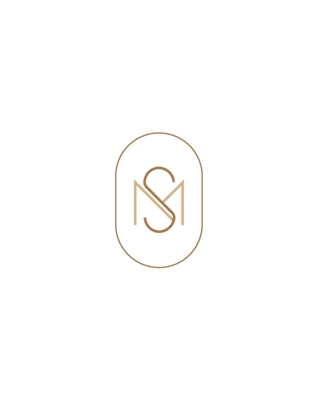
Try it Now!Logo review of S, M
 Logo analysis by AI
Logo type:
Style:
Detected symbol:
Detected text:
Business industry:
Review requested by Hannafer
**If AI can recognize or misinterpret it, so can people.
Structured logo review
Legibility
![]() Letters S and M are clearly distinguishable even with their overlap.
Letters S and M are clearly distinguishable even with their overlap.![]() Minimalist lines do not cause visual clutter.
Minimalist lines do not cause visual clutter.
![]() The intersection point between S and M could slightly confuse at smaller sizes or from a distance.
The intersection point between S and M could slightly confuse at smaller sizes or from a distance.
Scalability versatility
![]() Simple monoline style ensures clarity at various sizes.
Simple monoline style ensures clarity at various sizes.![]() Works well on business cards, letterhead, and luxury packaging.
Works well on business cards, letterhead, and luxury packaging.
![]() Very thin lines may lose visibility when scaled down for smaller formats such as embroidery or digital favicons.
Very thin lines may lose visibility when scaled down for smaller formats such as embroidery or digital favicons.
200x250 px
100×125 px
50×62 px
Balance alignment
![]() Excellent centered alignment within the oval.
Excellent centered alignment within the oval.![]() Monogram is visually balanced with symmetrical spacing.
Monogram is visually balanced with symmetrical spacing.

Originality
![]() Stylish integration of S and M, creating a unique monogram.
Stylish integration of S and M, creating a unique monogram.
![]() Monogram within an oval is a frequently used format, offering limited distinction in a crowded luxury/fashion market.
Monogram within an oval is a frequently used format, offering limited distinction in a crowded luxury/fashion market.
Aesthetic look
![]() Elegant, minimalist look suitable for high-end or boutique brands.
Elegant, minimalist look suitable for high-end or boutique brands.![]() Line thickness and color choice add to the premium perception.
Line thickness and color choice add to the premium perception.
![]() Some may find the line-art too delicate or minimal depending on brand positioning.
Some may find the line-art too delicate or minimal depending on brand positioning.
Dual meaning and misinterpretations
![]() No inappropriate dual meanings or misleading shapes present.
No inappropriate dual meanings or misleading shapes present.
Color harmony
![]() Use of a single, muted luxury gold adds to elegance.
Use of a single, muted luxury gold adds to elegance.![]() Strong contrast with white background maintains clarity.
Strong contrast with white background maintains clarity.
Teak
#B7996E
White
#FFFFFF