 View review
Logo score
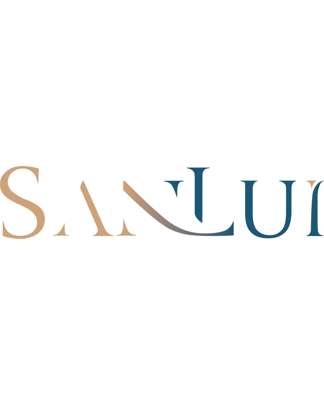
Logo review ofSanlui
Review the detailed scores below to see what is working and what should be refined first.
Legibility
Originality
Misread
Balance
Scale
Detailed review
Logo performance breakdown
Legibility
![]() Text is generally easy to read due to spaced, clear serif typeface.
Text is generally easy to read due to spaced, clear serif typeface.![]() Letterforms are distinctive and upscale.
Letterforms are distinctive and upscale.
![]() The custom swooping line connecting N and L may cause slight confusion or visual interruption, especially at smaller sizes.
The custom swooping line connecting N and L may cause slight confusion or visual interruption, especially at smaller sizes.
Originality
![]() Custom typographic treatment of N–L connection is distinctive.
Custom typographic treatment of N–L connection is distinctive.![]() Elegant serif differentiates it from generic sans-serifs.
Elegant serif differentiates it from generic sans-serifs.
![]() The wordmark concept is not inherently unique; the originality relies largely on the swooping form.
The wordmark concept is not inherently unique; the originality relies largely on the swooping form.
Color harmony
![]() Color transition is smooth, and the palette is harmonious and subdued.
Color transition is smooth, and the palette is harmonious and subdued.![]() The combination of warm beige and cool blue provides an upscale contrast.
The combination of warm beige and cool blue provides an upscale contrast.
![]() Gradient application may result in visibility issues on non-white backgrounds or in monochrome usage.
Gradient application may result in visibility issues on non-white backgrounds or in monochrome usage.
Teak
#B7996E
Biscay
#387187
Shadow
#7A6E60
Your palette is close. Explore sharper color combinations with Colorfly.design before updating the logo.
Explore palettesBalance alignment
![]() Good horizontal balance between characters.
Good horizontal balance between characters.![]() Visual weight is distributed due to consistent serif structure.
Visual weight is distributed due to consistent serif structure.
![]() The transition between the N and the L, with the sweeping ‘bridge’, creates a slight imbalance and draws disproportionate focus.
The transition between the N and the L, with the sweeping ‘bridge’, creates a slight imbalance and draws disproportionate focus.

Scalability
![]() Logo will work well on signage, menus, and digital marketing.
Logo will work well on signage, menus, and digital marketing.![]() Relatively clean and minimal for most printing scenarios.
Relatively clean and minimal for most printing scenarios.
![]() Swooping detail may lose clarity on small-scale items like favicons or embroidery.
Swooping detail may lose clarity on small-scale items like favicons or embroidery.![]() Color gradient could create issues for black-and-white and monochrome uses.
Color gradient could create issues for black-and-white and monochrome uses.
200x250 px
100×125 px
50×62 px
Misinterpretations
![]() No inappropriate imagery or unintended dual meanings detected.
No inappropriate imagery or unintended dual meanings detected.
Try your own review
Review my logo
Wondering how your logo performs?
Get a clear logo score, key risks, and priority fix ideas before your client or audience sees it.
Keep exploring


