selsy logo review
3.5/5
Logo score
Logo review of

Selsy

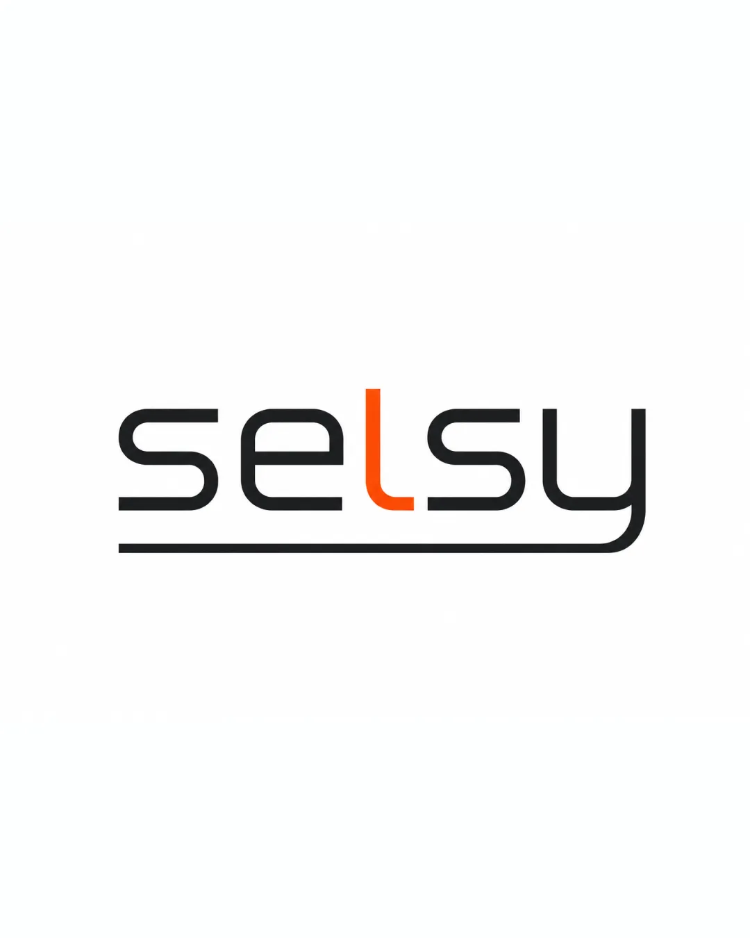
Solid geometric wordmark, tech-appropriate, but lacks strong brand distinctiveness or visual cue for target industry.

Wordmark Clean Geometric Sans-serif Technology
4/5
Legibility
3/5
Originality
4/5
Misread
4/5
Balance
3.5/5
Scale
Action plan

What to fix first

The most important fixes to handle before polishing the full presentation.

1

Increase line thickness or introduce a bolder variant for improved visibility at small sizes.

High priority

Thin lines and stylized elements risk disappearing at small scale.

Impact: Improves Scalability And Clarity For POS Contexts Where Logos Are Often Used Small. · Effort: Low

2

Consider integrating a subtle graphic cue or icon relating to food or transactions for stronger industry fit.

Medium priority

Enhances logo’s contextual clarity and brand recall.

Impact: Improves Immediate Relevance To Food POS Users. · Effort: Medium

Detailed review

Logo performance breakdown

4/5

Legibility

Checkmark icon Text is easily readable.
Checkmark icon Distinct separation between letters.

Warning icon The stylized 'l' could confuse at very small sizes.

3/5

Originality

Checkmark icon Custom letter shaping and underline add some unique touch.

Warning icon General geometric sans-serif approach is somewhat generic.

4/5

Color harmony

Checkmark icon Orange accent adds energy and contrast to the otherwise neutral palette.

Black
#1A1A1A

Orange
#FF4900

Your palette is close. Refine the color roles and combinations before updating the logo.

Build brand colors
4/5

Balance alignment

Checkmark icon Consistently aligned and well-proportioned.
Checkmark icon The underline provides visual grounding.

Warning icon Slight imbalance due to the unique 'l' and the heavy underline extending right.

logo 200x250 pixels scalability test alignment grid overlay
3.5/5

Scalability

Checkmark icon Simple lines support scaling.

Warning icon Thin lines and the underline could get lost at very small sizes.

logo 200x250 pixels scalability test

200x250 px

logo 100x125 pixels scalability test

100×125 px

logo 50x62 pixels scalability test

50×62 px

4/5

Misinterpretations

Checkmark icon No unintended negative shapes or meanings.

Brief match

Checkmark icon Food Ordering And Billing POS: The clean and modern style is suitable for technology products; however, there's no visual food or POS reference.

Try your own review

Wondering how your logo performs?

Get a clear logo score, key risks, and priority fix ideas before your client or audience sees it.

Review my logo