Wondering how your logo performs? 🧐
Get professional logo reviews in seconds and catch design issues in time.
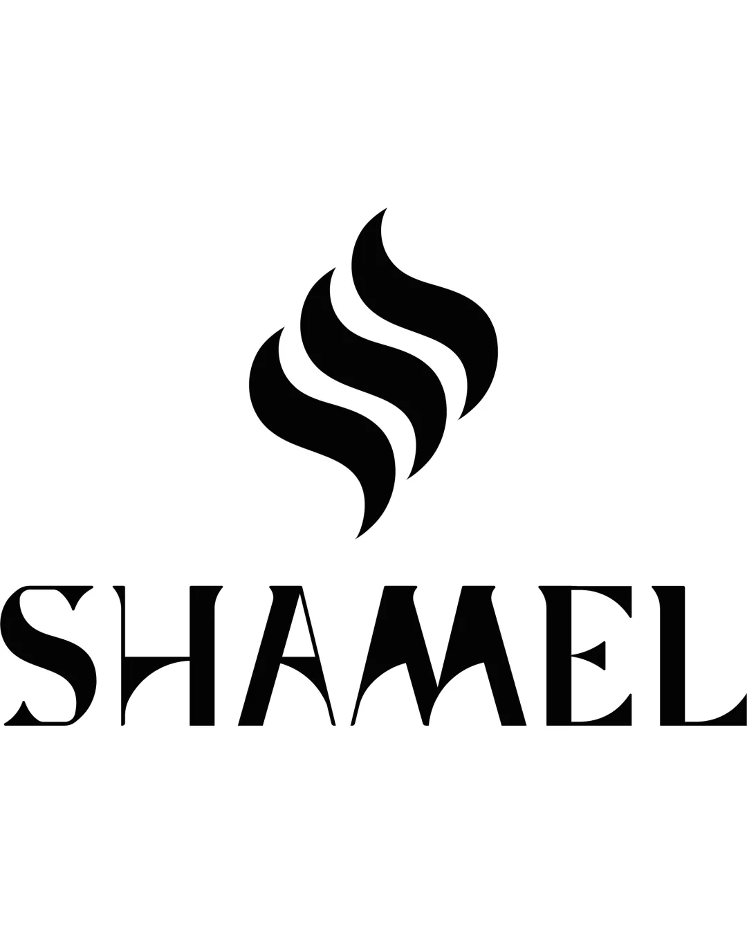
Try it Now!Logo review of SHAMEL
 Logo analysis by AI
Logo type:
Style:
Detected symbol:
Detected text:
Business industry:
Review requested by Nero_news
**If AI can recognize or misinterpret it, so can people.
Structured logo review
Legibility
![]() The text 'SHAMEL' is clear, bold, and mostly easy to read.
The text 'SHAMEL' is clear, bold, and mostly easy to read.![]() Good contrast between text and background.
Good contrast between text and background.
![]() Stylized letterforms, especially the 'A' and 'M,' make quick reading slightly harder; at small sizes or from a distance, this could impact legibility.
Stylized letterforms, especially the 'A' and 'M,' make quick reading slightly harder; at small sizes or from a distance, this could impact legibility.
Scalability versatility
![]() Simple, bold mark and wordmark ensure good legibility at larger sizes like signage or print.
Simple, bold mark and wordmark ensure good legibility at larger sizes like signage or print.![]() Will work well in monochrome and in both positive and negative spaces.
Will work well in monochrome and in both positive and negative spaces.
![]() Crispness of thin lines in the type may be lost in very small formats such as favicons or embroidery, especially the intricate negative spaces in 'A', 'M', and 'S'.
Crispness of thin lines in the type may be lost in very small formats such as favicons or embroidery, especially the intricate negative spaces in 'A', 'M', and 'S'.
200x250 px
100×125 px
50×62 px
Balance alignment
![]() Good visual alignment between the symbol and text, with the icon nicely centered above the wordmark.
Good visual alignment between the symbol and text, with the icon nicely centered above the wordmark.![]() Both elements complement each other in weight.
Both elements complement each other in weight.
![]() Slight disproportionality between the heavy, round symbol and the sharper, more geometric wordmark.
Slight disproportionality between the heavy, round symbol and the sharper, more geometric wordmark.

Originality
![]() Abstract flame/smoke symbol feels modern and is not excessively generic.
Abstract flame/smoke symbol feels modern and is not excessively generic.![]() Custom letterforms, particularly in the 'A' and 'M,' add differentiation.
Custom letterforms, particularly in the 'A' and 'M,' add differentiation.
![]() Three-wave flame design has some resemblance to widely used energy and gas industry marks—moderate risk of blending in.
Three-wave flame design has some resemblance to widely used energy and gas industry marks—moderate risk of blending in.![]() Wordmark style, while elegant, is not groundbreaking in approach.
Wordmark style, while elegant, is not groundbreaking in approach.
Logomark wordmark fit
![]() Style of the abstract flame and the refined wordmark complement each other and feel cohesive.
Style of the abstract flame and the refined wordmark complement each other and feel cohesive.![]() Both have a strong visual presence, unified by consistent use of black.
Both have a strong visual presence, unified by consistent use of black.
![]() Minor disconnect between the highly organic mark and the rigid, sharp-edged wordmark—could be softened for better unity.
Minor disconnect between the highly organic mark and the rigid, sharp-edged wordmark—could be softened for better unity.
Aesthetic look
![]() Minimal, powerful, and instantly impactful aesthetic.
Minimal, powerful, and instantly impactful aesthetic.![]() Creates a premium, professional brand perception.
Creates a premium, professional brand perception.
![]() Lack of a secondary color or accent could hinder differentiation in certain applications. Underlying form is not unique enough to be unmistakable.
Lack of a secondary color or accent could hinder differentiation in certain applications. Underlying form is not unique enough to be unmistakable.
Dual meaning and misinterpretations
![]() No inappropriate or ambiguous shapes detected. The flame form is clear and free of offensive undertones.
No inappropriate or ambiguous shapes detected. The flame form is clear and free of offensive undertones.
Color harmony
![]() Monochrome palette creates strong contrast and timeless appeal.
Monochrome palette creates strong contrast and timeless appeal.![]() No clashing or excessive use of color.
No clashing or excessive use of color.
Black
#000000
White
#FFFFFF