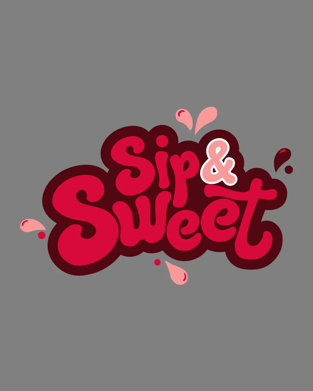
Sip & Sweet logo review
3.5/5
Logo score
Logo review of

Sip & Sweet

A lively, functional logo for beverage/food use, especially strong for medium sizes, but requires testing for small-scale clarity.

Wordmark Playful Script Wordmark With Splash Effects Beverage Or Food
4/5
Legibility
3/5
Originality
5/5
Misread
4/5
Balance
3/5
Scale
Your next steps

What to fix first

Focus on the changes that matter. Keep what makes the logo work.

1

overall logo mark

Test minimum printable and legible sizes for all use cases, especially stickers and bottle labels.

Worth testing High priority Low effort
Area to inspectApproximate location

The thick outline and splash accents may lose detail or become muddy at very small sizes, especially on rounded bottle surfaces or small stickers.

How to check

Print at smallest intended sizes to ensure text and splashes remain clear.

See the category review
2

overall wordmark

Consider refining the ampersand style or stroke weight for better consistency with main letterforms.

Optional refinement Medium priority Low effort

The ampersand style slightly differs from the rest of the script, which draws unusual attention and disrupts flow.

How to check

Compare wordmark with adjusted ampersand for visual cohesion.

See the category review
Detailed review

Logo performance breakdown

4/5

Brief & logo match

Based on your brief
Compared with

Logo to be used on bottle labels, stickers, social media, and aprons; needs to be playful, readable, and appealing for beverages/food.

Logo style and concept match playful beverage/food use with strong attention capture, but minor risks at tiny scales.

  • Label And Sticker Use

    Bold colors and playful style attract attention and fit food/beverage packaging.

  • Social Media Profile

    Distinct, compact shape and friendly style will stand out at small sizes, but readability of the ampersand may need testing.

4/5

Legibility

  • Text is large, clear, and playful.
3/5

Originality

  • Playful style; lively integration of splash marks.
  • The splash motif is playful but not highly unique for beverage/food logos; silhouette is better distinguished than the concept itself.

    Optional refinement overall concept

    Try: Explore enhancing the concept with a more defining accent/symbol that amplifies brand identity.

    Check: Test versions with subtle unique details to stand out in crowded categories.

4/5

Color harmony

  • Rich reds and pinks enhance sweetness theme.
Red#C30C34
Dark Red#651426
Light Pink#FFBDBD
Pink#F98A9E

Estimated colors. Use the original design file for exact values.

Create a full color palette using these colors

Create new palette
4/5

Balance alignment

  • Good optical balance and playful integration of splashes.
  • The ampersand style slightly differs from the rest of the script, which draws unusual attention and disrupts flow.

    Optional refinement overall wordmark

    Try: Consider refining the ampersand style or stroke weight for better consistency with main letterforms.

    Check: Compare wordmark with adjusted ampersand for visual cohesion.

Uploaded logoAlignment guide overlay

Inspect spacing with the guide. Optical balance may differ from geometric centering.

3/5

Scalability

  • Bold letters have strong presence at medium sizes.
  • The thick outline and splash accents may lose detail or become muddy at very small sizes, especially on rounded bottle surfaces or small stickers.

    Worth testing overall logo mark

    Try: Test minimum printable and legible sizes for all use cases, especially stickers and bottle labels.

    Check: Print at smallest intended sizes to ensure text and splashes remain clear.

    Area to inspectApproximate location
Uploaded logo at 200 pixels wide
200 × 250 px
Uploaded logo at 100 pixels wide
100 × 125 px
Uploaded logo at 50 pixels wide
50 × 63 px

Compare the detail at different sizes. Labels show the full image dimensions.

5/5

Misinterpretations

  • No unintended shapes or negative space concerns.

Black & white

Does the shape still work without color?

These tests are available only for logos uploaded in vector (SVG) format.

Background contrast

Find the surfaces where your logo stays clear.

These tests are available only for logos uploaded in vector (SVG) format.

Blur & silhouette

A 3px blur softens fine details so you can check whether the overall shape stays recognizable. If key gaps close or elements merge, the logo may rely too heavily on detail.

These tests are available only for logos uploaded in vector (SVG) format.

Try your own review

Wondering how your logo performs?

Get a clear logo score, key risks, and priority fix ideas before your client or audience sees it.

Review my logo