 View review
Logo score
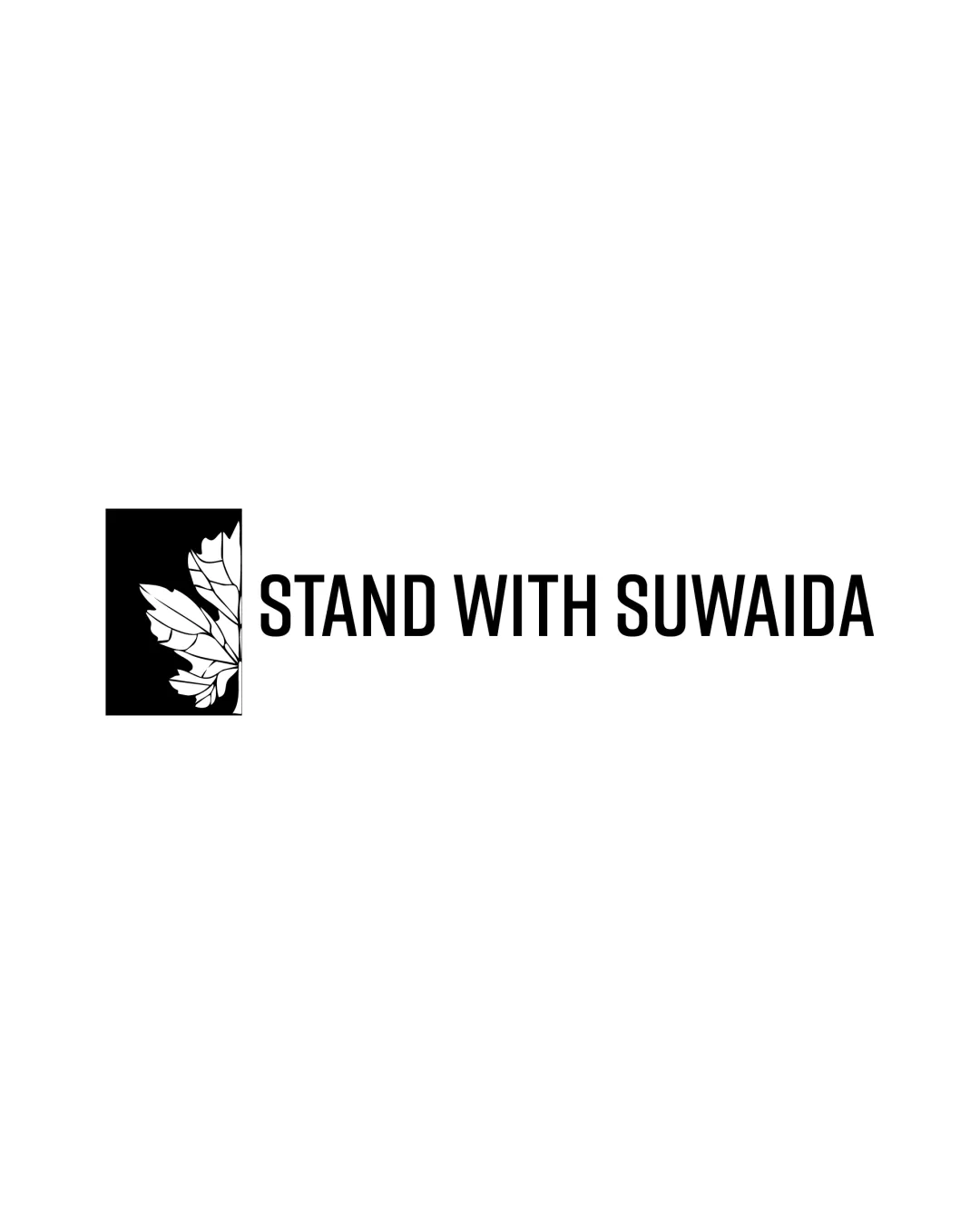
Logo review ofStand With Suwaida
Review the detailed scores below to see what is working and what should be refined first.
Legibility
Originality
Misread
Balance
Scale
Detailed review
Logo performance breakdown
Legibility
![]() Text is highly readable, clear sans-serif typeface, strong contrast against background, appropriate letter spacing.
Text is highly readable, clear sans-serif typeface, strong contrast against background, appropriate letter spacing.
Originality
![]() Effective integration of a leaf symbol to convey nature or solidarity. The composition is clean.
Effective integration of a leaf symbol to convey nature or solidarity. The composition is clean.
![]() Leaf in square is quite common and lacks unique details. No strong creative elements that set the icon apart from generic nature or support logos.
Leaf in square is quite common and lacks unique details. No strong creative elements that set the icon apart from generic nature or support logos.
Color harmony
![]() Excellent contrast and harmony within the black-and-white scheme. Universal compatibility and strong versatility.
Excellent contrast and harmony within the black-and-white scheme. Universal compatibility and strong versatility.
Black
#000000
White
#FFFFFF
Balance alignment
![]() Solid horizontal structure, neatly aligns symbol and wordmark. Consistent use of geometric shapes provides stability.
Solid horizontal structure, neatly aligns symbol and wordmark. Consistent use of geometric shapes provides stability.
![]() Visual weight of the black square and leaf on the left slightly outweighs the textual element, causing minor imbalance when viewed at smaller sizes.
Visual weight of the black square and leaf on the left slightly outweighs the textual element, causing minor imbalance when viewed at smaller sizes.

Scalability
![]() Simple shapes and black-and-white palette ensure strong scalability. Will reproduce clearly on business cards, signs, and social profiles.
Simple shapes and black-and-white palette ensure strong scalability. Will reproduce clearly on business cards, signs, and social profiles.
![]() Thin lines in the leaf illustration may not translate well to very small scales or embroidery. Some fine detail loss is likely.
Thin lines in the leaf illustration may not translate well to very small scales or embroidery. Some fine detail loss is likely.
200x250 px
100×125 px
50×62 px
Misinterpretations
![]() No inappropriate or confusing visual meanings present in the composition.
No inappropriate or confusing visual meanings present in the composition.
Symbol & text fit
![]() Both logomark and wordmark share a minimalist aesthetic. The solid weight of the text matches the boldness of the symbol.
Both logomark and wordmark share a minimalist aesthetic. The solid weight of the text matches the boldness of the symbol.
![]() The illustrative nature of the leaf is more detailed than the uniform wordmark, creating a slight stylistic mismatch.
The illustrative nature of the leaf is more detailed than the uniform wordmark, creating a slight stylistic mismatch.
Try your own review
Review my logo
Wondering how your logo performs?
Get a clear logo score, key risks, and priority fix ideas before your client or audience sees it.
Keep exploring


