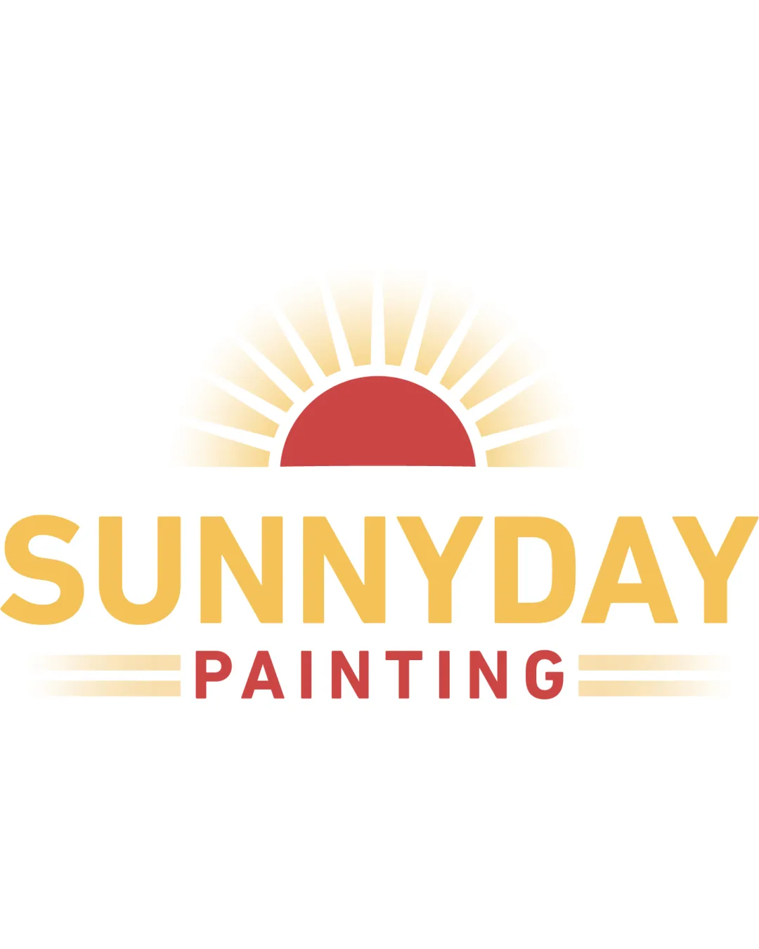
SUNNYDAY PAINTING logo review
4.0 / 5
Logo score
Logo review of

Sunnyday Painting

A strong, appealing logo with effective communication and minor areas for further distinction and refinement.

Combination Mark Friendly, Clean, Geometric Painting Services
5/5
Legibility
3/5
Originality
5/5
Misread
4/5
Balance
4/5
Scale
Action plan

What to fix first

The most important fixes to handle before polishing the full presentation.

1

Tweak the sun rays to simplify and clarify the gradients for small-scale use.

Medium priority

Fewer, bolder rays without gradient will hold up better in practical applications.

Impact: Improves Scalability And Printing Clarity. · Effort: Low

2

Consider a more distinctive sun or paint element for originality.

Medium priority

A unique twist can help avoid blending in with competitors.

Impact: Raises Brand Memorability And Distinctiveness. · Effort: Medium

Detailed review

Logo performance breakdown

5/5

Legibility

Checkmark icon Text is clear, large, and easy to read.

3/5

Originality

Checkmark icon Sunrise ties well to 'Sunnyday', fitting for painting.

Warning icon Sunrise motif is fairly common in service branding.

4/5

Color harmony

Checkmark icon Warm, optimistic palette is inviting.

Warning icon Palette is pleasant but conventional.

Yellow
#F6C454

Red
#D85543

White
#FFFFFF

Your palette is close. Refine the color roles and combinations before updating the logo.

Build brand colors
4/5

Balance alignment

Checkmark icon Good centering and symmetrical spacing.
Checkmark icon Mark and text are proportioned well.

Warning icon Slight crowding between sun rays and text.

logo 200x250 pixels scalability test alignment grid overlay
4/5

Scalability

Checkmark icon Simple shapes and strong contrast support most sizes.

Warning icon Sunray gradients may lose clarity at very small sizes.

logo 200x250 pixels scalability test

200x250 px

logo 100x125 pixels scalability test

100×125 px

logo 50x62 pixels scalability test

50×62 px

5/5

Misinterpretations

Checkmark icon No unintended or confusing shapes.

4 / 5

Logo structure & brief match

Checkmark icon Sun and color palette connect well with the brand name.

Warning icon Could explore more unique integrations between symbol and text.

Checkmark icon Industry: Strong alignment with painting/home services; sun and clear type are relevant.
Checkmark icon Tone: Conveys warmth and optimism, suiting a friendly service brand.

Try your own review

Wondering how your logo performs?

Get a clear logo score, key risks, and priority fix ideas before your client or audience sees it.

Review my logo