Wondering how your logo performs? 🧐
Get professional logo reviews in seconds and catch design issues in time.
Try it Now!Logo review of TAIFUN
 Logo analysis by AI
Logo type:
Style:
Detected symbol:
Detected text:
Business industry:
Review requested by Wei_elyachan
**If AI can recognize or misinterpret it, so can people.
Structured logo review
Legibility
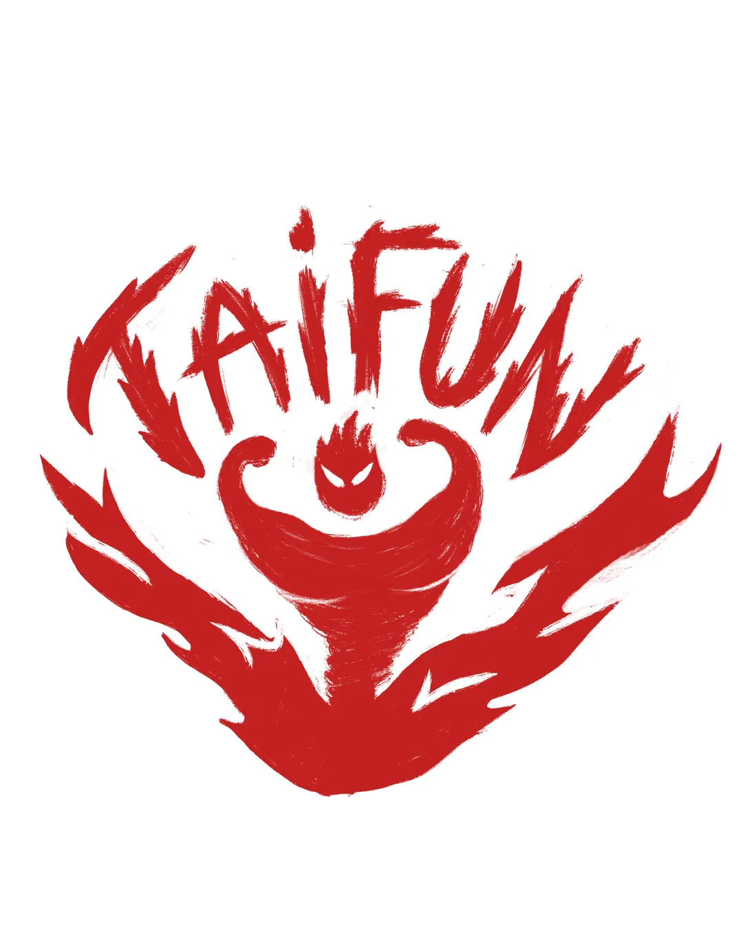
Unique hand-drawn typeface, strong presence.
Letterforms are overly stylized and distorted, making 'TAIFUN' difficult to read at a glance.
Some letter shapes, especially 'A' and 'U', blend into the surrounding visual chaos, reducing decipherability from a distance.
Scalability versatility
Large, bold form maintains visual impact at larger sizes.
Expressive style may catch attention on banners or posters.
Fine hand-drawn strokes, uneven edges, and busy composition will lose clarity at small sizes such as business cards or social media icons.
Highly detailed, painterly style is unlikely to reproduce well in embroidery or small product labels.
Lack of a simpler version for compact uses.

200x250 px

100×125 px

50×62 px
Balance alignment
Central focal point with symmetrical flame and figure elements.
Surrounding type loosely follows a circular composition.
Letter forms and symbol seem crowded and overly energetic, sacrificing spatial harmony.
The logo feels top-heavy, as the text and main figure overshadow the bottom flames.


Originality
Unique combination of custom lettering and aggressive mascot/figure.
Hand-drawn effect and dynamic flames create a striking visual identity.
Fierce emotion and movement are conveyed strongly.
Energetic flames and angry-eyed character border on cliché in the athletic and fighting sports space.
No inventive use of negative space or dual symbolism detected.
Logomark wordmark fit
Both the logomark (figure) and wordmark (TAIFUN) share the same brush style and aggressive energy.
The integration is visually chaotic, with limited separation or breathing room, making each element hard to distinguish.
Wordmark seems somewhat forced to curve around the logomark, impacting readability and cohesion.
Aesthetic look
Expressive, raw energy matches a fitness or fighting brand.
Brush strokes add personality and emotion.
Rough edges and messy style compromise professionalism.
Overly busy composition gives an amateur, unrefined feel, lacking polish found in high-end athletic brands.
Dual meaning and misinterpretations
No inappropriate or unintended symbols detected in the shapes.
Color harmony
Simple and bold with high-contrast red and white, making a strong impact.
Consistent use of one bold color reinforces brand identity.
Flame Red
#D32E1A
White
#FFFFFF


