Wondering how your logo performs? 🧐
Get professional logo reviews in seconds and catch design issues in time.
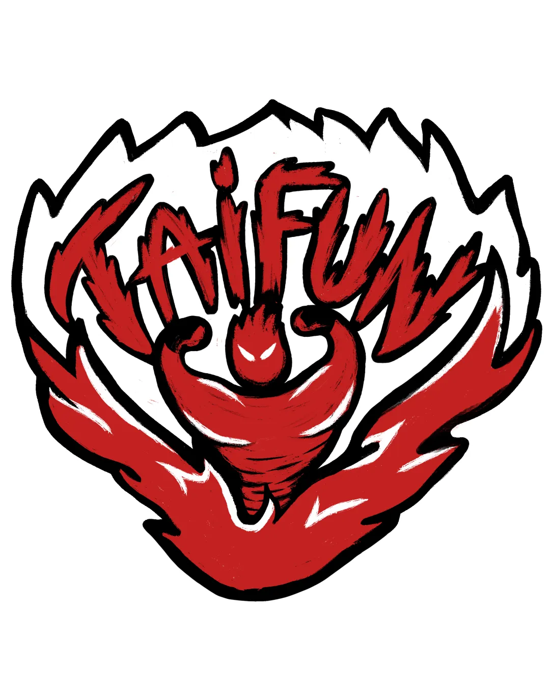
Try it Now!Logo review of TAIFUN
 Logo analysis by AI
Logo type:
Style:
Detected symbol:
Negative space:
Detected text:
Business industry:
Review requested by Wei_elyachan
**If AI can recognize or misinterpret it, so can people.
Structured logo review
Legibility
![]() Distinct color contrast between text and background.
Distinct color contrast between text and background.
![]() Text style is irregular and inconsistent in thickness, making it difficult to read, especially at a glance.
Text style is irregular and inconsistent in thickness, making it difficult to read, especially at a glance.![]() Overlapping of letters and integration with illustration further reduces clarity, particularly for the 'F' and 'U' characters, which blend into the flames.
Overlapping of letters and integration with illustration further reduces clarity, particularly for the 'F' and 'U' characters, which blend into the flames.
Scalability versatility
![]() Bold lines and simple color palette help preserve some clarity on medium backgrounds.
Bold lines and simple color palette help preserve some clarity on medium backgrounds.![]() Strong visual impact for large targets like posters or t-shirts.
Strong visual impact for large targets like posters or t-shirts.
![]() Fine irregular details and busy composition make it hard to read or recognize at smaller scales, such as favicons or badges.
Fine irregular details and busy composition make it hard to read or recognize at smaller scales, such as favicons or badges.![]() Line thickness and painted style would likely blur in embroidery, pens, or stamp applications.
Line thickness and painted style would likely blur in embroidery, pens, or stamp applications.![]() Design lacks a simplified icon version for app icons or minimalist uses.
Design lacks a simplified icon version for app icons or minimalist uses.
200x250 px
100×125 px
50×62 px
Balance alignment
![]() Central figure creates a sense of overall balance and symmetry.
Central figure creates a sense of overall balance and symmetry.![]() Lettering and illustration encircle each other, creating a visually cohesive unit.
Lettering and illustration encircle each other, creating a visually cohesive unit.
![]() Irregular hand-drawn lines cause visual imbalance, especially in the spacing between the letters and symbol.
Irregular hand-drawn lines cause visual imbalance, especially in the spacing between the letters and symbol.![]() Top weight from 'TAIFUN' text feels heavy compared to the rest of the image, causing upward imbalance.
Top weight from 'TAIFUN' text feels heavy compared to the rest of the image, causing upward imbalance.

Originality
![]() Energetic, custom-drawn illustration brings a unique personality.
Energetic, custom-drawn illustration brings a unique personality.![]() Integration of flames, figure, and dynamic text adds creativity.
Integration of flames, figure, and dynamic text adds creativity.
![]() General themes—muscular figure with flames—are common in sports/gym logos, though execution here is more personal.
General themes—muscular figure with flames—are common in sports/gym logos, though execution here is more personal.![]() No hidden meaning or exceptionally original twist in negative space usage.
No hidden meaning or exceptionally original twist in negative space usage.
Aesthetic look
![]() Energetic and aggressive style fits sports or team branding.
Energetic and aggressive style fits sports or team branding.![]() High-contrast color scheme provides strong visual punch.
High-contrast color scheme provides strong visual punch.
![]() Hand-drawn lines appear rough and unfinished.
Hand-drawn lines appear rough and unfinished.![]() Overall look is busy, with too many elements fighting for attention.
Overall look is busy, with too many elements fighting for attention.![]() Overuse of strokes and uneven texture lowers polish, giving a slightly amateur aesthetic.
Overuse of strokes and uneven texture lowers polish, giving a slightly amateur aesthetic.
Dual meaning and misinterpretations
![]() No inappropriate or unintentional imagery detected in figure or text.
No inappropriate or unintentional imagery detected in figure or text.
Color harmony
![]() Limited to red, white, and black—strong, cohesive palette for sports branding.
Limited to red, white, and black—strong, cohesive palette for sports branding.![]() High contrast ensures separation.
High contrast ensures separation.
![]() Large fields of solid color with minimal gradient may appear flat or less premium in some applications.
Large fields of solid color with minimal gradient may appear flat or less premium in some applications.
red
#D72638
white
#FFFFFF
black
#000000