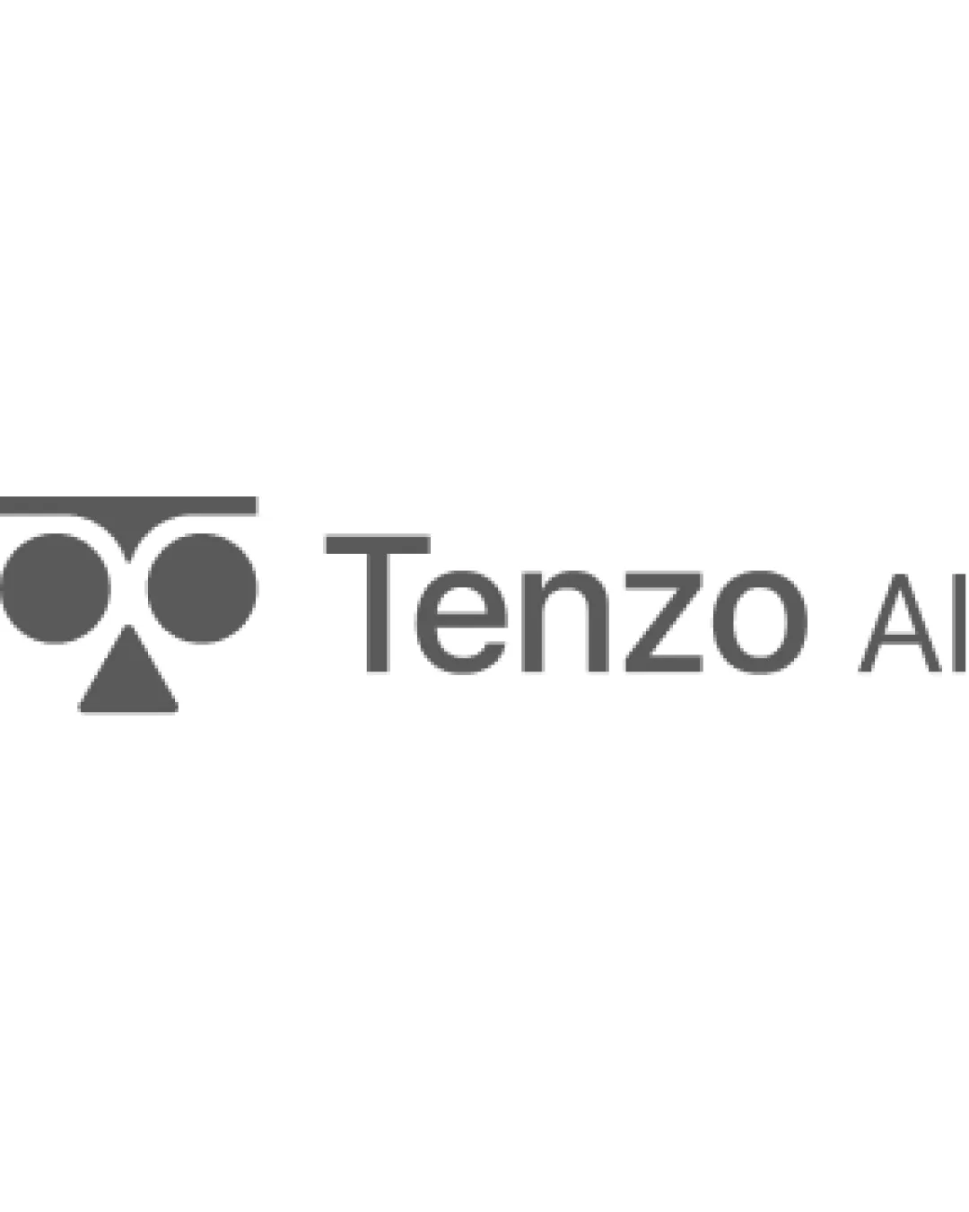
Tenzo AI logo review
3/5
Logo score
Logo review of

Tenzo Ai

This logo is functional and clear, but its abstract mark is generic and misses opportunities to reinforce AI hiring or interviewing themes.

Combination Geometric Minimalism AI Technology / Hiring Platform
5/5
Legibility
3/5
Originality
5/5
Misread
3/5
Balance
4/5
Scale
Your next steps

What to fix first

Focus on the changes that matter. Keep what makes the logo work.

1

Standalone mark

Explore more distinctive or AI/hiring-relevant mark features.

Visible issue High priority Medium effort
Area to inspectApproximate location

The geometric face motif (two dots and a triangle under a bar) is a common abstract construction and lacks unique elements related to AI or hiring.

How to check

Test with focus groups or peers for memorability and perceived relevance.

See the category review
2

logo (full combination)

Refine spatial arrangement for improved visual balance between mark and wordmark.

Visible issue Medium priority Low effort

The large, left-heavy geometric symbol draws the eye away from the wordmark, creating a minor imbalance in the lockup.

How to check

Test various mark sizes and alignments for cohesion.

See the category review
Detailed review

Logo performance breakdown

3/5

Brief & logo match

Based on your brief
Compared with

AI saas, AI hiring, AI agent Hiring, AI screening, AI interview

The execution is competent but the concept is too generic to convincingly convey AI hiring or related technological differentiation.

  • AI Focus

    The mark's geometric abstraction could reference artificial intelligence but is conceptually generic.

  • Hiring And Interviewing Relevance

    No direct visual cues for hiring, screening, or interview processes are present.

5/5

Legibility

  • Clear, modern sans-serif type
  • No spelling issues
3/5

Originality

  • The geometric face motif (two dots and a triangle under a bar) is a common abstract construction and lacks unique elements related to AI or hiring.

    Visible issue Standalone mark

    Try: Explore more distinctive or AI/hiring-relevant mark features.

    Check: Test with focus groups or peers for memorability and perceived relevance.
    Area to inspectApproximate location
3/5

Balance alignment

  • The large, left-heavy geometric symbol draws the eye away from the wordmark, creating a minor imbalance in the lockup.

    Visible issue logo (full combination)

    Try: Refine spatial arrangement for improved visual balance between mark and wordmark.

    Check: Test various mark sizes and alignments for cohesion.

Uploaded logoAlignment guide overlay

Inspect spacing with the guide. Optical balance may differ from geometric centering.

4/5

Scalability

  • Simple, scalable symbol
  • Monochrome palette aids reproduction
Uploaded logo at 200 pixels wide
200 × 250 px
Uploaded logo at 100 pixels wide
100 × 125 px
Uploaded logo at 50 pixels wide
50 × 63 px

Compare the detail at different sizes. Labels show the full image dimensions.

5/5

Misinterpretations

  • No unintended readings detected
3/5

Symbol & text fit

  • Consistent geometric style
  • The geometric style mark fits the modern, neutral type, but the conceptual bridge to AI-specific hiring remains minimal.

    Optional refinement logo (full combination)

    Try: Enhance the symbolic connection to AI or hiring through mark refinement.

    Check: Test with targeted audiences for perceived brand messaging.

Black & white

Does the shape still work without color?

These tests are available only for logos uploaded in vector (SVG) format.

Background contrast

Find the surfaces where your logo stays clear.

These tests are available only for logos uploaded in vector (SVG) format.

Blur & silhouette

A 3px blur softens fine details so you can check whether the overall shape stays recognizable. If key gaps close or elements merge, the logo may rely too heavily on detail.

These tests are available only for logos uploaded in vector (SVG) format.

Try your own review

Wondering how your logo performs?

Get a clear logo score, key risks, and priority fix ideas before your client or audience sees it.

Review my logo