Wondering how your logo performs? 🧐
Get professional logo reviews in seconds and catch design issues in time.
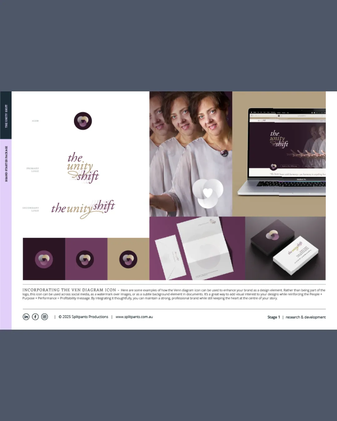
Try it Now!Logo review of the unity shift
 Logo analysis by AI
Logo type:
Style:
Detected symbol:
Detected text:
Review requested by Splitpants
**If AI can recognize or misinterpret it, so can people.
Structured logo review
Legibility
![]() Elegant typeface
Elegant typeface![]() Distinct color contrast
Distinct color contrast
![]() Script font may be difficult to read at smaller sizes
Script font may be difficult to read at smaller sizes![]() The color gradient can affect clarity
The color gradient can affect clarity
Scalability versatility
![]() Works well on digital mockups
Works well on digital mockups![]() Adaptable to various materials
Adaptable to various materials
![]() Complexity in the symbol may not scale well
Complexity in the symbol may not scale well![]() Text readability may decrease on smaller uses
Text readability may decrease on smaller uses
200x250 px
100×125 px
50×62 px
Balance alignment
![]() Well-balanced between symbol and text
Well-balanced between symbol and text![]() Good alignment in the composition
Good alignment in the composition

Originality
![]() Unique use of a Venn diagram as a fashion element
Unique use of a Venn diagram as a fashion element![]() Creative text arrangement
Creative text arrangement
![]() Venn diagrams can be common in certain contexts
Venn diagrams can be common in certain contexts
Aesthetic look
![]() Sophisticated color palette
Sophisticated color palette![]() Stylish and modern appearance
Stylish and modern appearance
Dual meaning and misinterpretations
![]() No inappropriate symbolism detected
No inappropriate symbolism detected
Color harmony
![]() Harmonious use of muted colors
Harmonious use of muted colors![]() Gradient enhances elegance
Gradient enhances elegance
![]() Gradient may complicate single-color printing
Gradient may complicate single-color printing