 View review
Logo score
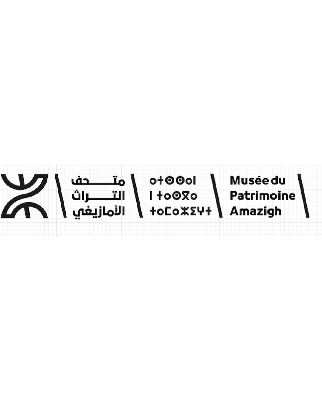
Logo review ofمتحف التراث الأمازيغي, Tifinagh..
Review the detailed scores below to see what is working and what should be refined first.
Legibility
Originality
Misread
Balance
Scale
Detailed review
Logo performance breakdown
Legibility
![]() Text in all three scripts is clear, well-kerned, and easily distinguishable.
Text in all three scripts is clear, well-kerned, and easily distinguishable.![]() High contrast between black lettering and white background improves readability.
High contrast between black lettering and white background improves readability.
Originality
![]() Combines recognizable Amazigh symbol with multilingual typographic treatment, distinct to heritage museums.
Combines recognizable Amazigh symbol with multilingual typographic treatment, distinct to heritage museums.![]() Tifinagh characters add strong cultural flair.
Tifinagh characters add strong cultural flair.
![]() Amazigh symbol is culturally generic and widely used, reducing uniqueness in isolation.
Amazigh symbol is culturally generic and widely used, reducing uniqueness in isolation.
Color harmony
![]() Monochrome palette ensures excellent harmony and adaptability.
Monochrome palette ensures excellent harmony and adaptability.![]() High contrast between text/symbol and background maximizes clarity.
High contrast between text/symbol and background maximizes clarity.
Black
#000000
White
#FFFFFF
Balance alignment
![]() Grid-based alignment and repeated slashes provide coherence.
Grid-based alignment and repeated slashes provide coherence.![]() Each language section is visually contained within its column.
Each language section is visually contained within its column.
![]() Symbol appears heavier than the text, drawing disproportionate attention.
Symbol appears heavier than the text, drawing disproportionate attention.![]() Spacing between elements feels uneven; the leftmost symbol dominates compared to the dense textual blocks.
Spacing between elements feels uneven; the leftmost symbol dominates compared to the dense textual blocks.

Scalability
![]() Monoline and bold lines will be legible in medium sizes and print materials.
Monoline and bold lines will be legible in medium sizes and print materials.![]() Simple color palette ensures adaptability.
Simple color palette ensures adaptability.
![]() Grid structure and thinness of some lines may lose detail at very small sizes, especially in the symbol.
Grid structure and thinness of some lines may lose detail at very small sizes, especially in the symbol.![]() Horizontal, multi-element layout may not fit well on all signage, merchandise, or web favicons—vertical or stacked variants are needed.
Horizontal, multi-element layout may not fit well on all signage, merchandise, or web favicons—vertical or stacked variants are needed.
200x250 px
100×125 px
50×62 px
Misinterpretations
![]() No apparent negative or inappropriate connotations in symbol or structure.
No apparent negative or inappropriate connotations in symbol or structure.
Symbol & text fit
![]() All textual and symbolic components follow the same monoline weight, providing a theme.
All textual and symbolic components follow the same monoline weight, providing a theme.
![]() Symbol's thickness and size imbalance with the smaller, more compact text blocks.
Symbol's thickness and size imbalance with the smaller, more compact text blocks.
![]() The heavy logomark overshadows the wordmark sections.
The heavy logomark overshadows the wordmark sections.
Try your own review
Review my logo
Wondering how your logo performs?
Get a clear logo score, key risks, and priority fix ideas before your client or audience sees it.
Keep exploring


