Wondering how your logo performs? 🧐
Get professional logo reviews in seconds and catch design issues in time.
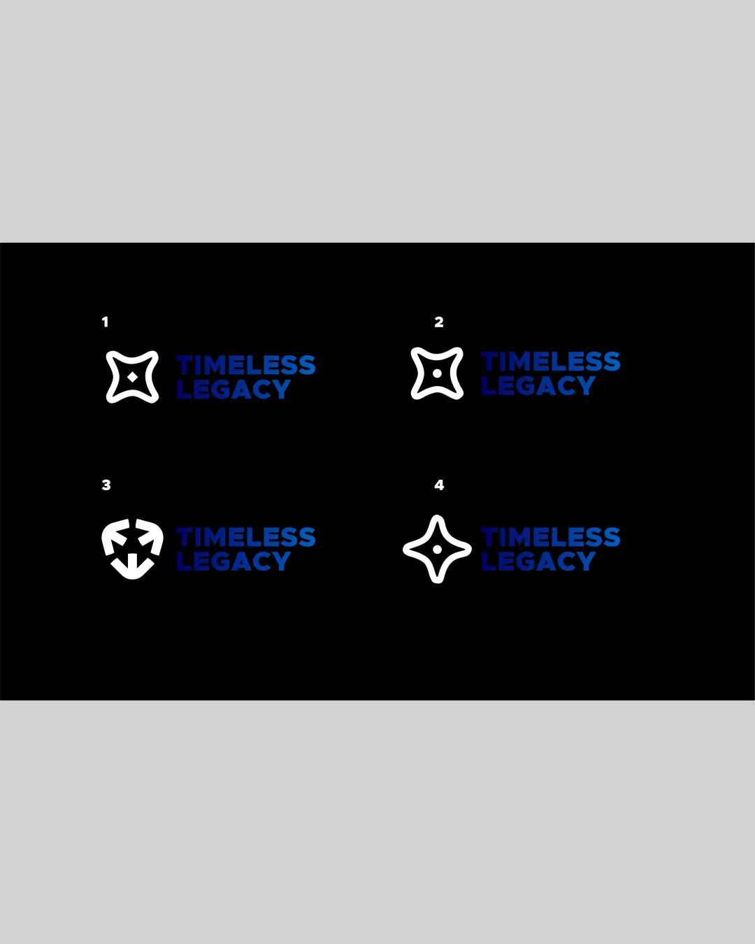
Try it Now!Logo review of TIMELESS LEGACY
 Logo analysis by AI
Logo type:
Style:
Detected symbol:
Negative space:
Detected text:
Business industry:
Review requested by Toba-dosumu
**If AI can recognize or misinterpret it, so can people.
Structured logo review
Legibility
![]() Text is clear, bold, and uses high contrast with background.
Text is clear, bold, and uses high contrast with background.![]() Font selection ensures strong readability at a glance.
Font selection ensures strong readability at a glance.
Scalability versatility
![]() Minimal, geometric symbols ensure clarity on large formats like billboards and digital platforms.
Minimal, geometric symbols ensure clarity on large formats like billboards and digital platforms.![]() Logomark maintains visibility at small sizes for most applications.
Logomark maintains visibility at small sizes for most applications.
![]() The fine internal detail in logo 4 risks becoming indistinct at very small sizes or embroidery.
The fine internal detail in logo 4 risks becoming indistinct at very small sizes or embroidery.![]() Symbols could be oversimplified for better clarity as an app icon or favicon, especially logo 4.
Symbols could be oversimplified for better clarity as an app icon or favicon, especially logo 4.
200x250 px
100×125 px
50×62 px
Balance alignment
![]() Wordmark and logomark are consistently aligned horizontally.
Wordmark and logomark are consistently aligned horizontally.![]() Weight of the bold wordmark is generally well-matched to symbol boldness.
Weight of the bold wordmark is generally well-matched to symbol boldness.
![]() Logo 1, 2, and 4 icons feel slightly lightweight compared to the very bold wordmark.
Logo 1, 2, and 4 icons feel slightly lightweight compared to the very bold wordmark.![]() Logo 3 feels heavier and slightly mismatched with the typeface weight.
Logo 3 feels heavier and slightly mismatched with the typeface weight.

Originality
![]() Abstract forms move away from literal or generic imagery.
Abstract forms move away from literal or generic imagery.![]() Logo 3 employs negative space in a creative manner.
Logo 3 employs negative space in a creative manner.
![]() Star-like marks in logos 1, 2, and 4 feel generic and lack strong distinctive personality.
Star-like marks in logos 1, 2, and 4 feel generic and lack strong distinctive personality.![]() Shapes could be interpreted as common ‘star’ or ‘badge’ icons without a clear unique twist.
Shapes could be interpreted as common ‘star’ or ‘badge’ icons without a clear unique twist.
Logomark wordmark fit
![]() Both elements are consistently paired beside each other.
Both elements are consistently paired beside each other.
![]() The visual weight and style of logomark and bold sans-serif wordmark are poorly matched.
The visual weight and style of logomark and bold sans-serif wordmark are poorly matched.![]() Curve-based symbols contrast harshly with rigid, geometric text style.
Curve-based symbols contrast harshly with rigid, geometric text style.
Aesthetic look
![]() Minimalism keeps the design modern and uncluttered.
Minimalism keeps the design modern and uncluttered.![]() Strong blue and white palette adds a professional look.
Strong blue and white palette adds a professional look.
![]() Does not stand out aesthetically among modern consulting or tech brands.
Does not stand out aesthetically among modern consulting or tech brands.![]() Overall design lacks unique aesthetic character or detail.
Overall design lacks unique aesthetic character or detail.
Dual meaning and misinterpretations
![]() No inappropriate or unintentional shapes observed across logo options.
No inappropriate or unintentional shapes observed across logo options.
Color harmony
![]() Two-tone palette is well chosen; blue contrasts sharply with white/black.
Two-tone palette is well chosen; blue contrasts sharply with white/black.![]() Color approach is simple and effective for branding.
Color approach is simple and effective for branding.
White
#FFFFFF
Ebony
#151619
Cobalt Blue
#2366D1