Wondering how your logo performs? 🧐
Get professional logo reviews in seconds and catch design issues in time.
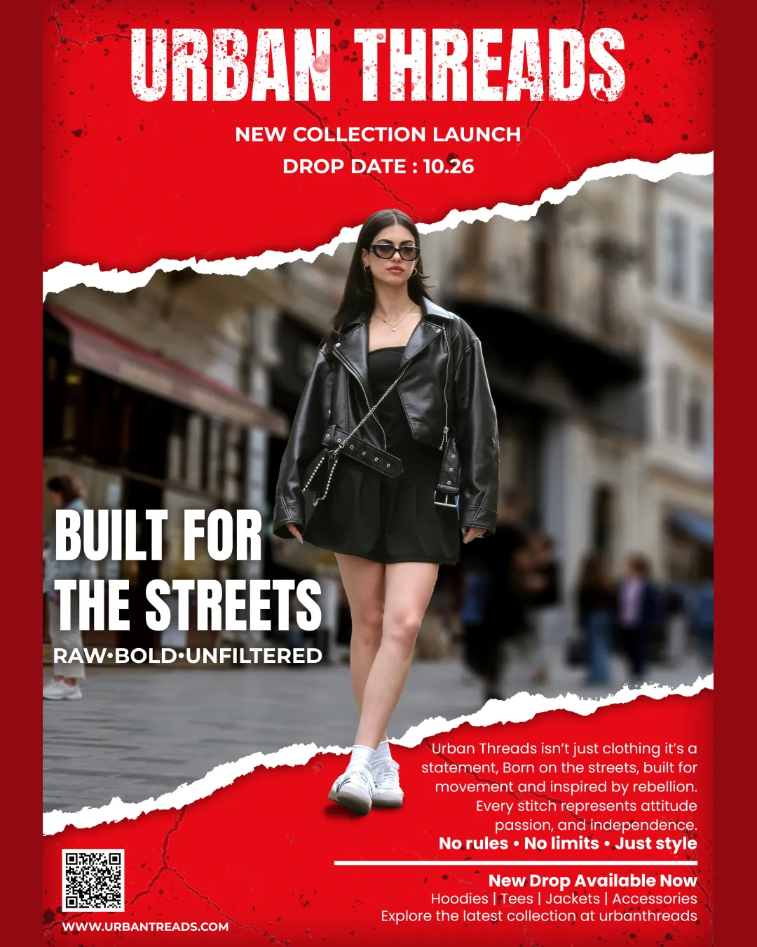
Try it Now!Logo review of URBAN THREADS
 Logo analysis by AI
Logo type:
Style:
Detected text:
Business industry:
Review requested by Dhaval_Tadvi
**If AI can recognize or misinterpret it, so can people.
Structured logo review
Legibility
![]() The bold sans-serif, uppercase font ensures strong visibility and presence.
The bold sans-serif, uppercase font ensures strong visibility and presence.![]() Large font size stands out clearly against the red background.
Large font size stands out clearly against the red background.
![]() The distressed, rough treatment of the font slightly diminishes readability, especially for people skimming quickly or at smaller sizes.
The distressed, rough treatment of the font slightly diminishes readability, especially for people skimming quickly or at smaller sizes.
Scalability versatility
![]() High contrast color scheme will print well in larger advertising formats and on apparel tags.
High contrast color scheme will print well in larger advertising formats and on apparel tags.![]() Simple wordmark (no intricate lines or gradients) is generally scalable.
Simple wordmark (no intricate lines or gradients) is generally scalable.
![]() Distressed, textured font overlays may lose clarity or become visually muddy when reduced to small sizes, such as on website favicons, small apparel labels, or embroidery.
Distressed, textured font overlays may lose clarity or become visually muddy when reduced to small sizes, such as on website favicons, small apparel labels, or embroidery.![]() Heavily detailed textural effects don't translate well to monochrome or single-color applications.
Heavily detailed textural effects don't translate well to monochrome or single-color applications.
200x250 px
100×125 px
50×62 px
Balance alignment
![]() Text is horizontally centered and visually dominant at the top, ensuring a clear hierarchy.
Text is horizontally centered and visually dominant at the top, ensuring a clear hierarchy.![]() All-caps block style creates a unified, structured layout.
All-caps block style creates a unified, structured layout.
![]() Visual weight from the distressed effect makes the logo feel slightly messy and less grounded, especially if placed on busier or textured backgrounds in the future.
Visual weight from the distressed effect makes the logo feel slightly messy and less grounded, especially if placed on busier or textured backgrounds in the future.

Originality
![]() Distressed and grunge treatment adds character and distinguishes the wordmark from basic sans-serif styles.
Distressed and grunge treatment adds character and distinguishes the wordmark from basic sans-serif styles.
![]() Distressed all-caps sans-serif wordmarks are common in streetwear and urban fashion, making it less ownable and at risk of blending in with similar brands.
Distressed all-caps sans-serif wordmarks are common in streetwear and urban fashion, making it less ownable and at risk of blending in with similar brands.![]() No custom typography or unique symbol—lacks a proprietary visual element.
No custom typography or unique symbol—lacks a proprietary visual element.
Aesthetic look
![]() Gritty, raw look matches the target audience and aligns with the ‘urban’ theme.
Gritty, raw look matches the target audience and aligns with the ‘urban’ theme.![]() Bold, contrasting colors create high energy and impact.
Bold, contrasting colors create high energy and impact.
![]() The heavy distressing may appear overdone or amateurish if not refined—a cleaner application could elevate the look, and the aesthetic may polarize people outside the core streetwear demographic.
The heavy distressing may appear overdone or amateurish if not refined—a cleaner application could elevate the look, and the aesthetic may polarize people outside the core streetwear demographic.
Dual meaning and misinterpretations
![]() No visible inappropriate or ambiguous shapes; the design intention is clear and straightforward.
No visible inappropriate or ambiguous shapes; the design intention is clear and straightforward.
Color harmony
![]() Red, black, and white contrast powerfully and evoke strong street and fashion vibes.
Red, black, and white contrast powerfully and evoke strong street and fashion vibes.![]() The restricted palette is effective and matches brand positioning.
The restricted palette is effective and matches brand positioning.
![]() A harsh, very saturated red may compete with apparel colors or other visuals in practice. Consider more variation or moderation for adaptability across product lines.
A harsh, very saturated red may compete with apparel colors or other visuals in practice. Consider more variation or moderation for adaptability across product lines.
White
#FFFFFF
Vivid Red
#BD1D27
Black
#000000