VADA SOLUTIONS EST. 2008 VS logo review
4/5
Logo score Emblem category

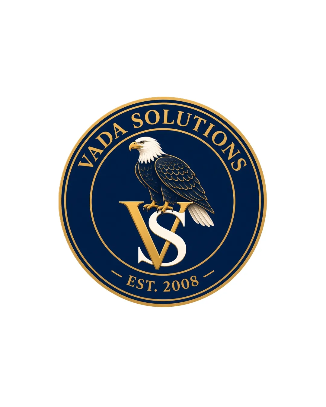
VADA SOLUTIONS EST. 2008 VS

creative810491 Essential logo review

A strong, credible emblem with minor clarity and scalability issues.

Emblem Classic, Formal, Patriotic Consulting Or Professional Services
4.5/5
Legibility
3.5/5
Originality
4/5
Balance
3.5/5
Scale
Your next steps

What to fix first

Focus on the changes that matter. Keep what makes the logo work.

1

Simplify eagle illustration for small-size reproduction.

High priority Medium effort

Current detail will blur at reduced sizes.

Improves logo clarity and professionalism across all media.
2

Slightly separate VS initials for better clarity.

Medium priority Low effort

Initial overlap may hinder quick reading.

Enhances instant recognition of the lettermark.

Detailed review

Logo performance breakdown

Not scored

Brief & logo match

Logo's formality and eagle symbology are a strong fit for consulting or professional services.

4.5/5

Legibility

  • All text is clear and easy to read.
  • Gold on navy blue gives strong contrast.
  • Slight overlap between initials may reduce instant clarity.
3.5/5

Originality

  • Eagle adds a unique, authoritative touch to otherwise traditional badge design.
  • Badge with eagle is somewhat conventional for security and consulting sectors.
4.5/5

Color harmony

  • Gold and navy palette is classic, elegant, and consistent with the theme.
Navy Blue#0A2340
Gold#C9AA6A
White#FFFFFF

Estimated colors. Use the original design file for exact values.

Create a full color palette using these colors

Create new palette

4/5

Balance alignment

  • Symmetrical circular composition.
  • Elements are visually centered.
  • Initials VS overlap could be optically cleaner.
Uploaded logoAlignment guide overlay

Inspect spacing with the guide. Optical balance may differ from geometric centering.

3.5/5

Scalability

  • Central elements scale fairly well.
  • Simple shapes maintain clarity.
  • Fine details in the eagle may be lost at small sizes.
  • Thin gold outline may disappear when reduced.
5/5

Misinterpretations

  • No confusing or inappropriate secondary readings.
4/5

Symbol & text fit

  • Eagle, initials, and text merge cohesively in emblem format.
  • Lettermark and wordmark slightly compete for attention.
Try your own review

Wondering how your logo performs?

Get a clear logo score, key risks, and priority fix ideas before your client or audience sees it.

Review my logo